Showing posts with label Slater Eric. Show all posts

Monday, 2 January 2023

Eric Slater at auction


I was surprised to see Eric Slater's colour woodcut The Avenue sold for only £500 in the autumn. As readers will know, I am not a big fan of Slater, but this print is one of his better landscapes and it does not appear to be faded. Possibly Slater has had his day, but it also strikes me people may be holding back. It was the same story with the Rigden Reads that sold in Gloucestershire in October. Many were not in all that good condition, although that has not put people off in the past. The highest price was £900 for his most illustrious print and like Slater, Read was getting a thousand easily at one stage.

According to James Trollope, The Avenue dates from circa 1936, which puts it towards the end of his career making colour woodcuts. The last one appeared in 1938 and by the time he made The Avenue, the images were more subtle and sophisticated than previously. As there is no colour image of the print in 'Slater's Sussex' and nothing of a reasonable size online, I thought this was well worth putting up. Perhaps now is the time to buy. 


Monday, 11 October 2021

'S. G. Boxsius from the Roof' : a prospectus for a new book & two new images


As artists of lesser standing and with less appeal than S.G. Boxsius have had small books published about them in recent years, I thought it was time Boxsius had one to himself more or less. This should be enough to please some readers at least although it would not be necessary or possible to devote a book to Boxsius on his own. There is not enough material out there about any of these artists to write a book about them. But as Boxsius was doing something new when he began making linocuts, a book would provide the chance to include linocut contemporaries of his like Isabel de B. Lockyer, Chica MacNab and Robert Howey. It would also be an opportunity to tell the true story of how the whole linocut trip took off well in the corrective fashion of Boxsius himself  before the Grosvenor School opened its illustrious doors in Pimlico.


In order to pull this off, I need help from readers. The number of prints by Boxsius in American and British museum collections can be counted on ten fingers. This is not very many for someone who produced at least thirty-five prints between about 1928 and 1938. But collectors have been taking an interest since the 1980s when Alan Guest identified Boxsius as one of the best practitioners. This means that the majority of his prints are in private collections in both the U.S. and Britain and I do need any readers willing to have their own images photographed for inclusion in the book to come forward. Without loans, this will not get off the ground. 


In the mean time, I include two prints you may not have seen and a better image of London from the roof than the small one you will have. (It is the same print I would think but in larger format). At the very top of the post is one of Boxsius' classic holiday images, By the quay, Looe from 1937. Presumably it shows 'Waterwitch' having her hull painted or caulked. The ship had already appeared in his work in 1934. Indeed there are times when he appeared to be short of new ideas. In other respects, he looked at his subject the way a sculptor does, turning it round to view it from all sides. Some of you will know the photograph of him working on a large tankard at Camden School of Art. There is also another photo of him surrounded by classical casts in the art room at Bolt Court. These are both telling photographs.


But not content with re-using images of his own, Boxsius often made productive use of the ideas of other artists. Ruins at Walberswick from 1931 (second from the top) depends on Eric Slater's The land-gate, Winchelsea from about 1926 (third from top) and the colour woodcuts of Cornwall that Sidney Lee made about 1905. (For readers who do not know the country, Looe is in Cornwall).  Nothing shows the corrective temper of the man better. In this respect, Boxsius was also a link between the old school colour woodcutters of the pre-war period and the new school linocut artists of the twenties. You can decide for yourself on the relative merits of the two prints by Boxsius and Slater. But you should know by now that there is more to Boxsius than meets the eye and there is a second more surprising source for his print in the shape of Elizabeth Keith's East Gate, Seoul by moonlight made in about 1920 (above). All this only goes to show how aware Boxsius was and how much he could absorb. Ruins at Walberswick isn't Boxsius at his best. That said, at this stage in the proceedings I will probably buy anything by him I can lay my hands on.

Sorry to say I have mislaid some of the email address of readers who I know own work by Boxsius. Anyone who can help though can contact me (Gordon Clarke) at the usual e mail cgc@waitrose.com. I can then send them a check list of Boxsius prints.


Monday, 25 January 2021

Eric Slater & the mystery of Icklesham Mill


As some of you will already know, Eric Slater's colour woodcut Tregenna Castle Hotel (below) is up for sale on ebay with only a couple of days left to go. Only yesterday a reader commented that Cornwall was outside his usual balliewick, a point that is valid in more ways than one. Slater has always been associated with the Sussex coast because he made chalk cliffs and Martello towers part of his stock-in-trade. But Slater was not as solitary as his lonely mills and Martello towers might suggest and was dependant on a number of people, not least his mother and grandmother who he always lived with.


James Trollope who owns the copyright to Slater's woodcuts likes to emphasise the influence of Arthur Rigden Read who he believes showed Slater how to make colour woodcuts after Slater moved to live not far from him at Winchelsea. Though I would not dispute that this is very likely true, there were others who had an effect, especially the Yorkshire artist, George Graham, who moved to Winchelsea in the early twenties and made a couple of colour woodcuts. The other is S.G. Boxsius who also worked in Sussex and in particular made a woodcut of Rottingdean Mill before he began making colour linocuts. 


Interestingly enough, Boxsius and his wife, Daisy, used to visit Devon and Cornwall and more than once old hotels and inns like the Crown Inn at Shaldon were the subject of his work. What is more to the point is how much better Icklesham Mill is than so much of Slater's work - and it is better for the debt he owes to Boxsius. The delicate use of pink, white and shadow against a cloudless sky is not very Slater and turns the centre of the print into a little Boxsius rather than the decorative stage-set we are all used to - and I am not denying that Slater doesn't have charm and appeal. I would buy one, but I was never prepared to stump up the kind of money people are prepared to pay.


The question is, though, where has Icklesham Mill been hiding all this time? And why is there no record of Slater exhibiting the print? Could it be that the print was a collaboration? Rottingdean Mill has the same small groups of houses to give the mill extra scale and, if anything, Slater handles light better than he does in Icklesham Mill. The light catching the sails and the depth of shadow at the back of the mill are particularly well done in Slater's naive way. But again it is the sense of calm and of background that is so Boxsius, especially the way the farther cliff is made into a second landscape. The print is subtle in a way so many of his prints never are. It was first exhibited in 1936 so it is quite late in his career  as a print artist. In all, the count I have based on James Trollope's catalogue is 45. This was some going between about 1926 and The stackyard, his final print apparently, in 1938. My feeling is work like Icklesham Mill may be later than that or simply remained. in his studio once he stopped exhibiting.


This doesn't answer the question why so many prints never seem to have been exhibited or why some work was only shown at the Sedon Galleries in Melbourne in 1932. Slater was a successful young printmaker by that point but most other artists exhibited at home and Australia came second. The answer was partly that Slater was taken up by the galleries as a bankable artist in the late twenties and early thirties just as much as he has been taken up by the print trade since the 1980s. One of his skills was to take what worked for other artists and to amalgamate them into his own. Given that his training at art school was limited, it isn't surprising that he had to learn on the job. Which brings me to Alfriston (above). The village is inland from Seaford where Slater lived so it is was on his patch. But is it the Slater we know? Not to me it isn't. The figures and the space are so much better handled than they are elsewhere in his work. The man in the cap creates a social space as he watches the people conversing. The figures also gives the scene greater depth by introducing exact scale. Slater's vases of flowers like his Tulips are sociable too but so far as I am aware this is the only place an everyday social space occurs in Slater's work. Not only that, it is very similar to Boxsius' Corfe Castle where the women on the grass are sketching the inn and the castle beyond them. My guess is that Slater sometimes needed considerable tuition. Beyond that, when his grandmother and then his mother died, the colour woodcuts died too. I find it odd than James had not found these two titles after all the work he had done (although a giclee print is now for sale). But there are others still missing for you to look out for and that he did record in his book, notably Stonehenge at sunrise and An inn by the sea - one of his better titles.

Wednesday, 18 November 2020

Christmas on ebay


Christmas tends to bring out the colour prints on ebay and Eric Slater's A downland mill has to come out of the sack first simply because it is going to cost so much. I know I am not going to please everyone by saying what I think about Slater, but that isn't what blogs are for. I understand what his appeal is but he is seriously overpriced and always has been. One of the reasons is that he became popular almost as soon as he began exhibiting in 1927, the prints sold well and there are enough of them around for dealers to offer them for sale now and for prices to keep on going up. 

This one is already over £800 and with four days left and Santa on the way, it will probably go for even more. I can't exactly say why this should be, but if you look at the image, to appears to be laid down, something that always put me off.

A downland mill was first exhibited in 1934 so comes in the middle of his career as a colour woodcut artist. The idea of depicting mills and Martello towers came from George Graham who had a house built at Winchelsea Beach around the time Slater moved into Alards in Winchelsea. I mean some of them are OK, but  by 1934 he had overdone windmills and other  his other colour woodcuts made around the time were better. As usual, the muted colour and shadows are likeable, but the image is not only static, it is weak.  In particular, the unattractive line of keyblock on the left hand side of the mill suggests how simple his approach could be.


William Nicholson's A fisherman has been hanging around for some while. Published in The dome in 1897, it was only the second of Nicholson's colour woodcuts and the only one to be printed directly from blocks that had been inked. All the rest were coloured by hand. The on you see here is not the image offered for same on ebay. This one comes from  Annex Galleries website. I am also not at all certain about what its status is as a print. I have seen some images that are signed which may mean that Nicholson printed them himself. All the other unsigned prints I assume first appeared in The Dome. I should also add that none of Nicholson's prints are true woodcuts. All of the were cut on end-grain on box. Nicholson only adapted the style of old hap books because he had come across some blocks in Ridges bookshop in Newark in Nottinghamshire where he had been brought up.


For any fans of Eric Hesketh Hubbard, here is the chance to buy his portfolio The gateways of Salisbury Cathedral Close printed at his own Forest Press and published in three editions in 1925. It is made up of five prints, mainly in sepia tones, but with the addition of some light green. I think one edition was printed on the press, the other two by hand and with the most expensive being on japan. I  cannot say for sure which one this is but almost certainly not the one printed on the press.

Hesketh Hubbard founded the Forest Press in an old shed on the common at Breamore near Salisbury in 1923 and wound it up only six years later. I know of thirteen colour woodcuts made during that time. I gave one of elms trees to my mother and she liked it a lot. I don't what happened to it and I have never seen it on the internet either. None made use of the Japanese manner and some of the ones are tougher paper are a bit crude. That said, many of them are interesting and some of them dramatic, but I wouldn't call them fine prints. Hubbard was in fact an accomplished professional artist and entrepreneur and the small group of woodcuts he made are not all that typical of his best work. But there you are. This is a quirky period piece. I have seen the complete portfolio for sale before but you would meed to be an enthusiast to buy it I would say.


Last but not least is Towards he downs, a colour linocut by Sybella Stiles. It's OK, I suppose, but not stylish enough to set the heart racing. I don't know much about her but she made various prints, including wood-engravings. It all depends what it goes for. 

Friday, 21 July 2017

A Sussex wave from Japan, the colour woodcuts of Eric Slater & Arthur Rigden Read: Hastings Museum and Art Gallery


In 1934 a friend of Arthur Rigden Read gave fifteen of his colour woodcuts to Hastings Art Gallery and I assume the fifteen colour woodcuts form the basis for the current exhibition at Hastings, but which also includes work by Urushibara, John Platt,  Eric Slater and Frank Morley Fletcher, an interesting mix of colour woodcut artists who all  made use of the Japanese method, hence the title of the exhibition.


Eric Slater was nowhere near as good a printmaker as Read, but he will help to bring in the crowds. It would be fair to say they formed a local school of sorts in the late twenties and thirties, but the Reads lived in Sussex for twenty years only and many of his subjects were French or Londoners or people like the Romanies who came from nowhere, so it's a shame curators try to give a minor artist this duff local slant. Read may be minor but he deserves better. As does his wife, who appears in a number of his woodcuts.
                                                                              

The show runs from 27th May to 3rd September and will appeal to the summer crowds as well as local cognoscenti. It will be worth going simply because I know that the bequest includes a number of prints that are rare enough to be unavailable anywhere online. Certainly I have never seen  some of them, but they have not been included in the booklet that has been published to coincide with the exhibition. But the less said about that little effort the better.

Tuesday, 28 October 2014

Eric Slater's ebay


Following the recent  sale of Eric Slater's well-known  The coastguard station (below) for £720, we now have A Sussex Mill (above) with a starting-bid of £250 from the same seller. Time was (and it was not so long ago) Slaters sold for £250. Not any more. Readers with an interest in Slater will have noticed that some prints have fetched a lot more - if I remember rightly one went not so long ago for around £1200.
                                                                              

The print on offer varies quite a lot from the version in James Trollope's book, Slater's Sussex. Generally, I think it's livelier and presumably Slater felt the same way about it. The blues are brighter and there is more green so the contrasts are greater but that only increases the colour-by-numbers effect that Slater undoubtedly has. They have period charm, yes. Are they worth £750? Most certainly not. Why are people prepared to pay so much? I really have no idea.

The prints certainly appear to be in good condition and how many are left to come out on the market is anybody's guess. The woodcuts with an edition given in the book are in 50s and so it surprises me they keep on turning up. I also wonder what will happen if something rare is being held back in reserve because I am quite certain that a market is being created here for those who seem willing to pay.

Saturday, 4 May 2013

Slater's Sussex, the colour woodcuts of Eric Slater: a review


A very unusual event this week, the publication of Slater's Sussex, the colour woodcuts of Eric Slater by James Trollope, the first study of a British colour woodcut artist since Malcolm Salaman's William Giles as far back as 1928. I think the Towner gallery at Eastbourne, who are the publishers, would have been wiser to make more of that than to claim rediscovery of Slater's work, which will strike most readers of this blog as dubious. But more of that later.
                                                                 

Anyone who has chosen to write about a colour woodcut artist soon discovers why so little has appeared untill this week. There are probably only two or three artists where there is enough material for a writer to go on. It was even trickier for James Trollope, because in many ways the subject chose him. He happens to live in the small town of Seaford in Sussex where Slater made most of his colour woodcuts between about 1926 and 1938. Coming across Seaford Head at auction was where it all began for him, and despite a determined effort to discover as much about Slater as he could, including a house-to-house search, his subject remains doggedly elusive. No fault of the author. Despite a valiant effort to place him amongst the other colour woodcut artists of the day, Slater comes over as less intriguing than his prints.
                                                       

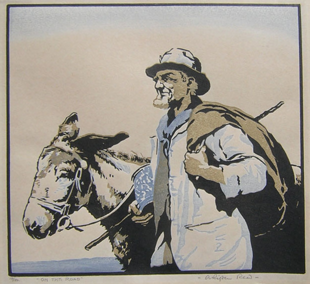
I decided to take a sea-faring approach when it came to illustrating my review. In May, 1940, the work you see here by three artists associated with Winchelsea in Sussex - Eric Slater, SG Boxsius and Arthur Rigden Read - was hung together at exhibition. Prints such as Read's Yo ho ho and a bottle of rum and Boxsius' Looe, Cornwall are yet to come my way, but the emphasis on sea-going and the southern British coast is there for all to see. Far from being localist, the exhibition recognised the importance of the sea to national defence. (Uncannily, the Dunkirk evacuation of Allied forces was ordered the day after it closed). James Trollope writes about the very local nature of Slater's subjects, but it is the history and the look of that coastline, with its cliffs and coastguard stations (see top) that has the greater meaning for me.
                                                                   

I happen to be a fan of Slater country myself. I lived at Frog Firle near Seaford for a while and even at the Beachy Head clubhouse above Eastbourne for a month. The landscape is one of the most different and affecting in all Britain. It was Slater who saw this, more so than Eric Ravilious, who was brought up in Eastbourne. James Trollope rightly brings out Slater's oddness, but he is no more odd than the coastline he describes, certainly not if you are used to the Lincolnshire coast as I am. So, the book includes a walk in Slater country, an explanation of the technique he used, it is generously illustrated in colour. So far as the early history of colour woodcut goes, Batten and Fletcher had made a successful print before they read Tokuno; his pamphlet only helped them to sort some of the problems out, but not all. It was published in 1894, not 1892, which was the date of the report it comes from. Nor was Tokuno a printmaker; he was an official. But none of this will be of great concern to most readers.

There is the low-down on more famous contemporaries like Frank Morley Fletcher, John Platt and Read, but no photographs of the artist, or any of the houses he lived in, London or Sussex. Generally, I think it's accepted that the neighbour he had at Winchelsea and who gave him private tuition in colour woodcut is Read (Campbell Dodgson does not name the artist).
                                                                              

The book contains a thorough and useful list of 45 colour woodcuts made over a period of about 12 years. Even though Slater's prints are often smallish, though not as small as Boxsius, bear in mind that Allen Seaby, the most prolific of them, made 100 in a career of 35 years or more. So, Slater showed commitment, and it is all the more surprising that he appeared to give up after the success of having The Stackyard published exclusively in the United States in 1938. James Trollope associates that year with the death of the artist's mother who he had lived with as an only child since the death of his father in 1904. There are no wife and children in the story either, and it's the case that many of these artists have been best served by their grandchildren. Slater has been fortunate to have caught the eye of James Trollope. But who receives fair play is hit-and-miss. The boy in Read's Little fishes (above) is presumably his adoptive son, Clifford, and the woman Kathleen Rigden Read. Slater's work is less obviously personal than Read's, but if Read looks farther, as the book says, in his own way, Slater looks deeper.

You can see a short BBC Sussex film about the artist and the book at http://www.bbc.co.uk/news/uk-england-sussex-22312620  Slater's Sussex is available from Towner at £15. Ring general enquires on +44 (0)1323 434670 to order by post and include a further £2.50 to cover costs. There is also e mail contact on their website.  I suspect Towner have not reckoned with the enquiries from outside the UK that I think they are going to get. Ah, well.

Tuesday, 30 April 2013

3 new woodcuts by Eric Slater


I say new not so much because they are new to me but simply because untill recently the subtlety of Eric Slater's colour woodcuts have not been done much justice by the kind of reproductions we have seen online. No one who reads this blog, or who goes out and buys a print on ebay, should complain. Almost everyone who does will know that ebay photos hardly ever do a colour woodcut justice. (An exception was the recent Mabel Royds, which came up very well).
                                                            

For Eric Slater all that has changed markedly through the photos published by James Trollope. A review of Slater's work in 1929 talks about 'his sensitive treatment of colour' and these new photos finally do bring that out. This of course is all by way of mea culpa to some extent. I've known Slater's work for many years but what you see here are subtle prints in good condition. No one really could deny that Slater's prints can be samey but I have come to the conclusion that isn't the point. By 1929 Slater had probably been making woodcuts for about two years and the same article starts out by saying, 'It has only taken Mr Eric Slater a short time to establish himself amongst those artists whose work one involuntarily looks for at an exhibition'. These images show why but they don't say how he got there.
                                                                      
 
By the late thirties, Campbell Dodgson, who had been Keeper of Prints at the British Museum and owned four of Slater's woodcuts, said the artist had learned the technique from a neighbour at Winchelsea. This must of course be Arthur Rigden Read, not just because he lived at Winchlesea for many years, but because Read's sense of light and colour was so good. That grey-greenish-blue in A misty day is almost straight out of Read. Even if some of Slater's prints can look rather drab at times, what I think he learned from Read was purity of colour and the way pure colours can be played off one against the other as he does so effectively in Japanese bush lanterns at the top.
                                                                                   
 
Finally, if, what I think is called Eventide Eastbourne does not recall the Sussex seaside town we know, I've included a jolly railway poster that puts the little headland you can see in the Slater into context. It does show just how true to the shapes of the landscape Slater was but the poster also brings out what I often feel about Slater; he's oblique, and more low-tide than cheerful. Now you couldn't say that about Read.

Monday, 29 April 2013

Slater's Sussex: the colour woodcuts of Eric Slater


Here is a must for the bookshelves of anyone with more than a passing interest in British colour woodcut: Slater's Sussex, a book by James Trollope, just published by the Towner Gallery at Eastbourne. It has eighty pages, seventeen of them in full colour, and another fifty illustrations. I don't have a copy as yet but James is a journalist who lives at Seaford in Slater country and I know he has used his skills to uncover as much as he can about this popular artist.

It costs £15 and at present is only available from the Towner. You can order over the phone 01323 434670. Both James Trollope and the Towner deserve support on this one.

Friday, 6 July 2012

Eric Slater at the Towner

                                                                               
As part of an exhibition called 'A point of departure' the Towner Gallery in Eastbourne has dug into its collection and hung a room with twenty-five colour woodcuts by the Sussex artist Eric Slater. The spin they have put on Slater goes something like this: forgotten artist who had not been on show since the Normans invaded. As anyone who tries to buy a Slater on ebay will know, this is curatorial tosh. You don't normally have much change out of perhaps £150 if you do. And when he starts to look like Ian Cheyne, as he does with Spring (above) it may well be more. But with Slater it pays to be selective. He is hit-and-miss.


No matter. The old Towner used to be a nice gallery to visit. Now apparently they have a new one equally strong on British C20th and seeing so many of Slater's colour woodcuts together is probably an opportunity no one should really miss if you don't live too far away. Slater really is quite an appealing artist although I would normally balk at the prices. But if you want to have a go, Bellagraphica currently have A downland mill (below) for sale on British ebay which currently stands at £119. It won't stay there.


The exhibition runs untill 11th November, 2012, so you have lots of time. Be there, or be square.

Thursday, 3 March 2011

The itinerants of Arthur Rigden Read

No one seems to know very much about the British printmaker and watercolour painter Arthur Rigden Read (1879 - 1955). He was born in Bermondsey and presumably grew up there. It's a working class area on the south bank of the Thames in London but unlike his fellow Londoners, SG Boxsius and Kenneth Broad, there are no signs of prints of anywhere in the city and at some point he moved to the small old town of Winchelsea very near the Sussex coast. It was an area that was popular with artists. Eric Slater worked along the coast towards Beachy Head and Cuckmere Haven, Read's friend, the etcher Bertram Buchanan, lived not far away at Iden and Sylvan Boxsius produced two linocuts of the Winchelsea area. I assume Read and Boxsius also were friends. There are very few people at all in the work of Boxsius, Broad was especially fond of crowd scenes but along with Mabel Royds, Read was about the only other British colour woodcutter to concentrate on figure subjects. Basically, he used the Vienna Secession manner, close-up and with minimal background. The only landscape I know by him is short on detail but the countryside is implicit in all these images. Not only are they figure subjects, they show us a very specific type of person. Here are men and women who made a livelihood by travelling through the sort of country Oliver Rackham memorably described as social countryside. Woods, heaths, commons and beaches are all implied in these images, all connected up by an intricate network of lanes and footpaths. It may seem a far cry from Bermondsey but I would suggest the London riverside predisposed Rigden Read to recognise and adopt the itinerants of Sussex. The list of them is surprisingly long: chimney sweeps, donkey men, poachers, tinkers, labourers, bodgers or chair makers, Romanies. People like this woman selling pegs, and who is possibly an Irish tinker, were commonplace in the mid 1920s when Read produced many of his woodcuts. He was fairly prolific because the prints weren't complex. It is far more the person that interests him here rather than the use of colour or the subtleties of printing. In some ways he is like Eric Hesketh Hubbard. Hubbard was also a Londoner who moved to the same type of ancient countryside (in his case the purlieus of the New Forest in Hampshire). But Read shows greater understanding of the lives of his subjects (though I have to admit that I now regret not bidding for Hubbard's image of travelling cider-makers).
The travelling life of the countryside wasn't unique as a theme to Rigden Read. The poet Edward Thomas in particular also recognised a very special sort of person who moved from one remote farmstead or hamlet to another across that same network of lanes and paths but Read was almost documentary in the way he picked out individual types. With their brown faces and their scarves and hats, they are people who are out in all weathers. The sacks they have thrown over their shoulders are their means to earning a living. They are picturesque to some extent but also prosaic, specially if compared to his finer work. If readers have any other examples showing these resilient and resourceful people who were obviously the object of admiration for Read, please send them in. And the rest of us can admire them, too.