Showing posts with label Wormell Chris. Show all posts

Friday, 3 March 2023

Further colour prints and all at Cirencester


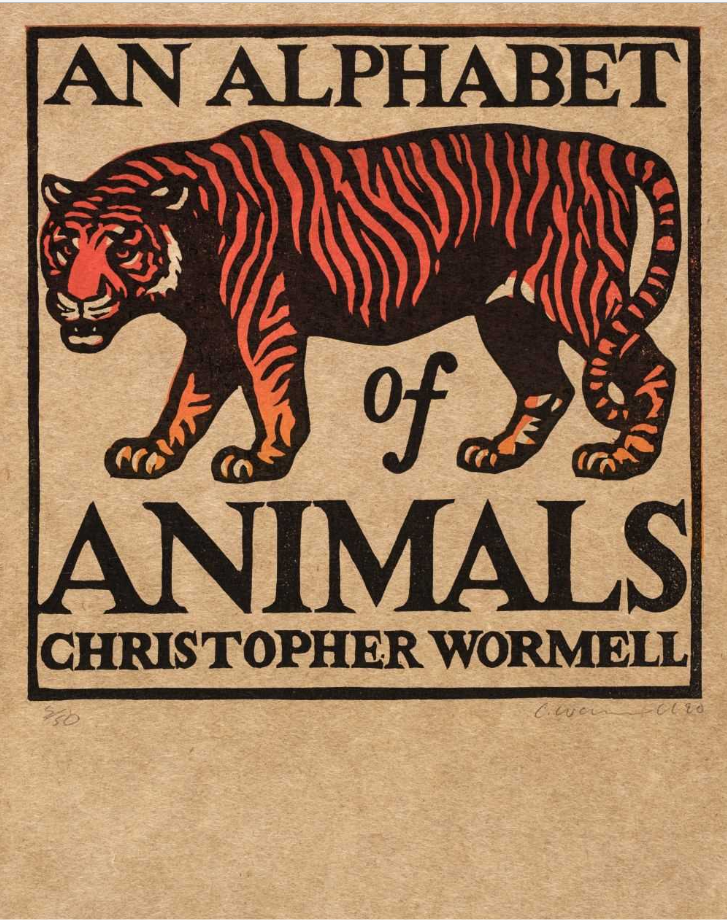
A long time ago I put up a post about Chris Wormell's work for Adnam's brewery at Southwold. (He also did package designs for Waitrose which I regret not keeping). I remember picking up a copy of his book An alphabet of animals at Tate Britain around about that time and thinking it would be a good idea to have one of the linocuts. But I never saw one. Not until today, when I came across the front page of the book up for auction on 8th March at Dominic Winter. And a fine piece of work it is though it is more like a chap-book illustration than an L.H. Jungnickel beast.


By an odd co-incidence, I had an email from a reader this morning where he mentioned a colour woodcut by P.G. Needell and, as it happens, there is a batch of paintings by the same artist, including Mill Hill, Autumn (above) in the sale at Cirencester. It is pure Needell. I am not sure how Dominic Winter came to think it is acrylic. Needell does not strike me as an acrylic sort of chap, but there you are. Stranger things happen. Anyway, judge for yourself.


W.J. Phillips' Jim King's Wharf, Alert Bay, BC from 1927 has the classic colour woodcut manner. It is a well-known image and going by the estimate, the auctioneers must expect to attract attention from buyers in Canada and the United States. The Americans tend to know a good thing when they see one and have been right about colour woodcut all along. To be honest,  I cannot share their enthusiasm for Phillips, but they have always been prepared to pay the necessary dollars for class. And a class act Phillips certainly is.


While we are on class, Edouard Manet's Le chanteur espagnol from 1861 is in this surprising mix of prints. Manet took European art on a trip it has never got over and here he is, at the onset of the etching revival, showing the way the modern artist handles a print. Immediacy is the byword. He uses etching primarily for its expressive and dramatic potential. What we are meant to hear is the clamour of flamenco. Yet for all its vitality, this etching is steeped in the past in a way that only the work of an artist with as original and broad a sensibility as Manet could be.


Sunday, 17 February 2013

W was for Wormell


A second look at the British illustrator and all-round success story, Chris Wormell - a second look because my first post only dealt with his designs for the Adams brewery campaign, and much as I like those, I actually prefer his animells.


His success, as I've said before, his based on the canny method employed, one way or another, by the illustrators that make a name for themselves. Wormell has drawn heavily on the two great founding-fathers of modern British relief printmaking. Both Thomas Bewick and William Nicholson have seeped into our visual awareness simply because artists and designers have returned to them time and again to build on their approach, so much so we now recognise something we know as soon as we see a Wormell zebra or kingfisher. This has to be one of the main tenets of Adland.


I am not decrying the originality or variety of Chris Wormell's work, but there is a difference between his wood-engraving of a hedgehog, which comes from a small edition, as you can see, and the more upfront frog on a lily pad. The hedgehog goes its own way, in a descriptive world to itself, and relies as much on Bewick's delicacy as the work of Ian Stephens does; the frog blends knowingness, caricature and appeal in equal measures, and is probably closer to the work of his peers in the United States.

                                                                            
Like Nicholson, he has no scruples when it comes to a keyblock, even though he has less need. All but two of Nicholson's woodcuts were hand-coloured, whereas Wormell's linocuts, so far as I know, are all printed. With Wormell, the keyblock is there for the impact and for the style. I doubt that you could print off one of Wormell's keyblocks and publish it the way one of Mabel Royds was, to reveal expressive or incisive cutting - and Royds learned just as much from Nicholson. His keylock provides pattern and outline but no more. Compare Seaby's broken, ragged line the second his alarmed grouse take flight with Wormell's deliberateness. His work is sometimes stationary, like old-time zoological prints, but like Royds and Nicholson before him, he has a great sense of shadow.


Even if Wormell is joyful colourist and rugged designer both, the truth is that, in the end, when it comes to birds or other animells, Bewick and the Japanese printmakers were better masters than the chapbooks or Nicholson who, after all, was only biding his time till he turned into Titian.


Sunday, 5 August 2012

Chris Wormell & the Adnams campaign

                                                                           
Chris Wormell crept up on the British people unawares and without hardly anyone knowing his name, became part of the visual culture. Not that he was the first graphic artist to ever do this. He only joins a distinguished company that includes Eric Fraser, Edward Ardizzone, Paul Hogarth and, last but not least, Claud Lovat Fraser. How do they bring off this visual coup d'etat? There are many good graphic artists who never achieve any popular status. Is it purely talent and, if so, what kind of gift do they have?

                                                                                    
With Eric Fraser it was a matter of tapping into the visual DNA and adapting the wood-engraving style that had become so prevalent by the 1930s. Ardizzone was more subtle. His use of the soft colours and ballet poses of French rococco led us somewhere we vaguely knew about although we couldn't say why. Like Fraser, Paul Hogarth made use of a recent style, in his case the main ploy was to make use of the shape-shifting psychedelia of the mid-sixties. The best of them though, was Lovat Fraser, with his canny blend of the popular C18th chapbook manner and the sophistication of the French Directoire revival. In his short career he produced something that was generic, waggish and appealing.

                                                                            
Without ever have gone anywhere near an art school, let alone the Royal College, Wormell took up some engraving tools in 1982 and taught himself how. By then the revival of British wood-engraving had begun. Everywhere people were fed up with the often boorish, academic and basically uninteresting art of the seventies and began to look elsewhere. As you see from the adverts here, Wormell looked to the colour graphics of the 1920s and 1930s and simply brought them up to date. He exchanged soft-focus nostalgia for Friends of the Earth.

                                                                               
That said, I am a great fan of Wormell. I gave a copy of his Alphabet to my great nephew and before I knew where I was his mother was pointing out his work in Waitrose and, as it happens, it was another member of the family who is a partner of the firm who took Wormell on to make the linocuts you see here for the Southwold brewery of Adnams in (I believe) 2004. (It was their art director who had the the bottle top idea). They called it 'Beer from the coast' so going down the pub turned into a trip to the seaside, an England without ideology. You only have to scroll down to the recent post on Arabella Rankin to see the kind of fine artist that served as a precedent for Wormell. His work is alot easier to come across than hers but will cost you quite a bit more. Failing that, visit one of the Adnam's pubs in East Anglia and swipe one of their beer mats. His work is there as well.