Tuesday 28 March 2023

Print & textile : Valerie Petter-Zeis


When I looked at the whole sheet of Valerie Petter Zeiss' colour woodcut (above), it made me think of the work Bernard Rice did in Bosnia about the same time, especially the way the hand-made paper was left to show as if it was all part of the work. I remember being was sorry when I had Rice's View of Travnik framed. It not only meant covering the handmade paper with all its loose fibres and was careful to ask Les not to cut the paper but to fold it so at least it would remain intact. The paper was obviously part of the work in his case. As I have never seen any of Petter-Zeiss' woodcuts let alone own one, this has to be only a suggestion. Rice himself trained at the School of Arts and Crafts at Innsbruck.  It is not easy to sort out the training of Valerie Petter Zeis. Where she began and what she became are two different things. She began as a student of painting at a private school in Vienna before the first war but ended up with her own workshop in Myrtengasse where she sold textiles and prints amongst other things. This was presumably before she married Franz Zeis in 1925.


The odd thing is Rice also used textile. I have a tablecloth by him printed with horse designs and he also printed directly onto cotton. It made me wonder whether Petter Zeiss had studied with him at the school of arts and crafts he worked in while he was in Bosnia because there was an obvious change in direction. Before the war she was a student of fine art but during the war she was making prints that were patterned like textiles. She was not alone in adopting a very different way of working but her application stands out. It was all thought through in a way that is unusual. Arthur Rigden Read took a similar approach but he had been trained in an architect's office  where that kind of way of working was par for the course.


Not surprisingly, she made batik like Kathleen Rigden Read. She also used a variety of materials in her clothes like glass beads and fortunately some have survived in good condition. This not not make it any easier to sort out the rest of her life when she was not working. I do not know when she opened her workshop or how long it lasted but her work was either sold in British people bought it in Austrian because it has turned up at auction in this country.


The Easter card (above) was made for sale at the Wiener Werkstaette shop as early as 1908 and shows her using a combination of floral and archaic designs typical of the period before the war. Most of the more whimsical decoration was eventually chucked out in favour of work with a stronger and more thorough sense of design like this cushion cover. It remains floral but the old self-conscious schematic manner has gone. The flowers are sort-of identifiable at least and it is richer, livelier and direct as work intended for sale in a shop needs to be.


Going back to Bosnia woodcuts, at least one of them is dated 1917. This only means it was made then. She may have visited before the war and made the prints later. Either way, they are unusual and Rice is the only artist I know of who made a comparable series of woodcuts depicting part of the unique European culture of that hapless country. What I especially like is the way the print above suggests the Ottoman history of Bosnia. The way the shops and mosques crowd around an open space is redolent of lost or wrecked cities like Aleppo and Sarajevo makes the prints valuable records.


They share a faux naif style with Rice's woodcuts which make me think they knew one another's work. The main difference between the two artists is Petter Zeiss' use of colour and of other mediums like watercolour (above). Because of the palm trees, I assume the watercolour doesn't depict anywhere in Bosnia. North Africa is possible though the minarets look Ottoman so it could be anywhere in the Muslim Mediterranean, specially Egypt. 


Wherever it is, we get an idea of her broad her interests and sympathies and I do not want to imply that her woodcuts were a major part of her work. The overall approach is what matters and I get the impression from the mere survival of her other designs that textiles were at the heart of what she was doing. To make prints of Bosnia and the Near East with its great tradition of textile manufacture shows how sensitive she was to cultures just beyond our own boundaries. In discovering something about that culture, she revived something in her own.


Saturday 11 March 2023

Gerrie Casper's 'Das Haus der Frau'


Many readers will be familiar with Gerrie Casper's long-running and much-loved blog, The Linosaurus. I had a reminder this morning about all the work Gerrie had also put into his two volumes called Das Haus de Frau. The subject is German women artists who were making colour woodcuts between 1914 and 1939 and is available either as books or a PDF from www.dashausderfrau.nl I have not read it yet, but I know Gerrie has put a huge amount of research into this subject over the past ten years, so for anyone interested in German colour woodcut, it will be a must.


I assume Valerie Petter-Zeis (top) visited Bosnia during the first war and she may be Austrian. Nevertheless Aus Sarajevo from 1917 is a good print and is currently available from Galerie bei de Oper in Vienna at 420 euros. Taking the subject of the Muslim Mediterranean one stage further is Emil Orlik's etching of Egyptian women published in Berlin in 1922 and available from the same gallery at the same price (and many thanks to them for the use of their excellent photographs). The subject of the discovery of the southern Mediterranean by artists is replete with irony and frustration in equal amounts and really should have been covered better by Modern Printmakers. I never bought into Edward Said's ideas about orientalism and never even reached the middle of anything he wrote, including a tortuous article he once wrote for The Times. I believe the discovery began with Eugene Delacroix who made observations about the population of Tangier that remain true to this very day.


Thursday 9 March 2023

Before the storm: colour woodcut & Dagmar Hooge


.
I cannot explain why it has taken me so long to get round to the colour woodcuts of Dagmar Hooge. First impressions counted and that is for sure. Nonetheless, I am surprised they have proved so indelible. Hooge was one of the very first woodcut artists I came across. I have a dim recall of a smudgy print of flowers but as we were all in the habit of dismissing artists we saw very little of and knew absolutely nothing about, that was where she stayed. Our scale of values tended to be as whimsical as the period we loved. If it was a Thiemann, of course we wanted one. If it was anyone else who happened to be Austrian or German, frankly, we could not have cared less. We were a coterie in the know, that was what mattered. You picked up a Hans Frank for less than a tenner and that was the end of it.


A lot of course depends on what chance brings your way. Hooge was being sold in this country after the first war. Provincial galleries like Nottingham Castle Museum bought them from small commercial galleries along with Ohara Koson and the Frank brothers and you can still come across the names of German and Austrian artists in newspapers of the period. More to the point, in recent years, good prints by her have turned up at auction in Norwich and Crewkerne as well as London and Lone Jack, Missouri, so I will try and adjust.


Hooge was born in Hamburg in 1870, making her a contemporary of Allen Seaby. Like him, she grew to maturity before artists began using colour woodcut to make their original prints and also like him, she had a long and varied career. She was apparently based in Munich and certainly exhibited in Bremen in north Germany in 1906. Most sites say she died in 1930 but Bonham's in London sold a print showing Santa Maria della Salute in Venice dated 1929 and the Minneapolis Museum of Art (who I tend to trust) give 1931 as the date of death. Minneapolis also hold the fine Venetian scene at the very top.


In manner, she was most like the artists of the Vienna Secession. She has the same four-square formality and use of strong shape and colour. The Munich connection may also help explain what she has in common with Carl Thiemann. There is not only the expressive landscape (third from the top), there are flowers and Venice, too. In the eighties, Hooge gained a reputation based on those flower prints and that was where she tended to remain as if she were a continental Hall Thorpe. As you see, there was more to her than decoration. It is all the more surprising, there is still so little known about her career and there are so few prints available online. She must have han a long career because it is obvious the landscape with the primrose sky was made about 1905 and some of the flower and Venice prints are post-war. Like so many of the women artists, she is something of an enigma. Or am I being unfair once again?


What strikes me about the landscape (above) is how much it is like an American or Canadian artist with their taste for the great outdoors. (There is another, lighter version of this print). Gustave Bauman with his German background comes to mind. It is only Hooge's stricter design and half-abstract style that gives her away as a European proper. Unlike Edna Boies Hopkins, Hooge made very little use of a conventional key-block even when she started out. This made her job trickier and made her depend more on colour and pattern. As a result, her dying tulips are hardly recognisable. Only think of Mabel Royds' approach to the very same subject just a few years later. 


 They are very different from the anemones (above) or Red roses (below). The anemones are like Hans Frank but the use of line is subtle and surprising, making the image much less conventional than it might have been. Hooge was not a flower artist. The flowers are not only different species, each of the prints have different things to say. Like Edouard Manet and Henri Fantin Latour, she makes her flowers more intense by cramming them together. Both Urushibara and Arthur Rigden Read tended to give them much more space. Here is an artist with a purpose. For instance, she could never have achieved the sense of luxury of the roses if she had employed a key-block and it would be a mistake to ignore the subtle levels of expression and symbolism. But then, if we knew more, we could say more.


Gerrie Caspers says she was friends with the artist Martha Cunz and visited her in Switzerland in 1922. Aufziehendes Wetter (below) apparently dates from just after the visit and shows thee Matterhorn range. If we take the English translation to be Approaching storm, it suggests that what I said about her imagery may be true. I like the suggestion of hardiness, with each alpine house being a small mountain sufficient unto itself. A print like this signals a move away from the decorative pattern-making of the old  secession days to greater realism, not a style we would associate with colour woodcut at all. The strange light before a storm often attracts artists often attracts artists and I think she pulls the whole thing off pretty well.


Hooge is an artist where it helps to identify the time of day. The early mountain landscape looks like dawn as do the red trees with the deep shadows. The light forms everything. The roses facing the light are open and pale while the one turning away is dark and closed. She has the kind of sensibility where everything has personality and each thing is graded according to its worth, from large to small.


I was surprised to come across this cupid trailing rose petals behind him on the shore. Hooge probably could not avoid using some key-block here and I like the way she has nevertheless placed the boy against bands of colour. I am not generally a fan of colour woodcut used for figurative work like this. Hooge wisely turned the face away to avoid awkwardness and it works, partly, it has to be said, because the image is unconventional and intriguing. It is a very different image from Manet's ebullient guitar player. This is more a Sandy Denny song where all the birds are leaving. 


Sunday 5 March 2023

Classic British black-and-white prints (plus another Seaby) from the Cirencester hoard


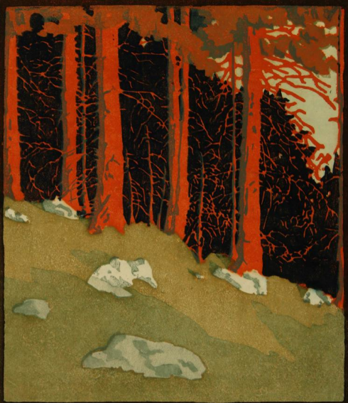
By now, readers may have drawn the same conclusion as myself about the current trend we are seeing. It looks very much like the British prints now coming up for sale were collected during the great revival of interest during the 1980s and come from estates of deceased persons. Nothing else can explain a lot of seventeen wood-engravings including work by artists as diverse as George Soper (below), John Farleigh, Bernard Rice and Reynolds Stone. Another artist whose work was never inexpensive even then is Stanley Anderson. Dominic Winter have his fine copper engraving The hedger from 1934 (above) in the sale.


You have got to like this kind of thing. And I do (and always have) but could never have brought myself to paying the price for an Anderson. Instead I contented myself with finding good prints at modest prices (as you could do) and only handing over larger amounts of cash when I had to. From the Cirencester hoard, it looks as though other collectors were doing much the same thing. How else would you end up with seventeen prints in a lot? Take it from me, we are living through good times and this treasure trove of prints by commendable artists is proof of that. Soper was never in the top league, but he has the correct amount of period glamour that frankly is hard to resist. OK, I sold the one print I had by him years ago at Phillips. But Phillips is rather grand today and if I took it back to them now, they would turn it down. From Yorkshire to Gloucestershire to Kent, the action has moved to the provinces.


The presence of Richard Shirley Smith's very fine Rhinoceros beetle from 1978 (above) says everything about the level of discrimination of both artists and their collectors back then. People had had enough of the dreary semi-abstraction of so much British post-war art. Let's face it, the British had never been all that good at modern and by the fifties and sixties it had all turned into a horror story of artists dependent on the art school system. Craftsmanship of the kind found very obviously in Shirley Smith was out the window. 


Yet again, you may well pay less for Anne Desmet's superb Rotunda series than the buyer in the 1980s. Her work was not cheap at the time and rightly so. She was one of the best. The two images I have here show only half of the work for sale, but you get the idea. This means that anyone with a taste for the classical past or Italy or sheer bravura craftsmanship is going to be tempted. I know I am. I was recently saying to a friend who is a professional librarian and bibliophile, I thought now was a good time to buy second-hand books. More than that, it is a good time to buy second or third-hand prints. People look at me with my map spread out on the big table at Caffe Nero in Carrington St in Nottingham as if I am Martin Frobisher or Vasco da Gama. The very idea of anyone looking at a map let alone owning one is beyond anyone under forty. Likewise, old prints and old books. 


Although I said the other day there were no Seabys from the great years before the war in the Cirencester hoard, I was wrong. Half-hidden in a lot that includes a Horace Brodsky linocut, is Seaby's Lapwings. I remember a friend buying this from Garton & Cooke and not being smitten. Nonetheless, it is from his best period and was certainly made in the first decade of the last century because it was exhibited at the first exhibitions held by the Graver Printers in 1910. It looks great simply because as always it was printed to such a very high standard. Its period value is considerable as well assuming you can forgive Seaby the Arts and Crafts mannerisms. Look also how easily he sits alongside the monochrome prints here. The mood with him is often dawn or twilight when colours are uncertain as opposed to secure. He said much the same thing himself in a 1909 essay he contributed to.


Another artist who was always in the lead on standards is Gertrude Hermes. There are a number of other wood-engravings by artists who adopted a brilliant modern manner, including John Farleigh and Eileen Mayo, but I thought Hermes' Borage stood out. It would be untrue to say I did not enjoy the style. The downside is Hermes does not always do her plants many favours. Style always gets the better of botany and if you like borage (as I do) you will miss the luxuriance of the plant. Now this could never be said of Allen Seaby and his birds. A.W.S. was an artist who both loved and knew his subject. For a moderniser as stylish as Hermes, subject gave way to sensibility and the lack of life in the work gets to be a drag.


Friday 3 March 2023

Further colour prints and all at Cirencester


A long time ago I put up a post about Chris Wormell's work for Adnam's brewery at Southwold. (He also did package designs for Waitrose which I regret not keeping). I remember picking up a copy of his book An alphabet of animals at Tate Britain around about that time and thinking it would be a good idea to have one of the linocuts. But I never saw one. Not until today, when I came across the front page of the book up for auction on 8th March at Dominic Winter. And a fine piece of work it is though it is more like a chap-book illustration than an L.H. Jungnickel beast.


By an odd co-incidence, I had an email from a reader this morning where he mentioned a colour woodcut by P.G. Needell and, as it happens, there is a batch of paintings by the same artist, including Mill Hill, Autumn (above) in the sale at Cirencester. It is pure Needell. I am not sure how Dominic Winter came to think it is acrylic. Needell does not strike me as an acrylic sort of chap, but there you are. Stranger things happen. Anyway, judge for yourself.


W.J. Phillips' Jim King's Wharf, Alert Bay, BC from 1927 has the classic colour woodcut manner. It is a well-known image and going by the estimate, the auctioneers must expect to attract attention from buyers in Canada and the United States. The Americans tend to know a good thing when they see one and have been right about colour woodcut all along. To be honest,  I cannot share their enthusiasm for Phillips, but they have always been prepared to pay the necessary dollars for class. And a class act Phillips certainly is.


While we are on class, Edouard Manet's Le chanteur espagnol from 1861 is in this surprising mix of prints. Manet took European art on a trip it has never got over and here he is, at the onset of the etching revival, showing the way the modern artist handles a print. Immediacy is the byword. He uses etching primarily for its expressive and dramatic potential. What we are meant to hear is the clamour of flamenco. Yet for all its vitality, this etching is steeped in the past in a way that only the work of an artist with as original and broad a sensibility as Manet could be.


Allen Seaby colour woodcuts at Cirencester


It makes a change to have two lots of one colour woodcut each being offered for sale by auction instead of everything being included in one lot as happened with Ethel Kirkpatrick not long ago. This time it is the turn of Allen Seaby at Cirencester. On 8th March, Dominic Winter have Twins and a print of a lone rabbit sitting in a field of buttercups and daisies. No-one ever gets the title of the first print right although I must admit I have never known the title of the second. Seaby rarely, if ever, inscribed his prints with the title or the date.


So far as colour woodcuts alone are concerned, Seaby had a long career lasting from about 1900 to 1938. In all, there were at least seventy-two prints and the difficulty with buying Seaby is this. Over that complete period the interest and worth of the woodcuts varied. Seaby often did not know where to stop, which can make buying him an art in itself. At the outset when still a student at Reading, Seaby struggled with the Japanese method. Once he devised his own way of working, the masterpieces began to happen. Most of them were made before the war even if on a number of occasions there was a return to form though I have to say it was almost always with bird prints like Redwings calling (1925) and The cuckoo, also missing from my list. This was commented on at the time but Seaby never took the hint and tried everything from rabbits to ruins and back. The one big exception was the remarkable Trout from 1927 which won the Storrow Prize in Los Angeles in 1927 as was only right.


Twins
is a good print but it is still not Seaby at his very best. His best work has a subtle and uncanny atmosphere unique in modern British printmaking. Like Trout or Redwings calling, one way or another they depend on suspension and in a telling phrase, Seaby went so far as to describe the new proofs floating off the block. By the time he made Twins, his method involved removing wood from the background and taking trial proofs till he was satisfied. I have seen a number of working proofs of both these prints and though I was unconvinced at the time, I can see the approach set the central image free of extraneous detail and left them to hover. Whether Twins achieved the necessary Seaby magic is another thing. As you will see, there were at least two different versions. At the top is the one up for auction in Cirencester while the one above is for sale at the McEwan Galley on Deeside in Scotland. Around that time, Seaby tried out a number of monochrome images which were largely successful though you tend to wonder what the point of it all was. You may wonder whether it is just faded. This is what is both good and bad about buying prints by artists like Seaby. In the end, there is no proper catalogue to refer to and you can sometimes get a bargain. 

At £450, Twins is not in that categoryThe Easter rabbit is probably not as satisfying but the array of buttercups and ox-eye daisies are pretty good and you will probably pay no more for it than the purchaser who had it from Garton & Cooke in 1988. In those far-off days, Robin Garton and Gordon Cooke had an ancient place in Lancashire Court off Old Bond St and had built up a reputation for selling modern British colour woodcuts at prices that took you aback. In 1986, Seaby's The Cuckoo had been on sale at the very modern price of £350 when a Helen Stevenson at £50 from Ayre's bookshop wasn't cheap. Now I only wish had bought two.