Showing posts with label Phillips Walter. Show all posts

Sunday, 27 August 2023

Classic British colour woodcuts for sale at Banbury


It is not often we are presented with a good choice of colour woodcuts in a single sale but the forthcoming auction at Banbury has an old collection of prints put together with care and good judgement. All seven come in their period frames and some have well-known dealers from the 1920s like Redfern, Bromhead and Abbey Galleries on the back.  I say this partly because the labels suggest the prints were bought framed but mainly because I prefer the way prints were placed in good-sized mounts at that time. Apart from the Arthur Rigden Read, the frames themselves are not up to much (and one has bowed outwards).


Heading the post is Rigden Read's bravura early masterpiece from 1923. Here is one of the most irresistible of all British colour prints with Kathleen Rigden Read in a sumptuous golden shawl worn over a plain linen shift, presumably of her own making. Read has dated the proof 1924 but that was the year it was pulled. It first appeared the year before. It has a large area of unprinted paper and this may have led to many proofs being discoloured. The one you see at the top is not the one in the sale. You can see that above. So far as I can see this one is in good condition and has been housed in a sympathetic frame.

The downside to many prints by Read is firstly they are small and secondly he often used drab colours in order to team up with the vegetable dyes his wife was using for her fabrics. The Venetian shawl was made before they held joint exhibitions and stands out, even though it is remains quite small. My mother had my own proof on loan for many years and everyone who came into the room for the first time commented on it. Read was a showman and that characteristic is to the fore here. This is not to say that Allen Seaby's owl does not have the necessary sense of drama but his theatricality was different. Read was just as observant as Seaby the naturalist. What Seaby has on offer in this print is poetry. Half-owl, half-ghost, what you have here is Seaby's presiding spirit, the constant search for what is always absent. 


The auctioneers give the title as 'The owl'. This must be wrong. To begin with, Seaby was a dedicated ornithologist and would have said it was a barn owl. Secondly, he made two similar but different prints of barn owls. One was more the work of the naturalist, the other more expressive. Regretfully, these are two of the only prints of Seaby's I have no record for. His output of about 100 colour woodcuts is too large to catalogue easily and the only records I have are the exhibition dates for the Graver Printers.


In 1910, Seaby exhibited fourteen colour woodcuts alone at the Graver Printers. This was the society's first exhibition and Seaby already had many prints in hand, including one entitled Lapwings. As with his barn owl, Seaby had two tries at the same subject and also made a print of young birds, which the National Gallery of Scotland call 'Lapwings' too. With no proper catalogue being available, the confusion is understandable. Seaby rarely put titles on a print. What you can see bottom left is the edition number. My guess is the one you see here is the first one and the better known one with the birds facing the opposite direction is Lapwings prepared for the Graver Printers exhibition of 1910.


For all the effort Walter Phillips put into making colour woodcuts, I remain unenthusiastic. Even so, his strong links with north America make him sought after over there and I have no doubt Norman Bay no 2 will be pricey. Phillips liked to present himself as a backwoodsman who taught himself how to the make colour woodcut by dint of his own ingenuity and hard work. This is tosh but Phillips was an able journalist with a regular column who could present himself as he wished. He was as earnest as Seaby (who was also a friend) but lacked Seaby's broader interests and his sense of humour. His prices are commensurably high without being an out-and-out joke. 


John Hall Thorpe on the other hand has had his day, partly because people are better informed about colour woodcut than they were ten years ago and partly because the fashion for art deco has died the death. All this will should make Cowslips and Forget-me-nots affordable and, I will admit, I was tempted recently by Marigolds mainly because it was still housed in its original frame. It is a glorious decorative print and was the first colour woodcut I owned but I decided against. If I found these two in a junk shop for £1.50 (as I did Marigolds) I would buy them. But that will not bring the 1970s with all its fads and bargains back. They are gone for good. And so is John Hall Thorpe.


While Seaby's Lapwings was hanging on the wall at the Goupil Gallery on Regent St., a twenty-two year old called Yoshijiro Urushibara was giving demonstrations of colour woodblock printing beyond even Seaby's capability in Shepherd's Bush. Only eighteen years later he became one of only four colour woodcut artists to ever have a solo exhibition of prints in London. (It says a good deal about what we have here that the other three were Hall Thorpe, Phillips and Seaby). Grasshoppers was among the exhibits at the Abbey Gallery in 1928 and provides firm evidence of the breadth of his work by the age of forty. One of the most thoroughly Japanese of all his many woodcuts, the series of images and his prominent signature are played off one against the other in a virtuoso display of nuance. Nowhere in the annals of British art has the relationship between image and calligraphy been so well made (unless we take his Crayfish into account as well). But where the detachment of Crayfish  is unnerving and creepy, Grasshoppers introduced collectors to the muted colours of the 1930s a good two years before the decade began. And if that doesn't sell it to you, nothing will.

The sale will be held at Holloways Auctioneers, Banbury, on 2nd September, 2023. There should be a follow-up post regarding prices once the sale is over.

Friday, 3 March 2023

Further colour prints and all at Cirencester


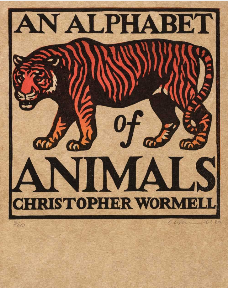
A long time ago I put up a post about Chris Wormell's work for Adnam's brewery at Southwold. (He also did package designs for Waitrose which I regret not keeping). I remember picking up a copy of his book An alphabet of animals at Tate Britain around about that time and thinking it would be a good idea to have one of the linocuts. But I never saw one. Not until today, when I came across the front page of the book up for auction on 8th March at Dominic Winter. And a fine piece of work it is though it is more like a chap-book illustration than an L.H. Jungnickel beast.


By an odd co-incidence, I had an email from a reader this morning where he mentioned a colour woodcut by P.G. Needell and, as it happens, there is a batch of paintings by the same artist, including Mill Hill, Autumn (above) in the sale at Cirencester. It is pure Needell. I am not sure how Dominic Winter came to think it is acrylic. Needell does not strike me as an acrylic sort of chap, but there you are. Stranger things happen. Anyway, judge for yourself.


W.J. Phillips' Jim King's Wharf, Alert Bay, BC from 1927 has the classic colour woodcut manner. It is a well-known image and going by the estimate, the auctioneers must expect to attract attention from buyers in Canada and the United States. The Americans tend to know a good thing when they see one and have been right about colour woodcut all along. To be honest,  I cannot share their enthusiasm for Phillips, but they have always been prepared to pay the necessary dollars for class. And a class act Phillips certainly is.


While we are on class, Edouard Manet's Le chanteur espagnol from 1861 is in this surprising mix of prints. Manet took European art on a trip it has never got over and here he is, at the onset of the etching revival, showing the way the modern artist handles a print. Immediacy is the byword. He uses etching primarily for its expressive and dramatic potential. What we are meant to hear is the clamour of flamenco. Yet for all its vitality, this etching is steeped in the past in a way that only the work of an artist with as original and broad a sensibility as Manet could be.


Wednesday, 20 January 2021

The gospel according to Walter


Walter Phillips was never slow to give an opinion and often had the opportunity to do so either in his newspapers columns in Canada or in books he wrote like The technique of colour woodcut. Amongst  number of other things he had done, Phillips had been a journalist in South Africa and came from a family where literature and the Bible were important. He had also been a tutor in Latin at Great Yarmouth and he  knew how to write well. What was unusual about Phillips and what doesn't doesn't helps to sort out fact from fiction was the publication of a biography by Duncan Campbell Scott in 1947 when Phillips was sixty-three. I have not read the book but it has meant there has been far more of Phillips' biography available than there has been for comparable artists. The problem is that all the information appears to have come directly from the artist and as I read through some of his other writing, I soon became sceptical.


The only training Phillips ever received was the classes he attended at Birmingham School of Art as a schoolboy in Worcestershire. There was nothing unusual about that. Young people who had had to go to work at fourteen or fifteen often put in long hours at evening classes where they studied for national exams. Once he left school Phillips' working life seemed to have little plan. But then his upbringing has been unconventional. As a minister his father would move from one place to another on the preaching circuit and his family would follow and moving to Winnipeg may have been a way of finding a stable life his wife and young family as finding a satisfying way of making a living himself. Either way the most important thing for Phillps was to be self-sufficient in whatever goal he set himself whether it was making prints or writing books and in this respect he was quite a lot like Allen Seaby.

Many of his friends and contemporaries like William Giles and Yoshijiro Urushibara had had very thorough training and both had spent time working in Paris where he said he had always wanted to go himself. Giles had taken Frank Morley Fletcher's class in colour woodcut at Reading (at least for a while) as Seaby had and Urushibara had trained as a carver and printer with the firm of Shimbi Shoin in Tokyo. How Phillips came to make colour woodcuts is another thing and given all that we know about Phillips it has always perplexed me that we know so little about he began. That he learned to make very good colour woodcuts like Mount Rundle (top,1951) and Gloaming (above, 1921) I would not dispute but the story he tells about how he got there doesn't always add up.


He and his wife emigrated to Canada in 1913 and he found a job as art master at St. John's College in Winnipeg. Up until then, he had been a water-colourist but when a friend went to serve in France, he left Phillips with access to his etching press, equipment and paper. Phillips made 29 etchings and then completely stopped in 1917 and suddenly began making colour woodcuts like Winter (above) instead. This was pretty good for a first colour woodcut and presupposes a lot of experiment before he could produce such an attractive print. The American curator and pioneering scholar, Nancy E. Green, said Phillips had had an epiphany; Phillips said he was at heart a colourist and that he was not very interested in line and for those reasons found etching unsatisfactory. But what did happen that was so important to him? Neither Green nor Phillips say but Modern Printmakers believes it has the answer.


Phillips himself confused the issue when he recalled a short piece about colour woodcut technique written by Allen Seaby for The Studio in 1919. He said he went back and looked at this article and it helped him improve his technique but this has never really rung true for me. Green says this was 'his first professional encounter with other woodcuts artists' but I wonder because the Seaby article was accompanied by no less than six of Phillips' woodcuts, including one in full colour. This must have been co-ordinated. Apart from that, you would hardly forget such an important breakthrough and the following year the National Gallery of Canada bought nineteen of his colour woodcuts, possibly as  result. I don't think Phillips was being disingenuous but I do think we have all been guilty of reading too much into what Phillips himself said about the matter. Facts count.


Phillips was not only hard-working, he was also a perfectionist and placed importance on being self-sufficient. Self-improvement was also high on the Victorian value scale and you would expect someone as productive as Phillips to make advances. All the same it is true that after 1919 Phillip's woodcuts became more proficient. By the time Phillips was writing, he and Seaby were friends and exchanged cards every Christmas. Seaby also owned three of Phillips' woodcuts and Phillip's as a friend naturally wanted to acknowledge a debt. What Phillips did acknowledge in 1919 was that Studio articles had already provided 'helpful stimulus'. Possibly the first was a mention of Ethel Kirkpatrick's Mount's Bay in a review in 1917. Colour woodcut was in the news. The previous autumn, John Hogg had published Fletcher's Woodblock printing, the first account in English of the Japanese method and in the next volume The Studio published Malcolm Salaman's article 'The colour print' accompanied by five illustrations including Giles Sand dunes, Denmark (above) and E.A. Verpilleux' Search lights, Trafalgar Square (above). These are the colour woodcuts Phillips saw in 1917.


Other prints included were Ada Collier's Venetian boats and Giles' A pastoral. I have never been able to track either of these down but have included Collier's image of a Venetian trabacola (above) as a useful substitute. These were the cause his epiphany (and I think Nancy Green was correct to place such emphasis on the moment) and puts the remark he made about Seaby into perspective. The Collier print and Gloaming have a good deal in common. The same can be said for the Giles print and Winter, especially in the detail of the background. Perhaps more importantly, Salaman says that Collier 'learned the craft of the woodblock from Mr. Giles.' Some time after this, Phillips began a correspondence with Giles and when Phillips explained that sizing the paper was presenting the most difficulty, Giles bought Urushibara in to give advice. So what happened here?


Phillips admitted he had never seen a Japanese colour woodcut when he began making them himself and it was not until he found a shop selling them on a visit to Chicago that he was able to buy any and start a collection. All he was doing here was following the contemporary art school method of giving the student a teaching example to follow as a model of good practice. But there would have been no need to have taken them home to study. The exceptional surface quality achieved by the Japanese printers would have been apparent to Phillips straightaway. This was so significant to him in 1925 Phillips went to Giles studio on the Kings Road in London to meet Urushibara who turned up with alum and brushes and proceeded to apply the size with the expertise that impressed everyone who was lucky enough to see him at work.


But there was even more to his epiphany than this. England did not have one school of colour woodcut, it had two. Salaman's article listed a number of artists who had studied with Fletcher, including Giles and it might have been as easy for Phillips to have written to Fletcher. At the time he had not heard about Woodblock printing and said he would have saved himself a lot of difficulties if he had. Nevertheless he eventually aligned himself with Giles and later joined in the criticisms that were made of Fletcher and the doctrinaire approach he took to teaching and to colour woodcut method. Salaman (whose sympathies lay with Giles) characterised Fletcher's followers as the Anglo-Japanese. Being more forthright, Phillips described colour woodcut as a cult. At face-value this looks surprising coming from someone who is now famous for colour woodcuts but it only shows how far Phillips was a creature of his time and perceived important differences that no-one today would bother about (unless you were studying the subject that is). But he said it nevertheless and one clue to what he meant is the judicious way Phillips used the key-block. Winter did not have one at all and even as he moved forward, the key-block never played the role that it did in the work of Fletcher, Seaby, Mabel Royds or John Platt. As the son of a non-conformist minister, Phillips would have been all too aware of cults. What I think he was talking about was the cult of the Japanese print followed by the Anglo-Japanese and which Salaman summed up as 'a local fetish'. These divergences of opinion and the coteries that gave rise to are lost on us today. We are all too busy with our own.


Saturday, 27 February 2016

Walter Phillips 'Winter woodcuts'


Walter Phillips was one of those in between artists who it takes some while to discover the kind of art that suits them. He has been claimed by the Canadians as one of their own, reasonably enough because he produced the work he is known for while in Canada (and the National Gallery were buying his woodcuts within only a few years of them being made). But I am not sure Canada does him much justice by this claim. His father came from a Welsh nonconformist background and in common with all Methodist ministers he went from place to place as a preacher in the manner of John Wesley (and as Christ had done before John Wesley) so the artist had a portable childhood and I am sorry to have to tell the National Gallery of Canada this but Phillips, in common with so many other artists, came from nowhere and what you see here are his pictures of nowhere.
                                                            

He did receive some art training on the way and, once he finally settled for a time at school in Worcestershire, he was sent for a number of afternoons a week to Birmingham School of Art. Five years in South Africa followed, not the obvious place to go as a would-be artist, and when he returned to Britain without having made enough money to go on with his training at one of the ateliers in Paris, he settled down to life as a teacher of art in Salisbury and then got married. Canada came next but only for a while. After ten years in the country, he was back with his wife and children in England and, according to Phillips, it was only because the children missed Canada that the Phillips went back to Winnipeg. For Winnipeg it was he came from.
                                                                             

But in between something had happened. Phillips had gone through a process of self-creation of a kind that isn't uncommon. What is more unusual is the way Phillips provided us with the documents describing what happened although what he said has to be handled with caution and, in the end, the true facts about those troublesome years of self-discovery in Canada are hard to make out because the more concise Phillips is about his predicament, the more confusing it becomes. Just like Canada, Phillips makes claims that always leaves me feeling dubious.
                                                                    

He presented himself as a woodcut pioneer and I suppose in some ways what he said was true. There wasn't much in the way of woodcut in Canada at the time but claiming he had never seen any work by any of the Japanese landscape masters when he began to make woodcuts, takes some believing. He disliked etching, we know that; his fastidiousness comes across loud and clear when he describes the smell and mess of the process but how he stumbled on woodblock is impossible to make out. Again he claimed that he remembered a helpful article written by Allen Seaby but unfortunately that particular article came out three years after he began his own exploration of woodcut and it would have been very little use when it came to making woodcuts properly. He talked about trying different kinds of paper and emphasised his resourcefulness by saying he once tried printing on lavatory paper before he tried a piece of old hosho paper he had lying around. Yet how did that paper get there?
                                                                    

But what he made was different and unlike any of the colour prints being made in England around about 1916. He is most like Seaby (and Seaby admired what Phillips was doing) but Seaby kept to subject and in the end he is much more like the rather abstract German artist Paul Leschhorn or the designer-artists of Vienna. What Phillips did discover for himself was a sense of space in Canada. Ironically, his winter woodcuts are very small and as soon as I saw one for the first time in front of me, (it was The lily, the one at the top of the post), that was what I liked. Phillips wasn't trying quite so hard and it came across as natural - notes, in fact, from a small island.
                                                                         

Winter woodcuts came out as a portfolio of prints in 1936. He had already produced three other portfolios. It was one way of recycling work. Snow bank (second from the top) had been sent out as a Christmas card in 1923, with Phillips making a note that an edition of 100 had been made, while The lily was sent out as a Christmas card in 1925 (and Seaby received one). Like William Giles, Phillips could be quite free and easy with his editions. At least one of Giles prints came out in three different editions but then both Phillips and Giles could sell them. They were also friends, hardly surprising. Not only that, it was Giles who provided the connection with the old country and, paradoxically, who introduced him to the refined practice of Japan.
                                                                    

But then Phillips' memory played all kinds of tricks with time. He was aware of his isolation. Back in Canada, he recalled the time he had spent in London, how informed and cosmopolitan it was compared with Winnipeg. There was Salaman's flat with the heaps and heaps of prints, the atmospheric studios of Chelsea that were dedicated to art. But you only have to look at the small prints here to see how he manoeuvres and the way space and perspective are malleable. In the end, Phillips wasn't very bothered about facts What is so wintry about Pom-pom dahlias you might ask? It is the irregularity that is so appealing. The blocks he used are never square; there is give-and-take about these images. The lily is there because it was sent out at Christmas. Winter woodcuts is no more about a season than the prints are about a place.

I should have added that these images are from the Loch Gallery, Winnipeg, and my thanks are due to them. They had the complete portfolio for sale but it is now sold.

Thursday, 19 September 2013

Walter J. Phillips by Nancy Green


Books about colour woodcut or linocut artists are becoming something of a cottage industry this year. Leonard Beaumont, Sidney Lee and Eric Slater are now joined by Walter Phillips from Pomegranate Press in Portland, Oregon. It is more of an appreciation than a scholarly work, with contributions from two of Phillips descendants, and a longer piece by the Cornell Arts & Crafts scholar, Nancy E Green. She goes over the life, adding details I had not come across before, and looking at his work as an artist making colour woodcuts (139 of them), watercolours, wood-engravings and etchings.
                                                       
        
Yes, he was as prolific as he was determined. He also did not start making colour woodcut until about 1916, so the number he made is remarkable, especially given the high standards he set himself. The book itself is mildly disappointing. There are a lot of images, all in colour, but somehow not quite right. The selection lacks the impact of Phillips at his best. He was a rather self-contained man, making a lot of striking but self-contained images. (The ones you see here and not necessarily in the book, although The Chinese Coat is). He used his children frequently as models (and also presumably his wife, Gladys) but the book doesn't say who his subjects are. Nor does Nancy Green talk about Phillip's country in Manitoba (along Red River), and then later Alert Bay in British Columbia.
                                                              

There are mistakes in the book - worse, they are other people's mistakes, which could easily have been avoided by reading the actual documents. Getting gallery names in London wrong is the kind of thing a scholar shouldn't do, but that Nancy Green has made a core subject. Perhap the problem is that the ground has already been covered more than once. A biography appeared during Phillip's lifetime, which is the main source for a lot of what we know about his life, and there were also books about him in 1978 and 1981. But this is the first to be made widely available by a publisher and is a must for your bookcase.

                                                         
I was hoping for more about his return to Britain in the mid twenties and the artists that he met. It was a crucial time for Phillips. It was where Urushibara handed over his know-how, and he gained the expertise that gave his prints the perfection that people pay so much for. I opened the package with anticipation, but what comes over here is a lack of fresh research, the sort of thing you look for in a new book about an artist. But it isn't that kind of a book and, for all its handsome American exterior and uncluttered layout, it's all a touch dull and been there. Even so, at £13.52 on Amazon, (which is what I paid) or an ebay, it's a book you ought to own. Just apply the plastic.


Tuesday, 20 March 2012

Walter Phillips in Wiltshire


In 1913 a young art master threw over his job at the Bishop's School in Salisbury and he and his wife moved to Winnipeg in Canada where he eventually found a job at the Technical School. Nothing unusual about that. Many young people from Scotland and England left for Canada at around the same time and also became printmakers. Walter Phillips first took the conventional option and began to make etchings. He was successfull but didn't enjoy the process and took up colour woodcut in 1916 and almost straightaway began to make some pretty good prints. Now comes the curious bit.


He made it obvious that he could not develop any further in Canada by coming back to England in 1924. This may help to explain the rather defensive remarks made by some Canadian writers - for instance Patricia Ainslie from the Glenbow Museum in Calgary saying that  Phillips was 'more imaginative' than his British contemporaries.(She couldn't have been including either Jessie Garrow or Ian Cheyne). He was certainly imaginative enough to claim later on that he had begun to make colour woodcuts without any instruction. And not only that, he also claimed that he had not seen any Japanese prints when he first began. But back to the story.


The boat docked at Southampton and presumably the family travelled on to south Wiltshire because some of the prints you see here show the Wylye Valley near Salisbury. For some years he had been in correspondence with William Giles who was regarded as the leader of the colour print movement in Britain and the two me met that year and Giles was certainly impressed by Phillips actual printmaking. He may have seen him printing either of the two prints above because both date from his stay in the country. The Mill Bridge probably shows Fisherton and The field barn is another print from 1925. It was around this time that he began to study with the Japanese printmaker Yoshijiro Urushibara who showed him how to improve his technique, particularly when it came to sizing paper. in this way, Phillips gained the ability to emulate the finish of the classic Japanese woodblocks.


This says a great deal about Phillips: about his perfectionism and the way that surface treatment was very important to him and that when it came to the treatment of subject, really the impression given was what mattered most to him. I think you only have to compare Eckington Bridge at the top (the village is in south Worcestershire) which he made in 1929 after his return home to Canada, with the other two prints. The colour scheme really has slipped free of reality. The actual sandstone bridge is pinkish but all the colours are enhanced to the point of prettiness. But his sure grasp of form saves it from being cheap and it is of course a fine print, no doubt of that. But is it really more imaginative than his British contemporaries, does he really have more 'breadth'? A Gloucester village (above) dates from 1926, when he was back in Canada, and  the same enhancement is there. Surely this isn't so much a display of imagination as a lack of it? The only other colour woodcutter to approach the British countryside in this rather trite way was the Australian John Hall Thorpe. But at least Phillips is able to say something about the dual nature of being both British and Canadian. The reflections below Eckingtom Bridge are just as real and perhaps more interesting than the bridge itself. The Mill Bridge, though, is an image of greater complexity, depicting double walls that lie between him and his past.

Tuesday, 20 December 2011

Walter Phillips' 'Rundle'


Here at last is your chance to own a Walter Phillips colour woodcut without breaking the bank. It's up for sale on UK ebay for another eight days and stands at £51 though I doubt it will stay there longer.

I hasten to add this is not the image used on ebay but one I have edited from elsewhere. I am certain it will look alot better when you see it and if I hadn't been going away I might have considered it myself. Phillips is quite masterly though whether he actually learned how to make colour woodcuts on his own and without reference to Frank Morley Fletcher as he once claimed is another matter. He was brought up in Britain but first moved to South Africa for a couple of years before settling in Winnepeg where he led the colour woodcut movement.

But there is nothing very British about him and our loss was Canada's gain.