Sunday 30 September 2012

The Antipodes, the arts & crafts & Margaret Preston

                                                                         
The to-and-fro of printmakers between New Zealand, Australia and Britain is fairly well-known now but even with an artist as popular as John Hall Thorpe many of the details that make the story worth telling often remain largely absent. Thorpe, of course, was in the self-promotion business and we have to take quite alot of what he has to say about himself with a pinch of salt. The linocut contingent who came to Europe and studied at the Grosvenor School in London now have their reputations dominated by those few months spent working with Claude Flight for a few hours every week. So far as I can make out, Helen Ogilvie didn't relish life in England and the second time she travelled to Europe, notably set up camp in Italy. The even smaller island of Capri suited her better.


How Ogilvie came to make colour woodcuts (see her post) is a blank. And I have only a bit more of an idea of the way Margaret Preston might have begun. Her first formal training was private lessons with William Lister Lister. He had gone off to Glasgow to train to be an engineer but had lately returned to Sydney as a fully-equipped artist. It was a common enough story for men at the time and by the time she was twenty-eight, Preston found herself travelling to study in Munich and Paris in the company of one of her own students, Bessie Davidson. That was between 1903 and 1905, seminal years to be in Paris to study art, and that's for sure.


And in 1912 she was back again in Paris, this time with student Gladys Reynell. The pair only moved on to England after the outbreak of war and even then it took another two years before Preston (and presumably Reynell) became students yet again, this time at Camberwell School of Arts and Crafts in south London. I don't know whether it was by chance or by design that this distinguished school was founded where the working-class districts south of the Thames turned almost rural (and had therefore attracted the likes of John Ruskin). But its philanthropical foundation and sense of practicality and outreach to working men and women made it a bastion of the English Arts and Crafts. (Its art gallery opened  in the evenings and on a Sunday to allow working people to visit).


I assume that the potter, WB Dalton was still headmaster at the school when Preston studied there but in a way, it doesn't matter. He had been instrumental in getting the ceramics course started, Roger Fry had been a student, and this was one course Preston took, along with basketry. (We are now quite some way from Dufy, Picasso, and Matisse).

                                                                                   
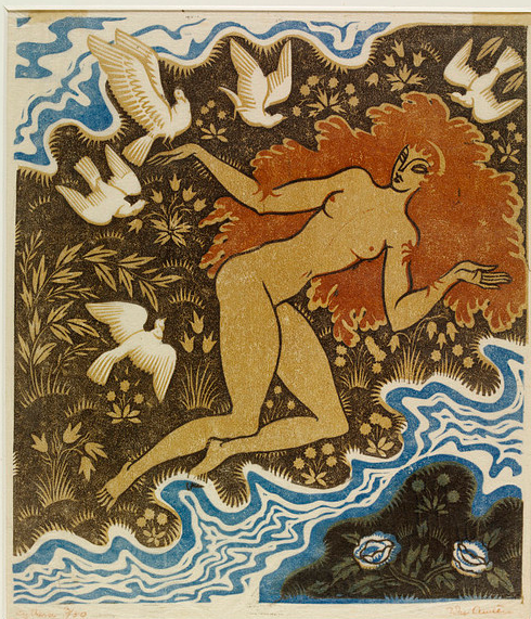
The National Gallery of Australia also suggest she took up printmaking here. Like many at the time, she gave etching a try and found it didn't suit her. For her, it was the equipment; for Walter Phillps, it was the mess and, even worse, the smell. She also gave colour woodcut a try. But all of the prints you see here are hand-coloured. Although quite a few of her colour woodcuts exist, I've never seen one anywhere. Significantly, she also had a crack at fabric-printing.


What the tale really is, I don't know, but it intrigues me, I have to admit. But there's something almost retrograde in all this. The facts from Australia are that she began making hand-coloured woodcuts in the early twenties and yet she harks back - to Gaugin, William Nicholson, the Fauves. And her attempts to make use of aboriginal art are irritating. But she went her own way. The earliest print here is Shell Cove, Sydney (third from the top) from 1920. By then, she was back in Australia, making prints and married. She was forty-five.


From then on, she became established. She exhibited with her friend, Thea Procotor, but her joint exhibition with Norbertine von Bresslern Roth and Frances Blair (see her post) at the Grosvenor Gallery in Sydney is one of the shows I imagine walking round. (The catalogue must still exist, surely). I suspect that if she didn't like all the equipment for etching, she would be not much keener on all the tackle she would need to make a colour woodcut. The point is that Australian claims for her as a printmaker are rather far-fetched. She has been roped in for the Japanese method and there is nothing remotely Japanese or method about her work. Not really. Nicholson broke new ground; Royds had the wit to take his example and print everything. Preston, I fear, took the easy way out.


Tuesday 25 September 2012

Mid-week on ebay


At last here is exactly the kind of thing that doesn't come up often enough, namely a good colour woodcut that has started off at next-to-nothing on German ebay simply because the seller has no idea who it is by. In some ways you shouldn't need to read the signature. This print is signed Karl Johne all over. Very few central European printmakers were using such bright colours nor doing trees as well as this, albeit in a conventional way. It's worth having at quite alot more than the derisory bids it has received so far, but then I suspect a small tribe will be waiting on the sidelines to place a bid. It is here on the blog simply so that readers can appreciate a print by an artist who isn't well-known enough and that probably hasn't been seen online before. He has done a tremendous job with a limited number of colours; the varied shapes, the reflections and the perspective all give the print interest. I especially like the way the plants right foreground combine with the precision handwriting. Convincing, well-conceived and very likeable, this view of the Isar nevertheless lacks the atmosphere and panache of Hans Frank's more wintry view across a river.


Just as good (if not better) is Leo Frank's City in the desert, an evocation of the citadel at Cairo at evening time, with the Mohammed Ali Mosque pretending it's on the banks on the Golden Horn. Frank finds himself on British ebay, and I would certainly have had a go at this one, partly because I like Cairo so much, and partly because as Leo goes, I like his use of blue here quite alot. But I'm afraid I like the condition of the print much less. Even by Frank brothers standards, the foxing is spectacular. I assume it was the kind of paper they both used. It seems to be almost endemic, though they would probably have had no idea themselves what would happen to their prints. There is another woodcut by him showing the Pyramids, with the statutory camels, not as nice, but just as badly foxed.


I can see no reason why, but people have already bid on this, and it only went up on British ebay today. Just to show how careful Frank was, I've included one of the many good photographs taken of Cairo long before its citizens took over every available space, including the cemeteries. I think the sand Frank shows may well be poetic licence. I'm not sure the desert ever got that close but I could be wrong. It's interesting the photographer has a better view of the mosque. Frank makes it look cramped but he wisely opts for an open view across the sand. Frank's print says more even though it shows less.

                                                                                      
And just so as you know that dealers in Germany do not bother to look and see what other colour woodcuts are for sale on ebay, another woodcut, but this time correctly identified as Johne! This one showing a chapel half-hidden by some lime trees is for sale at 85 €. Again, Johne has got the trees right. Even so, the seller still could only make out half the title. Gratifying to know that even Germans can't read their own writing. You will perhaps also have noticed by now how much both printmakers make use of verticals to break up the sky and divide the image. Frank and Johne also both use paths to connect foreground  to background, though Frank is far more subtle about it. (I must bear that in mind).


Sunday 23 September 2012

Goodbye, Japan: British colour woodcut in the twenties

                                                                             
Edward Bawden once noted, 'One can have too much of Japan,' a sentiment many young (and not so young) printmakers echoed when some key elements of  woodblock printmaking went AWOL from their work. The situation was summed up by William Giles himself when he travelled northwards to give a lecture on colour prints at Manchester in March, 1925. He was at pains to acknowledge the surge of talent that had washed across the British print scene and the way artists had simply thrown overboard what others had always seen as a life-line. Yes, it was the keyblock: 'It was a fundamental belief that a black outline was an all-important necessity, a belief based on the fact that it was met with in almost every Japanese colour print'.

His use of almost is important. It also helped considerably that every time students walked into the old Central School building in London they found themselves surrounded by examples of Japanese printmaking in the entrance-hall. They were held up to them as a model and a reference and were therefore hard to avoid. Even so, when Giles came to make his own first print, he made no mention of an outline and because all we have is a newspaper report, it's hard to say how far Giles was being ironic in the lecture. But more importantly, who were the 'many outstanding workers' who had 'appeared with their own individual expression' he was talking about? Giles makes no mention of Arthur Rigden Read, or his Venetian Shawl (above), but he could hardly have missed him. Read took up colour woodcut only in his forties and dispensed with the outline block without even trying. Notice the way he uses both shadow and the grain of the wood to avoid flatness and give a sense of three dimensions.


But Giles made special mention of Yoshijiro Urushibara. 'The finest technician in Europe' he called him. Hard, again, to say how far his words are qualified, but this fine, monochrone version of Moonlight, Bournemouth shows the way a Japanese printmaker might leave off the keyblock to show that one object lies behind another. Urushibara had certainly produced Queen of the Night (below) by the time Giles gave his lecture. No keyblock here, so why use it in the first place?


According to Giles, the keyblock allowed the publishers to make the popular ukiyo-e prints more cheaply. I don't know; but what I do know is he liked and admired the prints of Arabella Rankin (see her post). Her early woodcuts do make use of a fairly blatant outline that enhances the naive quality. Getting rid of the keyblock immediately introduces a tone of sophistication, as it does in The striped rocks, her remarkably advanced print for 1922. All she does is substitute the markings on the rocks and the line of surf to model the objects. In Queen of the night Urushibara had to resort to all kinds of surface markings and fussy outlines (which don't really show up very well here) to avoid flatness. And it ends up looking rather messy and, worse still, a bit pointless.


Another artist he came to know what the Canadian Walter Phillips. The pair had entered into a correspondence as Phillips the perfectionist had struggled to get his prints right. He was so keen to do this that he eventually left Winnepeg and brought his wife and children to Britain where he met both Urushibara and Allen Seaby.


There is plenty  of outline even in this Christmas card he sent to Seaby in 1925, soon after his return home, but by the time he made his pom-pom dahlias around 1928, it had vanished. But he was a devotee of the keyblock, being essentially a traditionalist and, in many ways, one very much like Seaby. There were also other younger artists who stuck with the keyblock, notably Ada Collier, herself a student of Giles, Kenneth Broad and Phillip Needell. Anna Findlay made use of the keyblock for her colour woodcuts, then something happened. She took up linocut.


Making a linocut doesn't necessarily mean an artist can do away with outline. It only means they use line in a different way, as does Ronald Grierson in Farm machinery. What we get now are all those racy jagged outlines and heavily defined planes we have come to love so much. But compare Phillips Waterlilies on its side to the Grierson and the differences are not so great. By comparison, Phillip's work is flatter and less dynamic. But what a Grosvenor School linocut gains in a modern sense of structure, it loses in expression. For all Claude Flight's blather about the avoidance of Japanese methods, it  was artists like Rankin and Rigden Read who showed the way well before he did. How far they were both influenced by European woodcut example and even by colour linocut is very hard to say.


I'm not a huge fan of Read's The batik scarf  but it shows how accomplished he could be with limited means and just how much can be achieved with turquoise and grey. But then he was in his forties by the time he made this in 1924, with alot of experience behind him. As was Mabel Royds. She had experimented as early as Sunspots in 1912, and left out the keyblock altogether, and she certainly made less use of outline from the early thirties on.  But what we tend to miss is what we perhaps take for granted. The vitality and eloquence of Royd's cutting was noticed by her contemporaries. Another artist with an individual and expressive use of black outline was Elizabeth Christie Brown but Royds was the only artist at the time to have a keyblock (for Girl and goat) published as exemplary in a book. Here she is still hammering away at her craft in 1927, with that combination of vital cutting, colour and suggestion that makes Read look rather technical, as Giles himself might have said. Malcolm Salaman, who should have given a lecture at Manchester instead of Giles, said the Indian subjects had brought out the best in Royds. I wonder whether these were the kinds of workers Giles himself was thinking about.


Wednesday 19 September 2012

Alice Coats

                                                                                 
One day some time around 1922, a student at Birmingham Central School of Arts and Crafts found a copy of Morley Fletcher's Woodblock Printing in the library and decided to have a go herself. (I am assuming the student was a woman). She found a cherry block (not in itself an easy thing to do so she must have been determined) and set about making a print. Presumably this got to the ears of someone with connections and Yoshijiro Urushibara himself was invited up to Birmingham to show the students how.

                                                                                  
The effect was immediate. A colour woodcut mania set in. And Alice Coats, who came from Handsworth and studied at Birmingham between 1922 and 1926, must have been amongst the students who went on to found the Central School of Colour Woodblock Engravers in 1923. Her view of St Phillip's churchyard in the city centre is one of her uncommon early woodcuts. November is also that uncommon thing, an English colour woodcut with a realistic urban subject. It's also the only colour woodcut by her that I've seen. I think printmaking wasn't her main interest at the time. She was there at the school to study illumination and lettering, one of those key arts and crafts courses, that had begun life at Birmingham in 1901 after the success of Edward Johnston's Illumination and Calligraphy course at the Central School in London.


But what is especially interesting about all this are two things: the way the students were encouraged to work with materials (like the cherry block), as Walter Crane had noted years before, and also the initiative shown by them. It was Have-a-Go. And Alice coats did. Woodcut, linocut, etching, wood-engraving - she tried them all. I particularly like the etching of Christmas party mistletoe below. It shows her warming to the subject that was eventually to preoccupy her. Even here, she is studying a plant in its enviroment, even if it is an artificial one. (The trees in central Birmingham are other early precursors of her great interest in botany).


From Birmingham she went to the Slade School and around 1931 put colour woodcut behind her and began making those newly-fashionable linocuts. The last colour woodcut I know of is The new ricks and plants and rural landscape begin to predominate, so far as I can see. There are more of her linocut images available but not enought to come to any great conclusions. But she was taken up by the Redfern Gallery in London, very much a home to the modern linocut movement.


As so many printmakers did at the time, she went into illustration, producing at least one children's book in the thirties and then after the war her classic Garden shrubs of their histories. Not so much is  known about her history as yet. This is all that I have. A print like The calf pasture strikes me as much more Iain MacNab than Claude Flight. But Still life with pears shows her capable of a far more modernist take on things than winter in Birmingham. Whatever the medium, though, whatever the style, I get the feeling she never lost sight of her ultimate subject. I will be looking for more.


Monday 17 September 2012

John Austen

                                                                            
The British artist, John Austen (1886 - 1948) is best known as a prolific illustrator of books throughout the 1920s and 1930s, but he also made a small number of wood-engravings and some striking decorative linocuts like Cythera (above), which provides the necessary contrast to the prints I had a look at in the last post. If Flight's early linocuts are twenties bohemia through and through, then Austen's, which date from about 1930 on, are thirties to the core.

                                                                                    
He was the son of a carpenter at Buckland near Dover, but decided against following in dad's footsteps and took the road to London instead, to train as an artist. Where, I do not know, but by the time he was twenty-five he was living in Eltham in south-west London working as a designer and illustrator for a correspondence course. (Interestingly enough, EA Verpilleux was doing something similar at the time in west London). He married Ruby Thompson when he was thirty-three, and I am told that Thommy provided the model for this beautifully polished pen-and-wash, as she did for many other figure-subjects. Years before, Henry Tonks at the Slade School had asked his students to spend less time looking at The Yellow Book and more time in the National Gallery. Looking at the way he had both Italian quattrocento and 1890s draughtsmanship off to a T, I think Austen must have done both.

                                                                                 
Everywhere he went, he seemed to absorb the styles of others like the proverbial sponge. He is the classic imitator who originates. Quite alot has been said about the influence of Aubrey Beardsley in his early work. This may partly be because the illustrations for Hamlet, and similar work, are what people like and know. But there is more to him than that. The masks he used have a formal rectitude Beardsley wouldn't have been bothered with. What he really learned from Beardsley wasn't so much the decadent manner as  it was to make the human figure central to the design.The well-lit skull wouldn't be out of place in a contemporary fantasy comic. It might be dead, but it is modern.

                                                                                 
What appeals to him almost everywhere he goes is classical art. Sometimes the approach is direct, sometimes the approach is by way of the C18th. While some contemporaries like Ronald Grierson attached classical odds and sods to their linocuts, Austen tries and explores the world they come from. I specially like this wood-engraving made for Aristophanes The Frogs in 1937. Its roots are in the work of Thomas Sturge Moore, who he would have known as a contemporary of Beardsley but its workmanship and sense of authenticity are modern as well.
,
                                                                       

He is always professional, adapting styles and techniques, but always to the back of him is a rigourous training and an an eye for the formal qualities of art. The female figure is also a major theme. Even when he depicts Sir Galahad, the unmistakeable features of his wife appear above the suit of armour. Hamlet's large eyes and little chin must belong to her as well. But the one I couldn't resist posting is the witty interlude below.


His interest in the details go hand in hand with his sense of authenticity. For instance, the perm is quite sensational but are nothing compared with the headlamp eyes. The boundary between observation and imagination is as fine here as it is with many of contemporaries. Like Edward Bawden and Edward Ravilious, he trawled backwards in time, picking up the styles he needed. What surprises me is that he could make such a good linocut as Cythera and still not be known for work like that. Quite simply the editions weren't big enough. (I also want to add that professional photography doesn't always do linocuts like this justice. The camera and the lighting fail to pick up the hand-made feel that makes them exciting and human.)


We don't really know enough about his career to say why he failed to make more prints but he left London after an illness in the late twenties, I think, and the couple went to live at various rural spots in Kent that included an oast-house. These are the kinds of details we have. In the last years of his life he shared poor health with his mentor, Aubrey Beardsley. Unable to work, he was placed on the Civil Pension List and died at 62. I don't have a very good image of the messenger-god,  Hermes but I wanted to include another print. It's probably Thommy again in disguise, anyway.


It was certainly hard to know where to stop with John Austen, but I decided on this final colour image of an exhausted artist from 'The gods are athirst' and a small, uncompromising self-portrait made in 1930. Notice the similar downward, inward-looking gaze. But then as someone else said, don't miss the pair of slippers either.


Finally, there are two sites I have to acknowledge as very useful sources: firstly, Jim Vadeboncoeur's 'Illustrators' based at Palo Alto, and then Brian Austen's 'Austen Families' at Hobart.

Thanks also to Keith (aka grumpyangler) for additional biographical info.


Thursday 13 September 2012

Claude Flight: a linocut evangelist

                                                                                     
Claude Flight had a nice line in pithy sayings. 'I am a lone figure, belonging to no school' was one of his most self-conscious. Ironically, the modern print industry has nevertheless attached his name to one very famous school. I mean the Grosvenor. He worked there weekly, for no more than four years, between 1926 and 1930, but his life and career have largely been subordinated to it by people who have one of two things in mind: their own careers or their bank accounts. Fortunately, his linocuts, like the one above, are as radical as those things are conventional.


I very much like the way you can read almost everything that has happened on the sheet of paper. He even put the price on them although the photographs don't show the £2 - 2s - 0d. This was alot more more than the average man's daily beer Flight claimed his prints might cost (unless he knew alot of average with way-above-average alcohol habits, that is) but then he certainly wouldn't be a lone figure when it came to fatuous remarks. The top sheet, as you can see, isn't even square. Nor is the print. The overprinting is smudged way beyond the image - if you can actually say where the image ends. Interconnection, though, is the name of the game. The figures become part of some unseen field of force that appears to include their environment. There is an even more remarkable attempt to define the second image by ruling lines with a pencil, the whole approach as outlandish as it was deliberate. Why?


Again, ironically, it was the whole commercial printmaking set-up that he had in his sights. His prints are quite simply the exact opposite of the fine etchings of the period that cost so much and meant so little. I won't name names, but the whole thing basically was a racket.

It's hard to say whether Flight was conscious of that other lone prophet, crying in the wildnerness. He had joined the Seven and Five Society alongside other artists with a modern outlook in 1923 but was subsequently eased out when the advanced Ben Nicholson began to insist on abstraction for all. Flight must have found it galling to discover that prints like the one above were not modern enough.


Clearly, it was easy enough, even at the time, to pick holes in Flight. The Studio never published one of his prints, denigrating them as design. (They showed rugs by Flight and Gertrude Lawrence instead). His aesthetics were in tatters before he had even put pen to paper. He took exception to Frank Morley Fletcher saying lino could not produce 'a beautiful surface' but viewed prints from a press as 'deplorably mechanical' and 'works of art of a very low order'. But, in the end, it was the example that he set that was perhaps as important as the prints that he made. By all accounts, he was a charismatic teacher who obviously brought out the best in many students. Sybil Andrews said that making the prints were by no means as straightforward as Flight liked to make out, and the work of some of his students at least ended up looking alot like him. Yet I wonder how many of them actually stuck their tissue images to an olive-green backing mount so the green might show through as he did with Trawler down the wave, above. It's a real shame you can't see this in the photo. It looks much better without its mount, than it does enclosed. And as soon as you see it in front of you, all the clap-trap is forgotten (if not entirely forgiven).  


Sunday 9 September 2012

Ethel Kirkpatrick & watercolour

                                                                                        
What we know so far about the early training of Ethel Kirkpatrick is sketchy and but she had begun to paint in watercolours early in her career when studying either at the West Kensington Schools (which soon became the Royal College) or the RA Schools in London and then at the Academie Julian in Paris. Watercolours by Kirkpatrick are not so easy to come by and so I was very fortunate to have this earlyish watercolour Boats at rest sent to to me by Clive Christy.

It provides a number of clues, not least that her interest in maritime subjects began early on. Funnily enough, the patterns and dark colours also suggests to me the way her interest in enamalling and jewellery might have developped. The watercolour dates from 1894 three years before she took a course in jewellery at the Central School in London. It shows part of the pilchard fishing fleet at Newlyn in Cornwall. (You can see the lighthouse at the end of the pier to the left of the larger vessel).


The date is interesting. 1894 was the year Lily Kirkpatrick moved to St Ives. It's generally assumed that Lily was a member of the larger clan Kirkpatrick. They were landed people from Coolmine on Dublin Bay but Ethel had been born in London. Her father had joined the British Army, was wounded during the Indian Mutiny and eventually joined the prison service. Over the years Ethel did time at Coldbath, Exeter, Wormwood Scrubs and most notoriously at Newgate. By 1894 Captain Kirkpatrick had had a house built at Harrow-on-the-Hill near London. Curiously, a studio for his two artist daughters had not been included in the plans. Ethel and Ida soon put this right. One was built after his death in 1896. It's been suggested that the sisters moved back to Harrow after the death of Lily in 1902. I somehow doubt this. Ethel was studying weekly at the Central School during the autumn and winter of 1897/1898 and the watercolour itself was exhibited at the Royal Academy in 1895.


Another maritime piece follows on (made presentable by one of the members of the Ethel Kirkpatrick Society) but I  don't want readers to assume Kirkpatrick was a maritime artist, straight and simple. She may have relied heavily on boats and water for her later colour woodcuts but she also painted figure subjects. Her Cornish Floral Dance finds her working in the style of Thomas Gotch. I think she was a more flexible artist than she might appear at first glance. Basically, we still know very little about the range of her work - even the colour woodcuts, which she is best known for today. I came across a new one to me called Thames Barges only on Friday. This is why it was so good of Clive to send his image on. It extends what we know about her work. And that was what was important to her.


Nor is there a simple jump between her watercolours of boats and the colour woodcuts. The earliest woodcuts depicting sailing boats that I know of appear to date from about 1912. This date is also significant. Generally, there had been no real opportunity for British artists to exhibit their colour woodcuts until the formation of the Society of Graver Printers in Colour in 1909. Nor was Kirkpatrick a founder member. (In fact, none of the leading colour woodcut artists were in at the beginning). But the opportunity to exhibit may well have led her to interpret some of her watercolours.


But there are subtle differences between the paintings and the prints. She continues to group boats together but there are fewer of them and, by and large, they often occupy a restricted space within the picture. She didn't believe in making it difficult for herself. Virtuoso printmaking of the kind practiced by William Giles (and he was very good at it) and John Platt was not for Kirkpatrick. The outgoing fleet is fairly complicated so far as her seascapes go. But what she loses in impressiveness, she gains by way of expression. Look at the way the boats and their sails turn with the wind and the water. This is what she was about. (One of her titles was With wind and tide). She is no formalist; she describes. Her watercolour training, the way she observed and sketched what she saw, led to the later colour woodcuts that she was proud of, the ones like Early morning Venice, Mount's Bay and a blue version of The outgoing fleet, that she gave to the nation. All of the six depict boats but all the scenes are different. The poet in her was at work, from London to Cornwall to Venice. She didn't let colour woodcut become too laborious for her, she let it set her free.

                                                                                  
[I include Hiroshi Yoshida's Morning at Abuto as Klaus refers to it in his comment below].

Wednesday 5 September 2012

The mid-week round-up on ebay

                                                                                          
Yes, I know it's only Wednesday but Clive (who will be well-known to many readers for The Blog That Vanished - I mean, of course, Art and the Aesthete,) tipped me off about a number of colour prints up for sale on US ebay and here are some of them. I post them now just in case anyone has some spare cash and wants a Walter Phillips, because Sunday coming would almost certainly be too late.

Now, Phillips was without doubt an excellent printmaker and Above Lake Louise even appeals to me. It comes in its original folder with a foreward by the artist, as sold by the Woodcut Society in 1945. This society was nothing of the sort. It was set up by a mid-western businessman in the thirties to sell unique prints mainly by US artists and, as I say, this one comes with an introduction by the man himself written in the way that only he knew how. He manages to position himself somewhere between aesthete and backwoodsman but behind the imaginative persona is someone who knew what he was talking about and what he has to say about the nature of a colour woodcut as a print rings true.

Four more days to go and it currently stands at $255. It won't stay there much longer. I should also add that the image I show here is not the one for sale. Here Phillips has tried (so far as a pc monitor will let me tell) to express the conditons he worked in as he sketched. There is a sense of spontaneity here, not something you would normally associate with colour woodcut. Unless, of course, it is the work of Phillips' old friend, Allen Seaby.


This image of The lady in black by Arthur Rigden Read  is also not the one for sale. The one that is up for auction has toning as the trade like to say. It's an anodyne term for a nasty phenomenon, an overall browning that has affected at least one other Read I know of - my own. Because toning is usually even, I suppose it's not so bad. Even so, condition is everything for works on paper and personally I don't think anyone should consider bidding a $300 for this, certainly not if they have read Phillips' introduction to his own print where he compares colour woodcut to fresco.


Bringing up the rear is the hapless Ernest Watson with one of those linocuts that display considerable energy to no great purpose. The cove could be one of those prints showing Cornish scenes. I posted his image of Mousehole on the colour woodcut tour of Cornwall. Probably readers will realise that whatever I say, I wouldn't bother posting any of these prints if I didn't have some kind of regard for the artist. Watson's boldness I can't help but like and admire. Whether it's $100 + worth of boldness, I wouldn't like to say. It currently comes with those infamous red letters reserve not met. I wonder what that reserve could be.

Many thanks to Clive. For all those who miss his blog, he is still out there, informative and inquisitive as ever.


Sunday 2 September 2012

The Sunday round-up on ebay


If you thought it was only other people who had a problem with German or Austrian handwriting, here is a dealer from Bavaria who failed on E Consentius. I had completely forgotten that Gerrie Caspers had posted on Elisabeth Consentius last June (I can't get the link to work) and had to deciper and search all over again. But Summer was worth it, the drawback being there is no PayPal only bank transfer. There is some bidding because people will know who it is but how far it will go is another matter. It will be interesting to see. (Bear in mind that all these prints are up for auction on ebay in either Austria or Germany).


This Franz von Zulow is less straightforward. In many ways I prefer this print to his more elaborate work. He patented a form of stencil cut some time before LH Jungnickel began using a similar technique but here he comes up with a woodcut where the colour was almost certainly applied by hand, which to my mind makes it alot less interesting. The print is also in rather poor condition but this will keep the price down so if you fancy a von Zulow, this is an opportunity. Unfortunately, other bidders are thinking much the same thing.


The fact that this woodcut by the philosopher-printmaker Emma Bormann isn't signed at all will also help to keep the price down. It depicts a view across the Bosphorus, probably showing the Semsi Pasa mosque on the Asian shore with Galata or Karakoy in the foreground. The Istanbulus are as fond of views as Bormann was, hence the tea-garden and the houses and flats growing ever higher. Funnily enough, Bormann doesn't always fetch the prices you might think.  I suspect this will look pretty good to the person who opens the package. More importantly, though, we must wait and see whether Klaus has anything to say about Bormann's astonishing use of colour.


Keeping the most intriguing to the last, we come to Walther Klemm's Junge Hunde - intriguing because this isn't the print we tend to see. I believe the woodcut with fewer colours that comes up quite often was professionaly printed in a larger edition. If my memory serves me correctly, Klemm and Thiemann were both working with a print publisher in Vienna around 1906/1907 but what you see here may well be a proof pulled by Klemm himself. This is where a signature does count. I like this alot more than the brown version (below). The bright colours are true to Klemm's work at the time. They can look crude but striking when you see them. I unexpectedly came face to face with Turkeys a few weeks ago and I will tell you now, it looked sensational. So, if I were spending money, I think I would spend it on this.