Showing posts with label Flight Claude. Show all posts

Saturday, 29 December 2012

Claude Flight: the low-down


In spite of all the hooey about the Grosvenor School of Modern Art and the five-figure prices artists associated with the school are fetching (and, let's be honest, folks, they're never worth it), Claude Flight has not been that well-looked after. The reason is quite simple. There has been no biography, not even a monograph that summarises his life and career. Stephen Coppel, the leading British authority, certainly knows his stuff, but even so, bald facts of themselves, are unenlightening. So, I thought I might combine some images of less common prints by Flight with one or two ideas, for what they're worth.


Until Julian Francis wrote 'Tom Chadwick and the Grosvenor School of Modern Art' (just published by the Fleece Press), no-one had written anything, so far as I know, about the actual way the school worked, so Julian's book is a welcome and sane addition to what we know. It resists hype - and we have had hype almost beyond endurance - and talks calm sense instead. Me, I sit down and write these posts, then re-read them some months later and am aghast at my own chutzpah.


That aside, Flight deserves some calm appraisal. His life was just as underprinted as the prints he went on to make. It builds unwittingly from early failure to get into the Navy to receiving the Credit Agricole from the French government for his service during the first war. He was no more an ordinary soldier than he was an ordinary printmaker. He may well be irritating and posturing at times, but he is rarely dull. That he moved through the various fads and fashions of the twenties and thirties, is obvious; that contemporary writers still go on about the Vorticists and the thrill of modern life, is less so - by far. It was Flight himself who disagreed with them when he said, 'I am of no school'. I can understand that a newspaper journalist at the time needed a phrase like 'The Trogolodyte Artist' to get the attention of readers, but all the talk of Vorticism is not much better.

                                                                                                                                                  
Flight picked up things as he went along, there's no doubt of that but his work to unfold the underlying structures has something in common with his father's work on meteorites. The role that Edith Lawrence played when he eventually met her in 1922, doesn't seem to have been worked out in any detail, though. There is alot less known about her, and what she was doing at the time, but of all the partnerships that existed then, theirs may well prove to be one of the most compelling.

                                                                             
It was certainly enduring. Fatefully, they left London during the Blitz for Wiltshire. Their studio off Marylebone Road was then bombed in 1941, and all Flight's lino-blocks were destroyed. They stayed on at Donhead St Andrews where Flight survived a devastating stroke in 1947. Lawrence, who was nine years his junior, looked after him for another eight years, untill he died forgotten in 1955. Not so very vorticist after all.

Thursday, 13 September 2012

Claude Flight: a linocut evangelist

                                                                                     
Claude Flight had a nice line in pithy sayings. 'I am a lone figure, belonging to no school' was one of his most self-conscious. Ironically, the modern print industry has nevertheless attached his name to one very famous school. I mean the Grosvenor. He worked there weekly, for no more than four years, between 1926 and 1930, but his life and career have largely been subordinated to it by people who have one of two things in mind: their own careers or their bank accounts. Fortunately, his linocuts, like the one above, are as radical as those things are conventional.


I very much like the way you can read almost everything that has happened on the sheet of paper. He even put the price on them although the photographs don't show the £2 - 2s - 0d. This was alot more more than the average man's daily beer Flight claimed his prints might cost (unless he knew alot of average with way-above-average alcohol habits, that is) but then he certainly wouldn't be a lone figure when it came to fatuous remarks. The top sheet, as you can see, isn't even square. Nor is the print. The overprinting is smudged way beyond the image - if you can actually say where the image ends. Interconnection, though, is the name of the game. The figures become part of some unseen field of force that appears to include their environment. There is an even more remarkable attempt to define the second image by ruling lines with a pencil, the whole approach as outlandish as it was deliberate. Why?


Again, ironically, it was the whole commercial printmaking set-up that he had in his sights. His prints are quite simply the exact opposite of the fine etchings of the period that cost so much and meant so little. I won't name names, but the whole thing basically was a racket.

It's hard to say whether Flight was conscious of that other lone prophet, crying in the wildnerness. He had joined the Seven and Five Society alongside other artists with a modern outlook in 1923 but was subsequently eased out when the advanced Ben Nicholson began to insist on abstraction for all. Flight must have found it galling to discover that prints like the one above were not modern enough.


Clearly, it was easy enough, even at the time, to pick holes in Flight. The Studio never published one of his prints, denigrating them as design. (They showed rugs by Flight and Gertrude Lawrence instead). His aesthetics were in tatters before he had even put pen to paper. He took exception to Frank Morley Fletcher saying lino could not produce 'a beautiful surface' but viewed prints from a press as 'deplorably mechanical' and 'works of art of a very low order'. But, in the end, it was the example that he set that was perhaps as important as the prints that he made. By all accounts, he was a charismatic teacher who obviously brought out the best in many students. Sybil Andrews said that making the prints were by no means as straightforward as Flight liked to make out, and the work of some of his students at least ended up looking alot like him. Yet I wonder how many of them actually stuck their tissue images to an olive-green backing mount so the green might show through as he did with Trawler down the wave, above. It's a real shame you can't see this in the photo. It looks much better without its mount, than it does enclosed. And as soon as you see it in front of you, all the clap-trap is forgotten (if not entirely forgiven).  


Wednesday, 16 May 2012

Claude Flight & the Anglo-Japanese

                                                                                      
We are by now used to modern curators on both sides of the Atlantic talking about the linocuts of Claude Flight with such seriousness, I was amused to come across Flight himself in his book 'Lino-Cuts' even bothering to mention printmakers he referred to as 'the Anglo-Japanese'. By that he would mean the followers of Frank Morley Fletcher who used a method of printmaking based on Japanese practice. As it happens the term had first been used by the critic Malcolm Salaman some years before. It is part of the job of critics to come up with these terms and catch-phrases to summarise a trend so it is interesting to see how far Flight saw himself as involved in a to-and-fro of discussion and insult about colour print  that had been going on more or less ever since Morley Fletcher and John Dixon Batten had first place mulberry paper on cherry block.

                                                                           
Salaman was both urbane and mischievous. He was after all a journalist. And the Anglo-Japanese could be relied on to respond. And so could Flight. From being a coterie of printmakers without a proper home, the Anglo-Japanese had suddenly found themselves not only with a Colour Woodcut Society in 1920, but a rapidly growing number of students and established artists taking up the barren. For the first time they were also in the majority at the Society of Graver Printers in Colour. Not only that, they had Bromhead Cutts to publish their work just like the etchers. And from this position of growing strength, they took on the humble piece of lino.

                                                                                 
One way or another, various people had a go at what they seemed to see as lesser arts. William Giles called colour print 'a true cause'; first Allen Seaby counteracted Salaman's praise of Robert Gibbings, when he used lithographic ink and an Albion Press for his colour woodcuts, with a summary of the Japanese method, then he carefully explained why linocut was suitable for children; even Morley Fletcher descried lino for its inability to produce a 'beautiful surface'. Not only that, The Studio Magazine never, so far as I know, published a Grosvenor School linocut. They quite clearly said they considered such prints 'design' and emphasised the point by showing only the joint designs for rugs and furniture of Flight and his partner Edith Lawrence, meaning it was nothing personal.


Flight took it personally. 'Lino-Cuts' (1927) was partly a response to Fletcher's 'Woodblock Printing' of 1916 and Seaby's 'Colour Printing with linoleum and woodblocks' of 1925. On all sides there was a sense of crusading zeal that had its roots back in the days of John Ruskin. Unfortunately, the enemy Flight had identified was the wrong one. The real enemy was not the harmless Anglo-Japanese; it was something much more formidable. It was the Royal College of Art. Or, to be exact, it was the confident individualists the college had begun to produce, none less so than William Giles. The real enemy was other linocutters.


My unqualified enthusiasm for the work of Sylvan Boxsius is well-known. It is based partly on this very simple fact: in a short printmaking career beginning probably a year or two after the publication of Flight's book, he gave both Fletcher and Seaby a significant run for their money. By using a water-based medium and painstaking cutting of lino, he was able to produce a surface that holds its own against the famous translucence of colour woodcut. He ignored the rhetoric and got on with the job. But like Flight and Fletcher's, the minor achievements of an artist-craftsman such as Boxsius were swept away by the major advance of modernism. But Edward Bawden was sufficiently modern and talented to hang on in there. Now I am equivocal about some of Bawden's linocuts but this isn't what I want to say. For better or for worse, modern British linocut owes far more to the craftsmanship of Bawden and his awareness of tradition and the styles of the past than it does to Flight. Curators can say what they like about Flight's jazz-age modernity, once the jazz-age was over, Flight was all over, too.


Wednesday, 7 September 2011

Eileen Mayo & Linoland


To read what some curators and auction houses say about Eileen Mayo (1906 - 1994) in the Antipodes, you would think she was some kind of multinational. But all the linocuts here (except for the last one) date from the time she spent in Britain before she left in 1953. Isabel de B Lockyer dated all of hers and most of these are dateable, too. To me, this suggests something interesting about the attitude of these artists to their linocuts - that it is art and not craft. Following on from Claude Flight, they make claims for a medium often seen as suitable for children. (Franz Cizek (1865 - 1946) at the School of Arts and Crafts in Vienna had pioneered its use for children and in 1925 Alan Seaby had this to say about his work  'it has been found that a child... can deal with linoleum with ease'). And, of course, Turkish Bath (1927ish) wilfully contradicts all this professorial wisdom. Its steamy abandon is hardly general viewing.


Morning tea, with its sexual ambiguity, is even less so. Here is an artist who had trained with a modern vengeance at a series of London art schools: the Slade, the Central School, Chelsea Polytechnic. But it all went out the window with her very first print. She famously got on the phone to Claude Flight for instruction in linocut. The sumptuous art deco of Turkish Bath was the lurid result. It's outrageous, of course, and a lark. And it also got her included in the 'The first exhibition of British Linocut' that Flight organised in 1929. (I am going by Osborne Samuel's date for this - it seems to waver). She was a true printmaker at that point; an artist who was using print to try out new ideas. By Morning tea her lifelong use of bold colour and repetitive, sinuous line is already well to the fore.


She was an admirer of Eric Gill's work but in those first two prints she come across as far more fresh and contemporary than Gill ever did (and I admire his work, too). If Black Swan sees her moving towards an interest in natural history, Cats in the trees displays the same wit and decorative elan we saw in her figure subjects. The skill of her work is beyond doubt. She was highly trained. The growing formalism of her work during the thirties is fairly typical of the times, which were less than easy. She perhaps wasn't going to make a living out of jazz-age linocuts but personally I would have liked to see more.


These two next prints, with their flat figures, simplified colours and sense of recording popular life, would not be out of place in a King Penguin book about British folk art. The Doric Dairy cart is quite some way from the sensuousness of the turkish baths, or waking up. There we had what I find very attractive, a woman artist taking women as her subject - not women in a domestic setting but in pleasurable ones. With ice-cream vendors and milk carts, we move back to a simplified world of linocut childhood. They certainly look like illustrations rather than manifestos.


But this is not a linocut artist, not like, say, Sybil Andrews or Claude Flight. All I have done is look at one aspect of Mayo's work that I like and that starts off very early in her career. She made wood-engravings, lithographs, screen prints, too, sometimes of the same image but never with quite the same sense of verve that she achieved early on.


But everything still went into the mix. This later linocut, which she made in Australia, has elements of both surrealism and abstraction. It's a glorious thing but you can see the teacher in her. In that resepect she is like Bormann and Klemm and Orlik, exemplary in what she does but somehow there is still something missing. I think you can tell by now which of these works I prefer.

Saturday, 27 August 2011

The Grosvenor School of Modern Art


The Grosvenor School is the sort of place where you would like to walk to Warwick Square, wander in and speak to Miss Andrews in the office, to enquire whether you could look in on Mr Flight's class so you find out just what they were all up to. I suspect it was the kind of place that had as much in common with the community of artist-converts at Ditchling in Sussex as it did with the Bauhaus in Weimar, Germany. Claude Flight (1881 - 1955) was a linocut evangelist and everyone, including the staff, attended his classes. It's no wonder they all made so many.


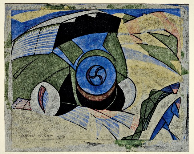
It was set up in this rambling old house in 1925 by three men who had all come to art and print later rather than sooner. Flight had tried out various things, including bee-keeping, untill he hit on modernism and, in particular linocut, as the answer. As you see from his Swiss Mountains from c1934, he was an enthusiast. He had begun making linocuts in 1919 and taught students to use separate blocks for each colour. In 1929 he organised 'The first exhibition of British linocuts' and even if his name is almost synonymous with linocut today, his enthusiasm for the Grosvenor School was short-lived. He taught there for only four years, from 1926 untill 1930, when he transferred his already informal classes to a cave above the river Seine.


Flight had studied at Heatherley's School of Fine Art in London both before the war and then after. Cyril Power (1872 - 1951) didn't enrol at Heatherley's untill 1925 when he was already 53. He had been a successful architect but turned his mind to art. He had met Sybil Andrews in 1921 and she duly became school secretary. (See Sybil Andrews: the rural year, February, 2011). It's not hard to see his interest in both architectural design and form in general in The Tube staircase, 1929. It shows the stairs at Russell Square underground station in London, an exact location for a dynamic print. If their modernism is at times far-fetched, this linocut does put me in mind of  Marcel Duchamp.


Power gaves classes on architecture and ornament (he had already published a three-volume book) but the only one of the trio with any prior experience of teaching at all was Iain MacNab (1890 - 1967) - and that wasn't much. If I also tell you he spent a year at Glasgow School of Art in 1917 before also moving to Heatherley's in 1918, you will begin to see the pattern. The brave idea of a school dedicated to modern art may well have begun with their joint experience of a London private art school. (I'm not suggesting the experience was bad because MacNab became joint-principal of Heatherley's in 1919 and didn't relenquish his post of director of art studies untill as late as 1953.) But in 1925, even with his limited experience, MacNab took on the job of principal at the Grosvenor and certainly stuck at it longer than Flight.


MacNab was also one of the finest British wood-engravers of C20th. The effect of prints like Corsican Landscape on his students of wood-engraving is clear; it may be less obvious with the students that practised other forms of printmaking but it there nevetheless.  As for the students themeselves, I started the post off with French Porters by the most talented one them all, the Swiss printmaker, Lill Tschudi (1911 - 2004). She came across the linocuts of that albatross-around-my-neck, Norbertine von Bresslern Roth, while still at school in Switzerland. She saw the school adverts in The Studio and attended between 1929 and 1930 when Flight was still teaching there. Like some of the other students she also trained with the French cubist Andre Lhote. It wasn't a matter of this being their only brush with modernism; some the students could obviously afford to pick and choose.


The Australian artist, Ethel Spowers (1890 - 1947) was one. She had studied art in Melbourne then moved to Europe in 1921 and, just to let you know what their first prints could be like, I include Spowers woodcut Eglise de Grace, Paris made during her first year in Europe. As you see, it isn't up to very much at all. Tug of War she produced in 1933, after her return to Australia, and is a fine piece of work without having the modernist thoroughness of Tschudi. Spowers only spent part of 1929 at the Grosvenor but it had a great effect. Linocuts she produced before that time were stronger than her early woodcut effort but conventional untill Claude Flight showed her how.


Eveline Syme had been at school with Spowers in Melbourne but went on to study classics at Cambridge. She turned her mind to painting and France in the early twenties but it was the discovery of Flight's book Lino-Cut that led Syme and her friend Ethel Spowers to enrol at Pimlico in 1929. I like the way they all went back home and turned the technique on Australia. It has of course helped to make their name. But that process only began in the 1970s, with the vogue for all things Deco. Nowadays a dealer on ebay only has to add the illustrious words 'Grosvenor School' to some linocut or other to prove that linocuts will never be affordable or democratic again. The idea had been to show the modern age they lived in - what everyone else was doing when they were making linocuts - in a modern way.


Wattle tree is by Dorrit Black (1891 - 1951). I think she is the weakest of the three Australian artists but this does show what they were about. She studied in Melbourne before heading for London in 1927 when she spent a mere three months at the Grosvenor School. It wasn't long but it was clearly enough. The British artist Gwenda Morgan (1908 - 1991) studied there far longer - between 1930 and 1936. This almost certainly couldn't have been a full-time arrangement. She had already spoent the years 1926 to 1929 across the river Thames at Goldsmith's, after all. But the example MacNab gave shines through much of her fine body of work. These wood-engravings may not be as thrilling as those linocuts but her work stays in the mind a long time after excitements have washed over it.


Ronald Grierson (1901 - 1992) was another student of MacNab's. Mainly known as a designer of textiles, he had also first studied elsewhere (at Hammersmith School of Art) before spending time at the Grosvenor. Alison MacKenzie (1907 - 1982) didn't arrive untill the 1930s (with her sister Winifred, see July, 2011). Both had studied woodcut with MacNab's sister, Chica, at Glasgow School of Art. It was a small, quite short-lived world for many of them, I imagine, far from the formal disciplines of many art schools and more in line with the progressive independent schools that were being opened up - but far more dependent than they were on the trends.


Thursday, 10 February 2011

Sybil Andrews: the rural year

Sybil Andrews (1898 - 1992) was a prolific printmaker. She made 76 colour linocuts in all, more than half of them between 1929 and 1939. Almost all are exemplary. Many of them are of rural subjects but she was brought up in the town of Bury St Edmunds in the east of England. It has been said that alot of her work drew on her memories of the Suffolk countryside nevertheless (and she may well have said this herself) and what I decided to do was try and put some of the prints of the countryside into a sequence, with each activity following on from the other. Of course, one or two are landscapes. Nor was the choice I had to make always an obvious one. But then I think that in itself says something of the kind of woman Andrews was and suggests what she was trying to do. So, for instance, the print above is called 'Michaelmas' which is straightforward because it falls on 29th September. What people are doing is sometimes less easy to follow. These men appear to be forking manure onto a cart, something clearly Andrews associated with that time of year. The haycut ('Mowers') was also easy. That was June. But there are two images of ploughing - one on arable, the other on grass. The second one presumably describes the ploughing of pasture in the spring in readiness for re-sowing. Below all the patterning, she was interested in particular things - and a way of life that many of us will barely recognise. This may help to explain why it is that dealers and collectors have placed so much emphasis on her style to the detriment of her subject.
'Storm' here is obviously autumn because the tree is still green. 'Otter hunt' was less easy to pin down but I placed it in the summer because one of the Lakeland hunts took their hounds out in May (once the martens and polecats had been dealt with). What the gipsies are doing in their print (the final one) may not be perfectly clear but two of them are wearing rubber boots because they've been collecting reeds and, of all the prints, that one is the most pertinent in a way because, instead of showing the Romanies as caricatures, round their campfire, for instance, or going down the lane in a horse-drawn van, as both John Hall Thorpe and Hesketh Hubbard did, she shows them at work, playing their useful role as seasonal labourers.
Colour, of course, plays a crucial role in suggesting the time of year - and occasioanlly time of day. Most of the autumn and winter prints are dominated by reddish brown; the spring and early summer prints rely on green while high summer is blue or bluish-green. I put 'Trackway' here because I assume we are looking down through bare trees. The trees in 'Tumulus' below are pines on a burial mound, a fairly common feature of the English countryside. (These two prints in themsleves tie her very much into the recording of everyday life and the cultural aspects of town and countryside that was such a key feature of the 1930s.)
She once said of her upbringing that she had 'a paintbox from the cradle' not so much to encourage her as to keep her occupied. This is very telling. She must have been an active child and this shows in both her way of life and the subjects she chose. The term 'Futurism' and 'Vorticism' are sometimes used in connection with her prints but I am skeptical about their relevance. By the time she was making these linocuts those first exhibitions by the futurists were long gone and British Vorticism barely survied the first war. But it was only Claude Flight example as a modernist and teacher that gave her what she needed: a dynamic style that drew of early modernism and was in keeping with what she most wanted to do.
She first studied at art school locally then moved on to Chelsea in London, where she attended Heatherley's art school herself. The end of the first war saw her working as a welder in a Bristol factory, a strong indication of her practicality and unwillingness to conform to the accepted women's role. (During the second war she worked as a boatbuilder at Southampton). She also strikes me as someone who took the opportunities life offered her and when she met Cyril Power after the war they formed a working partnership that was to last for 20 years. Power went on to found the Grosvenor School of Modern Art in Pimlico with Claude Flight and IainMacNab. MacNab, who was a wood-engraver, acted as principal; Flight lectured on linocut - lectures that Andrews attended when she wasn't occupied with her job of school secretary.
I think it was that kind of interaction that stimulated her and this is also why I cast doubt on the associations that are made with modernist movements like cubism and futurism. It was a style she was able to adopt to suit her own need - even if at first glance many of the artists associated with the Grosvenor School seem quite similar. Bold lines and dynamic patterns are what we look for in linocuts but if we compare her with her contemporary Norbertine Bresslern Roth, the rhythmic grouping of animals and people is about all they have in common. And although both artists have significant limitations in that all their works tend to appear similar, I think Andrews is the more vital and a far more dynamic colourist.
She also used considerable licence. I can't imagine that haymakers got together in a huddle with their whetstones unless, of course, that was how they began their working day. But it wasn't so much the hay, or the weather, or even the human figure that interested her so much as what they were doing. And this brings me to the curious thing about her. She does associate these activities with men. She is quite different from other women printmakers I've looked at. Emma Schlangenhausen had her female haymakers in the foreground; Mary Fairclough also gave women key roles in her work - her gipsy is a woman smoking a pipe. Women don't feature in her work much at all.
Not all her prints are concerned with light as this one of mowers is - and it isn't always something we look for in linocuts. But it is interesting that when she moves into the field of more conventional landscape, there is a noticeable shift. In some of these prints, especially in the one after the windmill, of a man collecting mangolds and the first print of ploughing, we can see what she has in common with the colour printers that come after her - Edward Bawden (1903 - 1983), for instance, and some of his (and her) contemporary followers like Mark Hearld (British, b 1974). The particularity becomes too intense, the simplification too childlike. It's only a slant in her but an irritation in them. (I like Hearld, Bawden less so). I think we need to be grateful that the Grosvenor School must have discouraged their students from taking the academic/medieval path as Eric Gill did before them and Bawden adopted afterwards.
This series, if that is what it is, effectively came to an end in 1939 with the outbreak of war. She had had a good run as a printmaker. Most of her British contemporaries had given up colour prints before 1930. She then turned boatbuilder and met Walter Morgan in the shipyard. They were married in 1947 and soon after that the couple emigrated to the backwoods of Canada. She was almost fifty. A second life had begun.