
I want to start up Modern Printmakers again with a post about an artist I like very much - and the city she went to live in for a while. Most of these images will be new to readers ( a good enough reason to post them) and all belong to the same genre of picturesque city views aside from the print below, which shows the nearby village of Perscholdsdorf. But then Siccard Redl often portrays Vienna as a village. The earth colours - the browns and the greens - are carefully chosen. Interesting that the gold that she went on to make her signature colour is barely present here.

Although all these prints belong to a particular phase of her life, at least one of them - the one you at the top - may well have been printed after her move to Argentina because it is annotated 'Viena vieja'. Even so, no one seems to have turned up any woodcuts she made in Latin America, which was the last place she lived in. (It's as well to point out here that she annotated work in German, Italian, English and Spanish at different points in her career. This sometimes indicates where she was working but not necessarily).

Her sense of perspective - both pictorial and cultural - is subtle. In this she reminds me of Ada Collier, another favourite. The historical pastiche of parkland hopefully shows what I mean. On one level, it's just a charming piece well away from the modernist take on things. But I think she approaches history as Collier did; it provides a gateway for her own imagination. This would cerytainly be true of her woodcuts of Columbus' caravels. It's the warm tones that captivate here not the ornamentation.

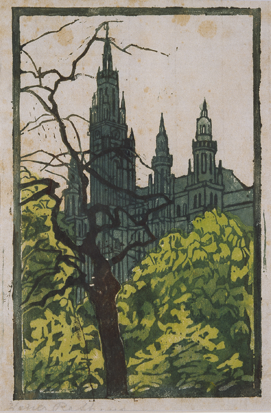
Below, a view of the Rathaus. Not her best piece of work and rather damaged but the use of blue and sharp green is interesting. Basically, she is trying to hide as much of the Rathaus as she can. Architectural detail isn't something that interests her very much.
It's atmosphere and tone that she does best as you see here in the woodcut of one of the allies of the city. There is another version of this woodcut without the child, I think, and in a diffrent colourway but I like the monochrome effect and the way it suggests a genuine wintry feeling. For all it's obvious appeal, it is still some way from the standard snowy scene - and let's face it, in the history of woodcut, there are hundreds and hundreds of those.

Charles, it's good to see you back. The world wasn't the same for some time. Where on earth do this pictures come from? It's obvious you have an affair with Josephine and you don't have to tell me. I agree some prints are like illustrations, but looking closer they are indeed very delicate and although figures were not her forte she wasn't afraid using them in the stage settings. Very honest and pure.
ReplyDeleteThanks, Gerrie.
ReplyDeleteI'm surprised you still haven't tracked down the source! There are a few more to come but I hesitate to post them as some are a bit chocolate-box.
who doesn't like chocolate?!
ReplyDeletethe colors in the first one make it so engaging. like magic.
from me too, so happy (and lucky) to see your posts.
You know, Lily, not for the first time you given me an idea.
ReplyDeleteAnyway, good to see you back commenting. As you know, the feedback is what counts.