Sunday, 5 March 2023

Classic British black-and-white prints (plus another Seaby) from the Cirencester hoard


By now, readers may have drawn the same conclusion as myself about the current trend we are seeing. It looks very much like the British prints now coming up for sale were collected during the great revival of interest during the 1980s and come from estates of deceased persons. Nothing else can explain a lot of seventeen wood-engravings including work by artists as diverse as George Soper (below), John Farleigh, Bernard Rice and Reynolds Stone. Another artist whose work was never inexpensive even then is Stanley Anderson. Dominic Winter have his fine copper engraving The hedger from 1934 (above) in the sale.


You have got to like this kind of thing. And I do (and always have) but could never have brought myself to paying the price for an Anderson. Instead I contented myself with finding good prints at modest prices (as you could do) and only handing over larger amounts of cash when I had to. From the Cirencester hoard, it looks as though other collectors were doing much the same thing. How else would you end up with seventeen prints in a lot? Take it from me, we are living through good times and this treasure trove of prints by commendable artists is proof of that. Soper was never in the top league, but he has the correct amount of period glamour that frankly is hard to resist. OK, I sold the one print I had by him years ago at Phillips. But Phillips is rather grand today and if I took it back to them now, they would turn it down. From Yorkshire to Gloucestershire to Kent, the action has moved to the provinces.


The presence of Richard Shirley Smith's very fine Rhinoceros beetle from 1978 (above) says everything about the level of discrimination of both artists and their collectors back then. People had had enough of the dreary semi-abstraction of so much British post-war art. Let's face it, the British had never been all that good at modern and by the fifties and sixties it had all turned into a horror story of artists dependent on the art school system. Craftsmanship of the kind found very obviously in Shirley Smith was out the window. 


Yet again, you may well pay less for Anne Desmet's superb Rotunda series than the buyer in the 1980s. Her work was not cheap at the time and rightly so. She was one of the best. The two images I have here show only half of the work for sale, but you get the idea. This means that anyone with a taste for the classical past or Italy or sheer bravura craftsmanship is going to be tempted. I know I am. I was recently saying to a friend who is a professional librarian and bibliophile, I thought now was a good time to buy second-hand books. More than that, it is a good time to buy second or third-hand prints. People look at me with my map spread out on the big table at Caffe Nero in Carrington St in Nottingham as if I am Martin Frobisher or Vasco da Gama. The very idea of anyone looking at a map let alone owning one is beyond anyone under forty. Likewise, old prints and old books. 


Although I said the other day there were no Seabys from the great years before the war in the Cirencester hoard, I was wrong. Half-hidden in a lot that includes a Horace Brodsky linocut, is Seaby's Lapwings. I remember a friend buying this from Garton & Cooke and not being smitten. Nonetheless, it is from his best period and was certainly made in the first decade of the last century because it was exhibited at the first exhibitions held by the Graver Printers in 1910. It looks great simply because as always it was printed to such a very high standard. Its period value is considerable as well assuming you can forgive Seaby the Arts and Crafts mannerisms. Look also how easily he sits alongside the monochrome prints here. The mood with him is often dawn or twilight when colours are uncertain as opposed to secure. He said much the same thing himself in a 1909 essay he contributed to.


Another artist who was always in the lead on standards is Gertrude Hermes. There are a number of other wood-engravings by artists who adopted a brilliant modern manner, including John Farleigh and Eileen Mayo, but I thought Hermes' Borage stood out. It would be untrue to say I did not enjoy the style. The downside is Hermes does not always do her plants many favours. Style always gets the better of botany and if you like borage (as I do) you will miss the luxuriance of the plant. Now this could never be said of Allen Seaby and his birds. A.W.S. was an artist who both loved and knew his subject. For a moderniser as stylish as Hermes, subject gave way to sensibility and the lack of life in the work gets to be a drag.



Friday, 3 March 2023

Further colour prints and all at Cirencester


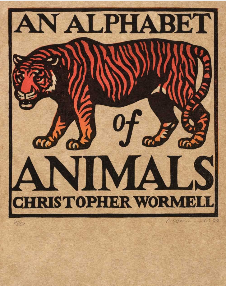
A long time ago I put up a post about Chris Wormell's work for Adnam's brewery at Southwold. (He also did package designs for Waitrose which I regret not keeping). I remember picking up a copy of his book An alphabet of animals at Tate Britain around about that time and thinking it would be a good idea to have one of the linocuts. But I never saw one. Not until today, when I came across the front page of the book up for auction on 8th March at Dominic Winter. And a fine piece of work it is though it is more like a chap-book illustration than an L.H. Jungnickel beast.


By an odd co-incidence, I had an email from a reader this morning where he mentioned a colour woodcut by P.G. Needell and, as it happens, there is a batch of paintings by the same artist, including Mill Hill, Autumn (above) in the sale at Cirencester. It is pure Needell. I am not sure how Dominic Winter came to think it is acrylic. Needell does not strike me as an acrylic sort of chap, but there you are. Stranger things happen. Anyway, judge for yourself.


W.J. Phillips' Jim King's Wharf, Alert Bay, BC from 1927 has the classic colour woodcut manner. It is a well-known image and going by the estimate, the auctioneers must expect to attract attention from buyers in Canada and the United States. The Americans tend to know a good thing when they see one and have been right about colour woodcut all along. To be honest,  I cannot share their enthusiasm for Phillips, but they have always been prepared to pay the necessary dollars for class. And a class act Phillips certainly is.


While we are on class, Edouard Manet's Le chanteur espagnol from 1861 is in this surprising mix of prints. Manet took European art on a trip it has never got over and here he is, at the onset of the etching revival, showing the way the modern artist handles a print. Immediacy is the byword. He uses etching primarily for its expressive and dramatic potential. What we are meant to hear is the clamour of flamenco. Yet for all its vitality, this etching is steeped in the past in a way that only the work of an artist with as original and broad a sensibility as Manet could be.


Allen Seaby colour woodcuts at Cirencester


It makes a change to have two lots of one colour woodcut each being offered for sale by auction instead of everything being included in one lot as happened with Ethel Kirkpatrick not long ago. This time it is the turn of Allen Seaby at Cirencester. On 8th March, Dominic Winter have Twins and a print of a lone rabbit sitting in a field of buttercups and daisies. No-one ever gets the title of the first print right although I must admit I have never known the title of the second. Seaby rarely, if ever, inscribed his prints with the title or the date.


So far as colour woodcuts alone are concerned, Seaby had a long career lasting from about 1900 to 1938. In all, there were at least seventy-two prints and the difficulty with buying Seaby is this. Over that complete period the interest and worth of the woodcuts varied. Seaby often did not know where to stop, which can make buying him an art in itself. At the outset when still a student at Reading, Seaby struggled with the Japanese method. Once he devised his own way of working, the masterpieces began to happen. Most of them were made before the war even if on a number of occasions there was a return to form though I have to say it was almost always with bird prints like Redwings calling (1925) and The cuckoo, also missing from my list. This was commented on at the time but Seaby never took the hint and tried everything from rabbits to ruins and back. The one big exception was the remarkable Trout from 1927 which won the Storrow Prize in Los Angeles in 1927 as was only right.


Twins
is a good print but it is still not Seaby at his very best. His best work has a subtle and uncanny atmosphere unique in modern British printmaking. Like Trout or Redwings calling, one way or another they depend on suspension and in a telling phrase, Seaby went so far as to describe the new proofs floating off the block. By the time he made Twins, his method involved removing wood from the background and taking trial proofs till he was satisfied. I have seen a number of working proofs of both these prints and though I was unconvinced at the time, I can see the approach set the central image free of extraneous detail and left them to hover. Whether Twins achieved the necessary Seaby magic is another thing. As you will see, there were at least two different versions. At the top is the one up for auction in Cirencester while the one above is for sale at the McEwan Galley on Deeside in Scotland. Around that time, Seaby tried out a number of monochrome images which were largely successful though you tend to wonder what the point of it all was. You may wonder whether it is just faded. This is what is both good and bad about buying prints by artists like Seaby. In the end, there is no proper catalogue to refer to and you can sometimes get a bargain. 

At £450, Twins is not in that categoryThe Easter rabbit is probably not as satisfying but the array of buttercups and ox-eye daisies are pretty good and you will probably pay no more for it than the purchaser who had it from Garton & Cooke in 1988. In those far-off days, Robin Garton and Gordon Cooke had an ancient place in Lancashire Court off Old Bond St and had built up a reputation for selling modern British colour woodcuts at prices that took you aback. In 1986, Seaby's The Cuckoo had been on sale at the very modern price of £350 when a Helen Stevenson at £50 from Ayre's bookshop wasn't cheap. Now I only wish had bought two.

Monday, 20 February 2023

Ethel Kirkpatrick: from auction-house to ebay


I know full well that dealers move pictures around. They buy them in one place and immediately try and sell them somewhere else. I am sure many of us have done the same thing at times. I know I have. But the latest example of this kind of behaviour I find depressing and annoying. I am talking about the three Ethel Kirkpatrick colour woodcuts I wrote about recently and which were a bargain when they sold for about £350 I think. No longer a bargain, though. Going under the poncey name of Boston Fine Art, some chancer has the same three prints up for sale at the colossal starting bid of £1,250 each. What gets me is that the individual hasn't even bothered to make a distinction between the three of them.

But let us try and get this greed in perspective. The same outfit has a rather scruffy-looking woodcut by Eric Hesketh Hubbard up for £350. They obviously have no idea because the Hesketh Hubbard is described as a linocut. I mean I quite like Hubbard but only the deranged would pay so much for it. Who are these rogues? And will any of the Kirkpatricks sell? I certainly hope not, but like anything, I suppose, it is worth a try.

The colour woodcuts of Edith Richards


I am not sure why I have never got around to the work of Edith Richards. At one time, colour woodcuts by her could be found online but lacking attribution, like the one of foxgloves above. We were all left guessing. What I can say now is she was born in Cardiff in 1868, and spent time in various places, including Epsom, an affluent area  near London, where she lived with family. 


She also spent time in Cornwall from about 1910 to 1921. By the looks of the large blocks of stone in the print above, this one dates from her time in Cornwall the print above. She obviously trained, because these are properly-made woodcuts, particularly the flower images, which she made in the full Japanese manner. All of the ones here betray the influence of Sidney Lee who worked in Cornwall from the late 1890s onwards and also taught colour woodcut at the Central School in London from 1906. As it happens, I have a black-and-white photocopy of a colour woodcut called Outside the village shop dated 1909, so it is always possible she took Lee's class.


She was a member of the Colour Woodcut Society and exhibited with them and the Graver Printers from 1909 until 1934, including Aigues Mortes (1926) and A Benedictine barn in Greater London (1934), a title that confirms that she had an original point of view (as you can see from the two flower prints here). Yet again, we have a printmaker with a sculptural sense of form. Hence the great blocks of granite!


The four prints held by the National Gallery of Scotland were donated by the collector, Jim Ede, who was born at Penarth near to Cardiff where Richards had grown up. He also trained at Newlyn between 1912 and 1914, so it may be he bought them directly from the artist in Cornwall.  (Ede met his wife in Edinburgh and they went to live there in 1973.)

Richards died at Islington, London, in 1955.


Friday, 10 February 2023

Update on Parker Fine Art on 7th February


There appears to be a definite trend which is in favour of the artists that readers of Modern Printmakers admire. Or, rather I should say, in favour of readers themselves, because the results at Parker's yesterday confirm that if you buy unfashionable art, you will get a bargain. That the William Lee Hankey watercolour and pencil sketch I wrote about this week only managed to achieve £190 is a sign of the times. Lee Hankey is a mixed bag. His models are often awkwardly posed, he can be trite, he can tend to be a costume-drama specialist. But £190 makes little sense.


Loup-de-mer (top) is a good example of the kind of work by him you could look out for, namely a portrait study and a male subject. With its skill, stylishness and sense of a character-part, Lee Hankey's sea-dog ticks the Lee Hankey boxes. But men are less appealing than women and here Lee Hankey tells it straight. Again someone tripped up by translating the French literally as sea-wolf, but that should tell you a lot about auction-houses and the mistakes they make. His Goose-girl (above) would do better I am sure but the genre manner lets him down. Nor can Lee Hankey resist giving the picture a strong dose of chic. The young lady may have been a goose-girl at one time (and may even be the same girl who posed at the age of five for E.C.A. Brown) but she is now playing the Lee Hankey part of lovely young woman with dressed hair and negligent blouse. This over-worked picture also made £53,000 at Christies twenty years ago and shows just what a bargain the buyer had yesterday


Even less fashionable apparently is poor Wilfred Fairclough. I decided to use a photograph of Fairclough in his etching studio to emphasise the professionalism and skill of this artist. How come his Orchard Farm only made fifty quid? This would have been an ebay price at one time. But fifty pounds for each one of his etchings? Just compare Charles Mackie reaching £800 and draw your own conclusions. By comparison, the Mackie was over-priced. Take it from me, Fairclough is a little master of printmaking, Mackie is not. The interest of the Mackie lies as much as anything in the period value and the way he was breaking with convention. The moral remains as it was in the eighties - go for skill, go for the unobtrusive. 

Tuesday, 7 February 2023

William Lee Hankey, Wilfred Fairclough & Charles Mackie at Parker Fine Art


There is a good selection of prints and watercolours coming up at Parker Fine Art at Farnham on 9th February, including fairly expensive work by Laura Knight. Needless to say, Knight is never likely to find approval anywhere on Modern Printmakers. Nevertheless, there is good work by three artists who always will. Top of the list in my own book is Wilfred Fairclough's etching Hambledon orchard from 1943. William Lee Hankey's fine pencil and watercolour of a Pas de Calais scene (above) is the better work, but I would probably go for the Fairclough if I were going to bid (which I am not).

The delicate study of country women finds Lee Hankey at his best - bold, spontaneous and sensitive to light and movement. In fact, everything a watercolour study ought to be. I would guess the scene shown is in the village of Camiers where Elizabeth Christie Austen Brown lived and where the two artists sometimes worked alongside one another. Both were part of the troupe of English and Scottish artists who had settled in and around the town of Etaples from very early in the C20th and who exhibited together after the Graver Printers finally put on their first shows in London and Paris in 1911. Lee Hankey and his wife, Mabel, had a studio in the town, but had a house built at Le Touquet in 1904. He also acted as secretary for the Graver Printers while Brown was a leading figure in the Colour Woodcut Society when it was founded in London in 1920. Their first shows were held at the Macrae Gallery were her brother was proprietor.


It shows if nothing else how closely these artists worked together (and there is another post about Lee Hankey working at Camiers elsewhere on the blog). It may be coincidence, but Charles Mackie also worked near Etaples at the same time though the work offered for sale is from the distinguished and influential colour woodcuts he made of Italian subjects. To begin with, it is beyond me how Parker Fine Art can have made such a mistake with their cataloguing. They describe the print as At the Borghese Gardens in Rome simply because that is what it says on the label. If they paid more attention they would know the view shows San Giorgio Maggiore in Venice, a church which also appears in the work of Ethel Kirkpatrick and Carl Thiemann amongst others. I suppose they thought it might be St. Peter's but the correct title is The Palace Gardens, Venice (below).


About 1904, Mackie received a commission to copy a painting by Diego Velasquez in the Prado. On his way back from Madrid, he stopped off at his brother's flat in Paris then went on to Rouen and painted The return of the flock to the fold in the village of Lefaux only three or four miles from the Browns' home at Camiers. I suspect this was when he became interested once more in colour woodcut because the painting became the basis for a print. But it was after a trip to Venice in 1908 with the Laura and Harold Knight and Adam Bruce Thomson that he began to make the large-scale night scenes that Frank Brangwyn took note of when he was planning his seminal Bruges  portfolio with Yoshijiro Urushibara.

Mackie's method were unorthodox and either you like the end result, or you don't. But the Italian prints are impressive, especially the glorious Ponte degli Alpini, Bassano del Grappa, the one I like best. he had come to know the Knights after a hockey match played at Hinderwell near Staithes when the couple had only just left art school in Nottingham. Mackie took Knight under his wing and once a week she went down to his studio in Staithes where he showed her how to organise her palette. But it didn't really work for either of them and both artists were dogged by an inability to find any kind of working style.


I am going to return to Fairclough in a review of Ian Lowe's book about his work, so all I will say for now is Orchard Farm used to be at Hambledon in Surrey until some affordable homes were built on top of it. What I will add is that Parkers have got the title right on this one, the print comes from the period of his work I like best and there is another batch of proofs plus a later print included in the sale. Fairclough was also in Spain, with the resulting work being austere. After Mackie had been there, the Browns and Lee Hankeys visited the south together about 1906 and where the two friends worked at Granada. What strikes me as remarkable is that British artists and writers like Laurie Lee, Gerald Brennan and Fairclough continued to find the country rewarding long after it had gone out of fashion.


See also 'William Lee Hankey's deserted village' for more about Camiers and his illustrations for Oliver Goldsmith.