Monday, 6 February 2023

Night and day at the Villa Henneberg


Yet again I have been put onto something intriguing by the vigilant Jim Barnes in Scotland. This time it is an unexpected connection between the Scottish art nouveau designer, Margaret MacDonald, and a man who has had considerable coverage over the years on Modern Printmakers. I mean Hugo Henneberg. To be honest, I was unaware of the extent of Henneberg's collecting, but in the photograph (above) from the Austrian magazine Ver Sacrum you can see a smoker's cabinet he bought from MacDonald and her husband, Charles Rennie Mackintosh, after it was exhibited at the 8th Vienna Secession exhibition in 1900.


The two silver-plated panels representing night and day were made for the cabinet by MacDonald in 1899 and were considered lost until they turned up for sale at Dorotheum where they sold for 94,000 euros. That was in December, 2019. As you see, they combine classic elongated art nouveau forms with the eliptical shapes characteristic of the Celtic style which played such a part in the national revival in Scotland and Ireland. The ancient Celtic-speaking people of the maritime coast of Europe were famed for their craftsmanship, particularly in bronze, copper, gold, silver and enamel and, as Simon Esmond Cleary once said, objects like the British torc (below) from 1st Century BC remain the finest things ever made on these islands of ours.


But it was all rather odd the way MacDonald went about it. She wore her own hair the same was as the figure in the panel and the whole approach had a sense of theatricality and dressing up which now appears to be at odds with the stringency of what became modern design. Nevertheless, Scotland made a unique contribution and the purchase of MacDonald and Mackintosh's work by such an innovatory artist was typical of the eclecticism of so much modern art (though eclectic may not be the word art historians would make use of).


Henneberg may already have been thinking about a setting for his new piece of furniture because soon afterwards he asked Josef Hoffman to design a house as part of a group of four artist's residences on the Hohe Warte in the hills above Vienna. The semi-detached houses occupied by the artist, Carl Moll, and designer Koloman Moser were covered some years ago in a post called ' Carl Moll: secessio plebis in montem sacrum'. It was a title I could not resist. Nor could another well-known blogger resist the idea I had had because it was immediately plagiarised much to everyone's disbelief.


The Villa Henneberg in particular gave expression to the idea that fine art, design, architecture, gardening and music all belonged together in the same domestic setting, even if it was nit a very comfortable one. Dress reform also played its part as you can see from the photograph of MacDonald. Gustave Klimt was famous for wandering about in long loose gown and Henneberg went to him for a portrait of his wife, Marie, to hang above the over-scale fireplace in the large hall, which you can see in the immaculate maquette above. It was made deliberately hard to say whether you were inside or out. The trellis pattern was borrowed from garden design and it naturally played a part outside.


The house was completed in 1902 in a style which I can feel no great enthusiasm for and which I suspect would generally be regarded to day as laboured if not heavy-going. What it gained in originality, it lost in charm. I used to think that was the way it was with the secession but it was much the same with other artist's houses. About 1906, Pierre-Auguste Renoir had a house built in a gnarled old olive grove above Cagnes sur Mer near Nice. Supposedly based on a local style of farmhouse, the exterior is striking for its overall lack of appeal, but is full of exquisite detail and such a a refined sense of colour, it makes the National Trust look like beginners.


See also 'Hugo Henneberg and the history of linocut' and 'Hugo Henneberg, the first linocut virtuoso'.

Thursday, 2 February 2023

Arthur Rigden Read's 'The mandarin gown' at Bentley's


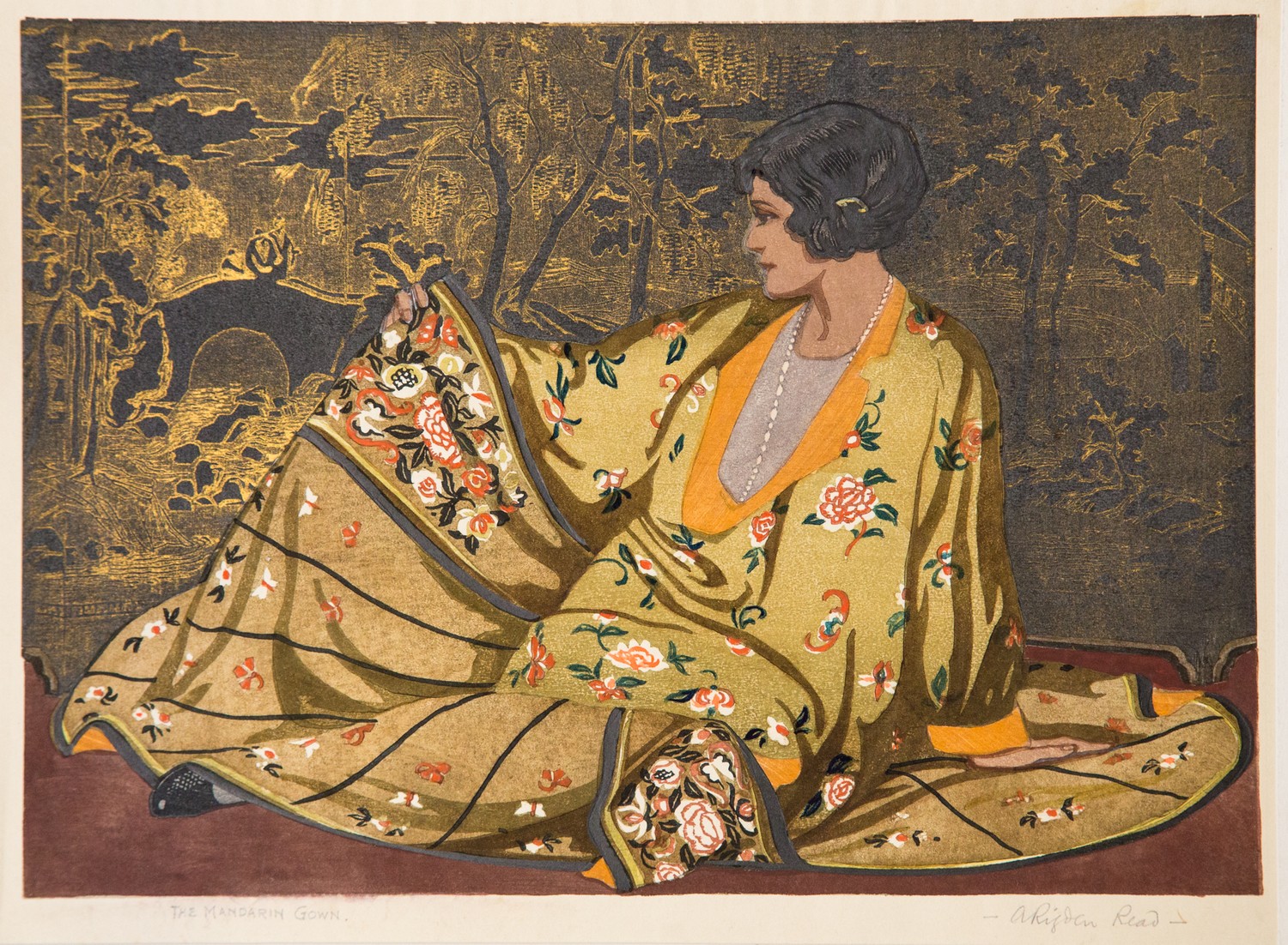
Perhaps things are looking up for colour woodcut, because I now hear that Arthur Rigden Read's show-stopper The mandarin gown (1927) is up for sale this coming Saturday (4th February) at Bentley's in Kent. It is in a job lot, but the Read should be the item of interest so far as I can see and, as with the Kirkpatricks, the estimate is on the low side. It depicts Kathleen Rigden Read wearing a glamourous Chinese gown with a decorative Chinese screen behind her. I will admit, I was rather appalled when I first saw this print. The combination of ruthless overkill and Read's willingness to represent his wife in yet another flattering gown was too much even for one such as myself inured to the runaway theatricality of British colour woodcut. But it has grown on me over time and, let's face it, the execution of such a complicated print is admirable. I mean, who else could have pulled it off? It would be a mistake to come to Read looking for the sensitivity of a Giles or Seaby. What you should expect from him at his best is showmanship and wit.


 It is also important to tell you this: Read made two versions of The mandarin gown. The one at Bentley's is the less expensive one, in a lower key and with a black and white background. The full throttle version (above) is simply the most unusual colour woodcut made by any British or American artist that I can think of in the twenties. That does not mean it is the best, but it does mean it overtops everyone else and that in a field where restraint was hardly a byword. Sad to say, Bentley's do not have the golden version, so you must content yourself with something less outrageous, but worth having all the same.

Three Ethel Kirkpatricks at auction


I heard only this morning that Dreweatts in Newbury have three colour woodcuts by the British artist, Ethel Kirkpatrick, in their forthcoming sale on 10th February. As readers of long-standing will know, I admire Kirkpatrick and I would happily bid for at least two of these prints, but unfortunately, Dreweatts have decided to sell all three as one lot, which may mean they will all be knocked down to the trade. All the same, I thought it was well worth readers knowing about the latest development and seeing for themselves how the sale unfolds.


Kirkpatrick does not come up for sale all that often and although none of these prints are must-haves so far as I am concerned, she was such a subtle colourist and so good at what she did, at the right price, any of these are well worth buying. But how many people want three boat prints? The classic image is Brixham trawlers (above) from 1923 or 1924 (there were two versions). In common with many of her fishing-boat prints made of Cornish subjects before the first war, the main action is in the centre of the image and where most of the cutting is done. It may not look all that much here, but I can assure readers that once you have this print in front of you, its subtlety and attractiveness will be obvious.


Kirkpatrick almost certainly studied with Frank Morley Fletcher at the Central School of Arts and Crafts about 1899. She was a students of jewellery-making there at the time and I think these fine prints complement the jewellery she was learning to make. Her careful craftsmanship says a lot about the approach Fletcher took and like his, these prints are faithful to the traditions of Japanese printmaking. But Brixham trawlers has a vivacity, spontaneity and magic you could look for in Fletcher, but would not find. Like Seaby, Kirkpatrick became the master of the medium. Fletcher was too often its servant.


The canal (second from the top) from 1922 is closer to the kind of pictures Fletcher was making about 1908. The old imagism has been abandoned in favour of a description of the canal and the surrounding country. Again, it is very well-made and would grace any collection of colour woodcuts. It exists in another version which I have included (third from the top) although the one for sale is the best known. I am entranced as I always am by the hills and sky. This was where she was often at her most Japanese and perhaps her most successful. 

Finally, there is Communications, past and present from 1924. For me, this depends far too much on perspective and is my least favourite of all her prints, but it is nevertheless another very well-made piece of work. Interestingly enough, Alan Guest does not have this on his check-list, which must include all the work she exhibited with the Graver Printers from 1912 onwards. If you include her first watercolours, she had an impressive career of more than forty years, including her first visit to Newlyn in 1894 and her final colour woodcut exhibited in 1932. She made at least thirty-four prints, including the small colour linocut Marigolds, (though Alan Guest included one or two variants in his list). Even so, it is a fair old number and is probably equal to the output of William Giles and Arthur Rigden Read. It needs to be said that neither of them could claim to have worked from the mid-1880s onwards as she had done and, really, it is extraordinary that the span of her career covered such very different periods and that she nevertheless managed to hold her own. Whatever you buy then, almost every print is more than a mere persuasive sheet of enchantment.

Saturday, 21 January 2023

Four colour woodcuts by Patience Galloway


This week's sale of colour prints at Exeter has reminded me that Patience Galloway is overdue a re-appraisal. I suspect, she is Isabel Patience Galloway (1900 - 1979) from Blackheath, Kent but with family connections in Hampshire and the Isle of Wight. I was unaware she had two prints in the sale at all until a reader tipped me off. But, as I said about the Boxsius linocuts, I saw the auction at Bearne's as a sign of the way the market is going and, as I suspected, prices are falling. Galloway is not a woodcut artist of the best sort, but if you don't pay too much, they are worth having. But £90 for two of them is a bargain.


The second print in the sale (above) usually has some fanciful title attached by a dealer or auction-house that declares the man to be a faggot-gatherer. If it sounds like tosh, that is because it is. No doubt this little piece of speculation has been derived from French genre painting. In my opinion the correct title is 'A Yorkshire woodman'. It was exhibited with the Graver Printers in London in 1938 and there is no record of a faggot-gatherer anywhere. With any re-appraisal, the first job is to get the title, date and medium right, so this is a start. Unlike many of her contemporaries, Galloway dispensed with a key-block and instead made use of deep shadow to model her subjects. This can make them look like lino and flat and rather generic. That said, she is strong on atmosphere and as this was the first time a good image of 'The old waggon' has appeared online, it provides an opportunity to have a second look. I think she comes out of it well. Not only are the haystacks, elms and the hayfield done well, the colours are lively and subtle, the waggon memorable. Mechanisation is implicit in the striped hay-meadow and the rugged grandeur iof the vehicle is self-evident despite having become somewhere for children to play.


The consensus of opinion is that some of the subjects are Welsh. Certainly, 'Moel Siabod' (above) is part of the Snowdonia range in north Wales. There are also watercolours, which auctioneers have described as showing lochs or tarns, but are more likely to be Welsh mountain lakes simply by association with Moel Siabod and another Welsh title.

One thing I like about Galloway is her consistency, both in the way she achieves a distinctive, subdued tone and the way she chooses her subjects. There is an unusual interest in mechanics. Both means of transport obviously work, one ancient, one brand-new. But there is a less obvious connection between the woodman and the waggon. As late as the 1930s, woodmen on large farms were also carpenters and were responsible for making and mending farm vehicles. Galloway's woodman may look like a toiling labourer but some of them were skilled. Note also the way she distinguishes between elm and beech and the way she describes the marks left by the reaping machine in 'The old waggon'.


It says in my notes that the yacht in 'On the Solent' (1937) is a Solent Sunbeam, a day racing-yacht designed by Alfred Westmacott and first built in 1923. I have no idea where this came from but as I know precious little about the artist, any information at all is worth having. But here we have a clue. In 1899, Westmacott had taken over a boatyard called Woodnutts (below) on the Isle of Wight not far from Bembridge. This was where our redoubtable sea-going twins, Concord and Cavendish Morton, went to live some years after they have learned to build boats and to make colour woodcuts. (See their post for further details). 

All I can add is two further titles - 'Llewedd' (1938) and 'Pines at sunset'.


Sunday, 15 January 2023

Gertrude Brodie's 'View from my Essex window'


I am sure readers will remember the second of two posts about a series of conte crayon and gouache drawings by the Essex artist and teacher, Gertrude Brodie, which I called 'The lamps of Settle'. I am pleased to say yet another drawing by this sensitive artist appeared on the British auction calendar in November, this time an intimate and subtle view of the Essex countryside from the artist's bedroom window.

The picture went up for sale in Scarborough in November, but apparently did not sell. The auction certainly had no sale price up and presumably it didn't reach its reserve. This can be the only explanation because, as you see, the work was drawn to the same high standard as my own The hill over Settle and Castle Hill, Settle (below).


The device of looking from a window was employed by a number of British C20th artists, including Lucien Pissarro, Arthur Rigden Read, Claughton Pellew and John Nash. I hardly need to say that Brodie is classic Modern Printmakers, a skilled, rather literary artist whose talent was ignored when British art became pseudo-modern. Fortunately, provincial auction houses take note of Modern Printmakers and put Brodie into some kind of a context when they offer her work for sale. Admittedly, that doesn't happen very often. Castle Hill, Settle went for £460. Please take note. Because there will be more.

Friday, 13 January 2023

The colour woodcut class at Edinburgh College of Art


It has been believed for many years now that Frank Morley Fletcher taught a colour woodcut class during his time as principal of Edinburgh College of Art, a period that ran from 1907 to 1923. I want to try and lay this for to rest once and for all. He did not. And while I am at it neither did Mabel Royds. The reasons are different, but the outcome is the same.

In order to gain a teaching post at any state school in Britain, you needed a teacher's diploma. Royds had one from Chester, her husband, E.S. Lumsden, William Giles and Allen Seaby all had one from University College, Reading, S.G. Boxsius had one from Islington, Chica McNabb and Ian Fleming had theirs from Glasgow and Helen Stevenson from Edinburgh. The whole point of the state art school was to train teachers. It has been a famous and long-lived complaint that students went to art school to become artists and were subsequently told that was not why they were there. Fletcher never set foot as a student in any state art school. The myth may have come about because he taught a class at the Central School of Arts and Crafts in London. But those schools were not run but the state. Rather they were the responsibility of new statutory authorities set up by the government and had the own independent boards of education. This meant that these vocational schools could employ working practitioners like May Morris and Edward Johnston. More likely, though, misconceptions about Fletcher are merely based on assumption.


If there appears to be a discrepancy, it centres round this fact. Many headmasters of art school came straight from what was effectively post-graduate study at the Royal College of Art in London. To Walter Crane, its first principal, the R.C.A. was 'a teacher mill'. (Nor did the chief agitator last long in the post.) It was taken for granted that a graduate would get a job as headmaster once they came out. John Platt (above, painted by Fletcher at Robin Fedden's house in France in 1922) went to Leek and Thomas Todd Blaylock went to Bournemouth. So, why was Fletcher eligible for the post at Edinburgh? Like Crane, he had no qualifications. I can only assume the post of principal involved no classroom teaching. But there were ways round the system apparently. Walter Phillips only taught in private school in Britain but did gain employment at the Technical Institute in Winnipeg.


So, why didn't Royds teach colour woodcut at Edinburgh? ('Edinburgh Castle' above is her only print showing the city). Because she was employed on the fine art course and colour woodcut was taught on the applied arts course where Platt was head of department for a few years. The only Scottish colour woodcut artist I know of who trained under Platt, was Stevenson. I have never come across anyone else, though I assume others may have studied the technique.

Going back to the Royal College, the most famous modern artist to have come out of the British system is David Hockney. He began at Bradford, then went on to the R.C.A. and Hockney, for all his Celtic exuberance, retains an academic feel to this day. Another popular and accessible artist is Eric Ravilious who trained at Eastbourne and only got into the R.C.A. by chance when a successful candidate dropped out. Unbelievably, there were no entrance exams as there were for the Beaux Arts in France. Instead, each school was allowed two places per year and if you didn't get in, that was it. Even then, Ravilious was assigned to the applied arts department not fine art.

In its defence, one of the great strengths of the British system was its draughtsmanship based on drawing from the model, although this was by and large imported from France by artists who has studied at the academies in Paris. This takes us back to Fletcher who not only studied in Paris, but went on to take a life class at the Central School.


Fletcher's legacy depends on this handbook published in 1916 (above) and which ran to three editions. Possibly in defence of Fletcher, Arthur Rigden Read said that everything he knew came from that man. This is unlikely to be entirely true, because he must have learned something from Urushibara, too. But it does suggest he learned to make colour woodcuts using Fletcher's book. How many others did? I know for certain that Steven Hutchins did in the 1980s. So, as you see, there was a class in Edinburgh after all and it went by the name of 'Woodblock printing'.


Monday, 9 January 2023

Font size


Not surprisingly, there has been comment about the change in font size on the blog and I want to reassure readers that the change of size within some of the individual posts is not an eccentricity, but a failure on my own part to control the new system adequately.

I remain open to suggestions from readers, but I may not be able to reproduce the flawless script of this alabaster plaque from the 1570s at the Priory Church of St Michael at Breedon-on-the-Hill, Leicestershire. Nor will I be entertaining you in Tudor Latin.

For the historians and place-name enthusiasts amongst you, Breedon partly derives from the British word 'briga'. The most recent scholarship by Alan James, who now lives at Kirkcudbright, is definitive. He says it means 'a fortified place'. The church is built within a defensive compound of something like the second or first century BC.