Saturday, 7 January 2023

S.G. Boxsius for sale by auction


Coming up on 18th January at Bearnes in Exeter are two fairly early colour linocuts by S.G. Boxsius. The main attraction will be his early technicolour masterpiece, Rain, St. Michael's Mount, depicting the famous island at the end of its causeway underneath some of the most improbable cloud and light effects in colour print history. The colours are intensely weird, the detail sublime. Be warned, though. The premium is 36%, including tax.


Boxsius began exhibiting work at the Royal Academy in 1913, soon after he graduated from the Royal College of Art, but no prints appeared until Rain, St. Michael's Mount was exhibited at the Royal Society of Arts in 1928. It was then sent to the Graver Printers in 1930. Why this happened, I do not know. William Giles was probably his teacher during his first period of study at the R.C.A. between 1898 and 1899. Giles thought well enough of Boxsius to ask for an article about linocut for 'The colour print journal'. The feeling was mutual. Aside from the coastline of Cornwall, the main inspiration for Rain, St. Michael' Mount was Giles' ravishing Rainbow, Isle of Jura (above) made after a visit he and his wife made to Jura in 1922. Typically, Boxsius turned the whole thing on its head and took Giles' very large print and reduced its size considerably. (He went on to do the same thing with Georges Seurat's Bathers, Asnieres acquired by the Tate Gallery from the French collector and dealer, Felix Feneon in 1926.)


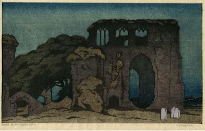
The second print in the sale is Ruins at Walberswick (above) which I have written about already. I tend to think it shows the influence of Elizabeth Keith's East Gate, Seoul. It also became a model for an early Eric Slater print. Anything by Boxsius is worth having. What you will have to pay is another thing. But we can all take this as an indicator of how prices are going. Judging by the Slater fetching £500, it does not necessarily mean they are rising

Friday, 6 January 2023

Frances Blair: woodcuts, linocuts and a check-list


It is now ten years since I posted on the Scottish artist, Frances Merritt Blair (1881 - 1954) and in that time no new images of her colour prints have appeared online (so far as I know). This obviously means that her work is rare and may help to explain why The brown sail (above) went for a relatively low price when it came up for auction in this country in the autumn.

I decided the best way forward was to publish a check-list of all the recorded colour prints made by this very attractive and able artist and to add any further details I have picked up about her career since I last wrote about her.


It will not be much. She exhibited prints in Scotland, England, the U.S. and Australia between 1925 and 1946. Part of the time at least, she was working in Cornwall, with Helen Stevenson acting as contact from her home on Comiston Drive in Edinburgh. In February, 1926, Blair exhibited alongside Stevenson and Iain MacNab at the Society of California Printmakers and where Cornish cream shop (above), a depiction of Harris' dairy in Penzance in Cornwall, was bought by the Los Angeles Museum. In the November she became a member of the Society of Scottish Artists in their applied art section. There was also New colour woodcuts at the Grosvenor Gallery in Sydney in 1929 alongside two other stylish artists, namely Margaret Preston and Norbertine von Bresslern Roth.

Blair was working in Cornwall in the mid-twenties only and went back to live in Edinburgh where Jim Barnes has discovered various addresses for her. But that is about all the biography we have.

Cornish cream shop has been described as a linocut, but I cannot tell from the image what it is. No-one researching Blair has come up with any further references to lino. Nevertheless, it is still worth giving a basic rundown of what was happening in Scotland and England in regard to colour print. The early history of colour linocut for either country has not so far been published until now. So, here it is.

In 1921, Claude Flight made two colour linocuts, L'Arc de Triomphe and Trinity College and St. John's Chapel. The same year, there was an exhibition of child art (including linocuts) from the children's art class held at the School of Applied Arts in Vienna where the colour linocut artist, Hugo Henneberg, was a teacher. That same year, Dryad Crafts in Leicester published a pamphlet by Allen Seaby called Handprinting in colour. Probably Anna Hotchkis' Autumn in Galloway was made about the same time. The subject is Little Boreland at Gatehouse of Fleet. Hotchkis was a regular visitor to Kircudbright between 1915 and 1922 when she left Scotland to teach in China.

Following the child art exhibition, Flight radically changed style and made Trawler down the wave and Swing-boats (both 1921) using a vigorous, modern manner. In 1924, the Graver Printers in London showed colour linocuts for the first time, including de B. Lockyer's Near Vevey and Evening afterglow, Bordighera. The latter title is evidently influenced by William Giles who then asked S.G. Boxsius for an article about linocut for The Colour Print Journal in 1925 or thereabouts. This was never published, because the journal folded, but the same year Dryad brought out Seaby's Colour printing in linoleum and woodblocks.

Meanwhile, Glasgow became the first British school of art to put linocut on the syllabus when Chica McNabb included the medium in her course on relief print methods. This only ran between 1926 and 1927 when McNabb married and gave up work. That year, her brother, Iain, asked Flight to take a weekly class at the Grosvenor School of Modern Art in London. In 1927, Flight also published Lino-Cut. This was based on a series of articles he had written to promote the use of lino among artists rather than for use in schools and is the most important book written about linocut during the period.

The whole issue surrounding the use of wood and lino was beset with the kind of invective, snobbery and doctrinaire purism that the 1920s were so good at. It is in equal parts hilarious and infuriating.

Whatever the medium was Blair used, the approach is interesting. Look at the way she handles both the boats, the sail and the way she groups the houses across the bay. This way of looking at her subject was even more pronounced in her view of Harris' dairy in Penzance. The two prints are more mature than their faux naif style suggests. 


The check-list below has all the information available to me and includes contributions relating to English sources by Alan Guest from the 1980s while Jim Barnes recently supplied the same number of records for Scotland. For further information about the history of colour linocut, see the posts about Hugo Henneberg and Chica MacNabb.


Mousehole colour woodcut. Royal Scottish Academy 1925, Los Angeles 1926.

Cornish cream shop colour linocut, 1925. Los Angeles and Royal Glasgow Institute 1926. Illustrated The Studio, 1927, p 435.

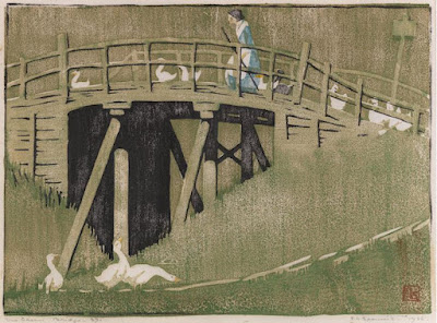
The little bridge colour woodcut. Royal Scottish Academy and Graver Printers 1925.  

At the Trossachs Graver Printers, Royal Glasgow Institute and Los Angeles, 1926

The brown sail colour woodcut. Graver Printers 1927 and Royal Scottish Academy 1935.

The woods o' Dee colour woodcut. Royal Scottish Academy and Royal Glasgow Institute 1927, Graver Printers 1928.

Lairig Pass Royal Glasgow Institute 1927. 

Blue Waters of Lorne colour woodcut. Royal Glasgow Institute 1929, Graver Printers 1930, Royal Scottish Academy, 1935.

Old mill of Gairn Aberdeen Artists Society 1929.

Flamboyant trees colour woodcut. Graver Printers 1931.

Hen farm Colour Woodcut Society 1931.

Horse range gorze, New Zealand. Colour Woodcut Society 1931.

Up a hill in Devon colour woodcut. Royal Scottish Academy, Graver Printers, Colour Woodcut Society 1931, Royal Glasgow Institute 1932.

A lane in Devon colour woodcut. Royal Scottish Academy 1932.

East Lothian Aberdeen Artists Society 1932.

White sand, Morar colour woodcut  Royal Glasgow Institute 1932.

Evening, Morar  Colour woodcut. Royal Glasgow Institute 1934, Graver Printers 1935.

A Sussex mill  Graver Printers 1935.


Tuesday, 3 January 2023

The colour linocuts of Berta Coucke


I suspect your first reaction to Flemish artist, Berta Coucke, and her colour linocut Les deux chateaux (above) that at last here is one of those Grosvenor School artists who is talented and likeable. As usual with many of the women who studied at the Grosvenor, there is no evidence that she did apart from the obvious Grosvenor techniques she employed and that some of her work toured with the Fourth exhibition of British linocut in 1933.


Claude Flight had left the Grosvenor three years previously, but the technique of basing images on drawings, trying out various blocs of colour, using a roller and overprinting the whole paper more or less, suggests she did train with him. The style of the prints also suggests she knew the work of Lill Tschudi.


The skinny, would-be modern figures (above) are typical of the style Flight himself was using in the late twenties. More intriguing is the manner of Les deux chateaux. This is also comparable to Flight's work of about 1932 and 1933 when he returned to more conventional landscape after he visited Tschudi in Switzerland. But as always with Grosvenor, the individuality of the artist is obscured by the prescriptive approach of the teacher. But then, they were all there for too short a time to develop and the class was held only once a week.


I know nothing more about her but I can tell you the preparatory drawing at the bottom turned up on ebay so it is worth bearing in mind that pages from her sketch-book are about. The fortune-teller (above) has the chic of French graphic art of the 1920s. But there is also a hint of the teacher-student relationship. By all accounts, Flight was an enthusiastic and engaging teacher who treated everyone like artists, but it was nevertheless impossible for them to avoid the forcefulness of his approach.


These are quite canny prints and it is a shame there are not more of them about. The final image of the dancers (above) suggests an artist who was half-way to genuine abstraction and who gift for design and colour. My guess from all this is that Couke's real interest was in fashion. Before the war, the students on the fashion course at the Wiener Werkstaette had been asked to use colour linocuts in their portfiolios and the dancers above gives you an idea why.


Thanks are due to Paramour Fine Art for Les deux chateaux and to Larkhall Fine Art for The fortune-teller. It is £600. The dancers are in the Fine Art Museum of San Francisco

Monday, 2 January 2023

Eric Slater at auction


I was surprised to see Eric Slater's colour woodcut The Avenue sold for only £500 in the autumn. As readers will know, I am not a big fan of Slater, but this print is one of his better landscapes and it does not appear to be faded. Possibly Slater has had his day, but it also strikes me people may be holding back. It was the same story with the Rigden Reads that sold in Gloucestershire in October. Many were not in all that good condition, although that has not put people off in the past. The highest price was £900 for his most illustrious print and like Slater, Read was getting a thousand easily at one stage.

According to James Trollope, The Avenue dates from circa 1936, which puts it towards the end of his career making colour woodcuts. The last one appeared in 1938 and by the time he made The Avenue, the images were more subtle and sophisticated than previously. As there is no colour image of the print in 'Slater's Sussex' and nothing of a reasonable size online, I thought this was well worth putting up. Perhaps now is the time to buy. 


Thursday, 29 December 2022

On holiday with Helen Stevenson


Like S.G. Boxsius, Helen Stevenson was one of those artists who did her best work after visiting somewhere on holiday. This is not meant to imply that she was in some way an amateur, but like Boxsius, she had a job as a teacher of art and the places she made the subjects for her colour woodcuts were far-removed from the place where she worked. But then Edinburgh was not a colour-woodcut place. It appears only once in the work of Mabel Royds and once in John  Platt (Murrayfield presumably). Stevenson looked westwards, to the braes, glens and lochs of Argyll and the Isle of Arran, off its southern coast. 


In Brodick Bay (top) was exhibited with the Graver Printers in London in 1930, following The coal boat (above) in early 1929. As both prints depict locations on Arran, she presumably visited the island in 1928. What is striking about the later print is how much more accomplished it is. Perhaps Stevenson realised there was not enough happening in The coal boat and went looking for ideas from another source. If anything, by comparison, In Brodick Bay has too much to say for itself.  


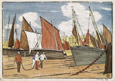
Brodick is the main town on the island and the place where the ferry arrives and most of the hotels are located, so it made an obvious and convenient subject. And notice how carefully she was followed by Boxsius in Bowsprits (1933), The Waterwitch (1934) and The bargeman (above). It was in Boxsius' approach to copy and expand (and improve on). More to the point is what he ignores (or misses). In Brodick Bay has an unmistakeable reference to the work of Hokusai in the stylised use of Prussian blue. The Boxsius way is almost always more art deco than Stevenson, his wife is a modern wife, engaging with the locals. Stevenson's characters are only absorbed in what they are doing. She has left the self-consciousness of Comiston Drive (where she lived) behind her.


In Brodick Bay  works on two levels (if not three). There is the sense of scale achieved by using larger and smaller boats and the complexity of human life set against the bare fell across the bay. What artists like Stevenson and Boxsius rarely achieved was the very different visual take on life summarised by Hokusai in his comic view of shipwreck from 36 views of Mount Fuji, c 1830 - 1832 (above). Note how the Scottish artist emphasises the foreground and relates it to the background where she leaves us to compare Goatfell with Mount Fuji, if we so wish. The Japanese artist, meanwhile, has no foreground to speak of and gives the mountain an area to itself. The outlandish scale is made to suggest his boat is an Ark come aground, or a sea-monster. For him, Fuji is both in the immediate foreground and superior to everything else. 


Monday, 13 December 2021

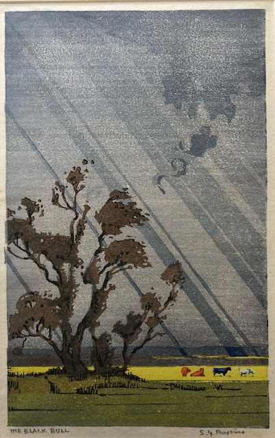
The black bull: the print catalogue of S.G. Boxsius


The only way a collector of prints made by an individual artist can really know what they are doing is to have a catalogue if their work. Even now, very few of the colour print artists who have featured on Modern Printmakers have anything like an adequate catalogue but they do exist, both in the United States and the U.K. Notable among them are the catalogues put together in Britain by James Trollope for Arthur Rigden Read and Eric Slater. There are also well-produced hardback catalogues for the prints of Norma Bassett Hall, Edna Boies Hopkins, Walter Phillips and Sydney Lee. Then there are further catalogues for three artists associated with the Grosvenor School, namely Claude Flight, Cyril Power and Sybil Andrews. Finally, there is the compendious catalogue for Yoshijiro Urushibara and the meticulous catalogue for John Platt produced by Hilary Chapman.

As a curator at the V&A once warned me, it can take years to put together proper catalogues like these and while this is true, a working document of some sort can also also very useful. For example, I know of check lists for Mabel Royds, Ian Cheyne, Helen Stevenson and Kenneth Broad put together by individuals or by two people working together (as I did with Broad's grandson). The print catalogue for S.G. Boxsius is ongoing and The black bull (featured at the top) tells you why. The image was sent to me by a reader only quite recently. Not only had I never seen it before, I had never even heard of it simply because there is no exhibition record for it - at least not that I know of.

Boxsius often tried to create mood in his prints one way or another. The black bull was not the only occasion he attempted to catch the fleeting effect of sunshine and rain that is typical of Britain, specially near the coast. Corfe Castle is one print people will know. There is also Rain, St, Michael's Mount where his attempt to depict falling rain tends to spoil what is otherwise a beautifully made print. With The black bull he decided on a more stylised effect and although the rays remind me of the sunburst on my grandmother's 1930s drive-way gate, it does ring true to the period and without doubt he gets away with it.


Another print that I came across only this year was his linocut Ruins at Walberswick (above) which I have talked about in a previous post. All this only goes to show that there are almost certainly others which are in private or public collections like these two. As institutions like the University of Wales and the National Gallery of Scotland put more of their collections online, we are gradually getting a better idea of the range of  work [produced by artists like Boxsius. But it is the same for Modern Printmakers. As readers send in images that are new, the more we get an idea of just how many prints he made. In all, I have records for forty colour woodcuts or colour linocuts and most of these I can match up with images. There are a few like Wind and Pines that may be hiding somewhere. It is hard to say but I tend to think there are other prints by Boxsius still out there. One reason I say this is because after his death, his wife, Daisy, kept much of his preparatory work which was then inherited by members of her family. It has always been believed there was a studio sale at some stage after Boxsius' death. Whatever happened, the watercolour designs and sketchbooks that survive are exceptional not only in their quality but by the very fact that they have survived at all. No one that I know of except for Mable Royds left so much studio material behind them and this makes the preparation of a Boxsius catalogue as rewarding as it is demanding.


At least one preparatory drawing I have seen matches the linocut Twilight at Winchelsea. It shows Boxsius making meticulous drawings he then transposed to wood or lino. Alongside many of the designs, he there are colour charts with notes. Unfortunately, the images I was sent are not square but I have decided to post one of the drawings which looks to me like a design for a linocut. This should give readers a better idea of the way the artist worked and may encourage people to send in other images. There is no colour chart beside this one, but it is the best image I have and the best example of the careful planning Boxsius undertook before cutting the block.


There are two problems when it comes to putting together any kind of Boxsius catalogue. Firstly, no one has any real idea when he began making colour prints. He may have begun as early as 1899 to 1900 when he was a student at the Royal College of Art. William Giles was probably teaching there at the time and published his first colour woodcut in 1900. A number of Boxsius prints owe a debt to Giles and in 1926 he wrote an article about linocut for Giles' Colour Print Magazine. Obviously this means that Giles must have known his linocuts by then. Boxsius certainly knew Ethel Spower's The green bridge (above) also from 1926 and made after a visit to Walberswick. The fact that both artists worked at Walberswick is too much of a coincidence and the figure on the bridge could be Daisy Boxsius taking a break from making watercolours. After all Boxsius placed what looks the same woman on the same bridge!


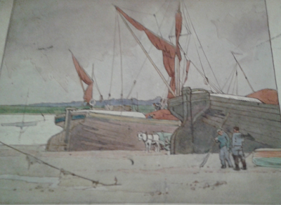
But as you all know by now matters are never straightforward when it comes to Boxsius. Another artist who depicted the Kissing Bridge was Sydney Lee and the other possibility is that Boxsius took Lee's colour woodcut class at the Central School some time after 1906. Boxsius owed more to Lee than he did to Giles. You only need to compare Lee's Drying sails, St. Ives (above) to the drawing by Boxsius below to appreciate the way Boxsius used the work of other artists as a starting-point. It is not the same but they are similar in scale though Boxsius' figures are greater style and charm than Lee's. So far as I know no-one was using lino in Britain at the time Lee was running his colour woodcut and wood-engraving class in London but Boxsius must have been making them soon after the end of the first war. There is nothing exceptional about that. What is unusual is the way he used both wood and lino. Most artists who did used both were like Isabel de B. Lockyer, Anna Findlay or Spowers who all used wood before adopting lino from the early to mid twenties onwards. Boxsius first exhibition date is for the linocut Rain, St. Michael's Mount in 1928 when he was already fifty years old.


This leads us to the other problem anyone would be faced with when putting together a Boxsius catalogue: how does anyone date the prints? None of them are dated and the exhibition record is patchy considering we now know of forty prints. It may be the first record we have for him, but Rain, St. Michael's Mount is obviously not an early work. But then how many obviously early prints are there? To my mind, there is only Old mill, Sussex. All the rest are the work of an experienced printmaker which can only mean that Boxsius had been more concerned with teaching others how to make prints rather producing professional work himself. It also suggests that making prints for exhibition should be classified as the special achievement of a mature artist in line with, say, the superb results gained by Arabella Rankin when she began making colour woodcuts at the age of fifty or Mabel Royds great flowers prints made during the last ten years of her life. All three of them were class performers and prove how far maturity can win out for artists who are determined and have the nerve to break loose.


Sunday, 5 December 2021

Ian Cheyne, S.G. Boxsius & John Hall Thorpe at Mallam's


I owe a debt to the two readers who wrote to tell me about the forthcoming sale of modern prints at Mallam's in Oxford on Wednesday, 8th December. It is not only a matter of the sale including an artist who I like as much as many other readers do. The sale includes many prints by post-war British artists, including members of the the well-known group like Patrick Caulfield, Allen Jones and David Hockney who all studied at the Royal College of Art in the early 1960s. When I began this blog, none of us would have predicted that a teacher-graduate of the R.C.A. in the 1920s like S.G. Boxsius would find a place among  professional artists like Caulfield and Jones. But here is he is, with two woodcuts and a linocut, which attest to the central place the R.C.A. has had for post-graduate studies in Britain for many years now.


It is all about money. We all all know that if  Boxsius prices had not been going up, he would not be there alongside bankable artists like Ian Cheyne and John Hall Thorpe and the information they give about the prints is wrong. But starting with Cheyne (top) Loch Shiel is one of the later, more decorative prints he made in the thirties and went up for sale first in 1937. Like all his prints, Loch Shiel is exceptionally well-made and designed and as Cheynes don't come on the market that often, it should sell for a good price. Generally, I prefer the earlier ones but anything by him is worth having.


Mallam's in common with so many people before' have decided Boxsius' Autumn (second from the top) depicts summer. It is the less common one where the farmhouse has a yellow roof and like most of them is signed only in the block. The print was based on a drawing still owned by a member of the family but the trees have been made far bigger and the effect of the olive green against the sky in the top left corner is magnificent. Also notable is the faint view across the bay, a typical Boxsius piece of subtlety which is possibly at its best here. Made in 1930, there was also an edition though I have never come across an record of it being exhibited anywhere. Also included in the sale is By the quay, Looe, (above) given a first viewing online here only a few weeks ago and if their cataloguer read Modern Printmakers, he would not have made the obvious mistake of saying it was a woodcut. The majority of his prints were lino, though to be fair, it is never easy to say which is which.


Also up for auction are a number of flower prints by John Hall Thorpe, including this one of forget-me-nots and daisies which I have never seem before. There is one early print called forget-me-nots where the main flower is, in fact, primulas, but that one is typical of his style while the one above is bolder and could be one of the woodcuts sold at his first London exhibitions in 1919. Unusually, the area outside the black background is printed in blue. I am not sure what is happening there and I can't think of any other example like it.