.
I cannot explain why it has taken me so long to get round to the colour woodcuts of Dagmar Hooge. First impressions counted and that is for sure. Nonetheless, I am surprised they have proved so indelible. Hooge was one of the very first woodcut artists I came across. I have a dim recall of a smudgy print of flowers but as we were all in the habit of dismissing artists we saw very little of and knew absolutely nothing about, that was where she stayed. Our scale of values tended to be as whimsical as the period we loved. If it was a Thiemann, of course we wanted one. If it was anyone else who happened to be Austrian or German, frankly, we could not have cared less. We were a coterie in the know, that was what mattered. You picked up a Hans Frank for less than a tenner and that was the end of it.

A lot of course depends on what chance brings your way. Hooge was being sold in this country after the first war. Provincial galleries like Nottingham Castle Museum bought them from small commercial galleries along with Ohara Koson and the Frank brothers and you can still come across the names of German and Austrian artists in newspapers of the period. More to the point, in recent years, good prints by her have turned up at auction in Norwich and Crewkerne as well as London and Lone Jack, Missouri, so I will try and adjust.

Hooge was born in Hamburg in 1870, making her a contemporary of Allen Seaby. Like him, she grew to maturity before artists began using colour woodcut to make their original prints and also like him, she had a long and varied career. She was apparently based in Munich and certainly exhibited in Bremen in north Germany in 1906. Most sites say she died in 1930 but Bonham's in London sold a print showing Santa Maria della Salute in Venice dated 1929 and the Minneapolis Museum of Art (who I tend to trust) give 1931 as the date of death. Minneapolis also hold the fine Venetian scene at the very top.

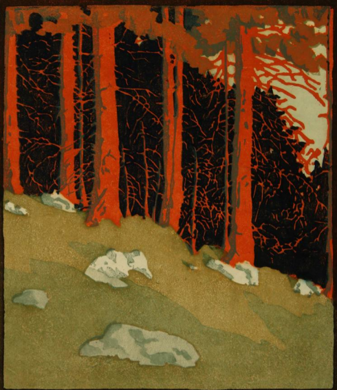
In manner, she was most like the artists of the Vienna Secession. She has the same four-square formality and use of strong shape and colour. The Munich connection may also help explain what she has in common with Carl Thiemann. There is not only the expressive landscape (third from the top), there are flowers and Venice, too. In the eighties, Hooge gained a reputation based on those flower prints and that was where she tended to remain as if she were a continental Hall Thorpe. As you see, there was more to her than decoration. It is all the more surprising, there is still so little known about her career and there are so few prints available online. She must have han a long career because it is obvious the landscape with the primrose sky was made about 1905 and some of the flower and Venice prints are post-war. Like so many of the women artists, she is something of an enigma. Or am I being unfair once again?

What strikes me about the landscape (above) is how much it is like an American or Canadian artist with their taste for the great outdoors. (There is another, lighter version of this print). Gustave Bauman with his German background comes to mind. It is only Hooge's stricter design and half-abstract style that gives her away as a European proper. Unlike Edna Boies Hopkins, Hooge made very little use of a conventional key-block even when she started out. This made her job trickier and made her depend more on colour and pattern. As a result, her dying tulips are hardly recognisable. Only think of Mabel Royds' approach to the very same subject just a few years later.
They are very different from the anemones (above) or Red roses (below). The anemones are like Hans Frank but the use of line is subtle and surprising, making the image much less conventional than it might have been. Hooge was not a flower artist. The flowers are not only different species, each of the prints have different things to say. Like Edouard Manet and Henri Fantin Latour, she makes her flowers more intense by cramming them together. Both Urushibara and Arthur Rigden Read tended to give them much more space. Here is an artist with a purpose. For instance, she could never have achieved the sense of luxury of the roses if she had employed a key-block and it would be a mistake to ignore the subtle levels of expression and symbolism. But then, if we knew more, we could say more.

Gerrie Caspers says she was friends with the artist Martha Cunz and visited her in Switzerland in 1922. Aufziehendes Wetter (below) apparently dates from just after the visit and shows thee Matterhorn range. If we take the English translation to be Approaching storm, it suggests that what I said about her imagery may be true. I like the suggestion of hardiness, with each alpine house being a small mountain sufficient unto itself. A print like this signals a move away from the decorative pattern-making of the old secession days to greater realism, not a style we would associate with colour woodcut at all. The strange light before a storm often attracts artists often attracts artists and I think she pulls the whole thing off pretty well.

Hooge is an artist where it helps to identify the time of day. The early mountain landscape looks like dawn as do the red trees with the deep shadows. The light forms everything. The roses facing the light are open and pale while the one turning away is dark and closed. She has the kind of sensibility where everything has personality and each thing is graded according to its worth, from large to small.
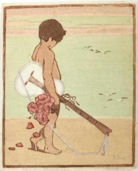
I was surprised to come across this cupid trailing rose petals behind him on the shore. Hooge probably could not avoid using some key-block here and I like the way she has nevertheless placed the boy against bands of colour. I am not generally a fan of colour woodcut used for figurative work like this. Hooge wisely turned the face away to avoid awkwardness and it works, partly, it has to be said, because the image is unconventional and intriguing. It is a very different image from Manet's ebullient guitar player. This is more a Sandy Denny song where all the birds are leaving.


Hello Charles, nice posting on a wonderful artist. May I suggest readers to visit "Das Haus der Frau" website and look-up this artist in the index for even more great prints: www.dashausderfrau.nl. The accompanying book reveals her and her sister's short biography and the connection Martha Cunz.
ReplyDeleteThanks, Gerrie. I know I should have looked at your book, too, but I had already spent quite a lot of time on the post.
DeleteIt's been a while, Charles ("Who knows where the time goes...?"). But your post on Hooge is as interesting and inspiring as the ones I used to read about a decade ago!
ReplyDeleteKlaus
Good to hear from you again, Klaus. I am going to try and post now and again though I may not always be able to maintain standards!
DeleteWhat a great post Charles. I have one of her prints somewhere in a cupboard and I bought it when she was largely overlooked outside of Germany and Holland. I know that Gerrie has done so much research on her but I must say the pieces you have highlighted are outstanding and the landscapes are beautifully executed. Bravo!
ReplyDeleteI was surprised by some of this work but a lot of new stuff has turned up online over the past ten years or so and perhaps more importantly the standard of the photographs is higher. Many years ago she was nothing more than an also-ran flower artist.
Delete