
When Alphonse Legros was professor at the Slade School in London, he would encourage the students to make models in clay as a way of understanding 'form'. I suppose, to some extent, this makes sense, but I don't believe that is all there is to it. Legros was versatile and understood the need of students to find out for themselves - I was going to say 'explore', but that sounds too modern.

Legros had made sculpture and medallions himself and during his early days at a school of drawing in Paris, he had also made friends with the sculptors, Auguste Rodin and Jules Dalou. He also made etchings and was a leading member of the early revival in the 1870s, but what really interests me is the way artists associate prints with modelling and sculpture, without perhaps being too conscious of it, and I think Jules Chadel was one of them who did. You only have to look at his Magpie and bee (above) to get my drift. It is flat, but he still imagines everything in the round and achieves a lot of what the print is about by a deft and vigourous use of perspective. For an experiment in colour woodcut, it is remarkably self-assured. What I should add is this: it also appears more Japanese than it actually is.

Chadel first trained as a sculptor, but moved from there to jewellery design and about 1905 went to work for Robert Vever, the leading Parisian maker of jewellery. Vever was a notable connoisseur of Japanese art with an impressive collection of Japanese woodcuts. Vever would be 'at home' on Sundays and enthusiasts like himself would come along to indulge their passion, as collectors always have. Vever was also a member of Les amis de l'art japonais, an exclusive society of designers, connoisseurs and artists, who would meet eight times a year at a Paris restaurant (usually the Cardinal) and took turns to produce illustrated menu cards and place-cards in the manner of ukiyo-e woodcuts.

For a number of years, Chadel worked on his cards with the fabric designer, Alphonse-Prosper Isaac. It was one of those happy arrangements; Isaac had been making these small prints for a while had learned how to print them, but Chadel was the better artist of the two, and between them, they made some of the small colour woodcuts you see here. Simple but subtle, and well-designed, there were nothing throw-away about them and, for all their self-evident charm, they were made with complete seriousness. You can see Chadel and Isaac's two stamps at the corner of print of the bird with the cherry and, though I am not absolutely sure, this little print appears to make use of the technique of karazuri, or shallow embossing, to suggest the breast-feathers. If so, Isaac was hardly a beginner.
Chadel also went on to make prints in editions like Le port de Douarnenez. As you see, it is a more conventional French prints, with nothing much that is Japanese about it. For me, the most interesting aspect of the print, is the way he is still working 'in the round' and making great use of perspective. It reads from bottom to top the way a Chinese print would but the conception is western. But I also think the first prints he made for Les amis de l'art japonais are less Japanese than they appear or, at least, that writers on art have emphasised what Chadel took from Japan without considering what else might be there. I don't think this has done Chadel justice, but this has been the standard approach to colour woodcut and especially to artists using the Japanese manner of making prints. In Britain, this was the approach taken by Alan Guest who did the first research hereand has been followed by his collaborator, Hilary Chapman. Alan (who was both mentor and friend) came to colour woodcut as a librarian with a specialist knowledge of print technique and as a collector with an interest in Japanese art and generally there has been too much emphasis on Japan and technique.

This view of mine is nothing new. It was taken by John Dickson Batten and S.R. Koehler in the 1890s (as Alan knew) and by Herbert Fust in 1924 (and picked up from him by the linocut artist, Claude Flight). Both Furst and Flight were hostile to colour woodcut but were not well-informed enough to make a lot of sense. I am far from hostile; I just tend to think there is more to most artists than the commentators say, Chadel included, and that writers have tended to take one aspect of their work as it suited them and make more of it than they should. This has happened to Flight and his linocuts. You only need to look at Chadel's wonderful Dragonflies to see its works the way that it does by combining aspects of western and Japanese art; it is a synthesis like the work of Mabel Royds. This is what gives it that typical turn-of-the century decorative clout. The wings and leaves are mainly flat against a flat background, but the bodies and the way the wings overlap rely on conventional perspective despite Chadel attempting to cover this up. It's not a crime; it's just more Paris than Tokyo. Dragonflies (and insects in general) are typical of Japanese art. Here they allow for unprinted space. But sculpture also relies on what isn't there - the space between arms and bodies, the holes in a Henry Moore. Sculptors also have to see their subject in the round and Chadel was looking at his dragonflies from above and below and from the back and the front, something that came naturally as a designer, but a designer who knew Katsushika Hokusai's manga (see below for an example).

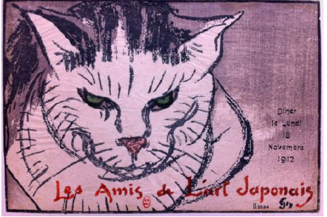
You will see that the menu with the cat image was made for a dinner held on 8th November, 1912, and had a magic ingredient. This was called Yoshijiro Urushibara. Urushibara had arrived in London in May, 1910, and first visited Paris in the December of that year when he addressed Les amis. Isaac and Chadel, in particular, were always grateful for the lessons he gave them; Isaac's own lessons went on daily for months and his way of making woodcuts improved. But look again. The cat manages to suggest both Japanese brush technique and European lithography, which had come into its own in the 1890s and was being widely used by artists like Pierre Bonnard and Henri Riviere and not just for the famous posters of Steinlen and Lautrec . It works not because it's Japanese; it works because, like Isaac and Chadel, two cultures of tradition and innovation, had become firm friends.

I particularly like the last one! Reminds me a bit of Thiemann's "Grunewald See II" (design and colours). Very interesting post!
ReplyDeleteKlaus
A very likeable artist and worth the effort.
DeleteGood info. I'ld like to order the yellow finch and cherries please......
ReplyDeleteThat finch may be like Jungnickel's parrots; it might not come in that colour. But I know exactly what you mean.
DeleteChadel seems to have been quite pleased with his cat print (some copies of which have mica in addition to embossing) and he gave a copy of it to his mentor Urushibara.
ReplyDeleteI think you are correct that a lot more was going on in Chadel's prints (and other works) than being a Japanophile. His Japanese period was actually quite brief, and his work always had a Gallic sensibility. As between Chadel and Isaac, it was Isaac who strove to follow in his master's footsteps. Isaac's mature, post-Urushibara woodblock prints after WWI show where Chadel could have gone, but chose not to.
Salaman admired Chadel and was surprised the revival of colour woodcut in the Japanese manner seemed to die out. The French seemed to put more effort into fine book illustration than the British.
DeleteAnd what happened to the proof Chadel gave to Urushibara?
It went by descent to his son.
ReplyDelete