Monday, 30 October 2023

Alice Coates & John Platt at Shrewsbury


This is a very late alert about a timed sale by Hall's of Shrewsbury. It has been open for about two weeks and closes at 4pm on 31st October. Tomorrow is still not to late to snap up some very choice work bought by a surgeon from Hilary Chapman in 2003 and 2004. There is also an interest modern colour woodcut 'The sower' by John Petts and a wildly misconceived colour linocut by the irreproachable Gertrude Hermes.


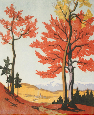
There are six epic colour woodcuts by John Platt and a rare and sublime colour linocut by Alice Coates called The signpost. It is England at a crossroads and I am never sure whether it represents Staffordshire or Worcestershire though in a way it hardly matters. No one but Coates would have seen the West Midlands as a hothouse, half-French, half-Grosvenor, the signpost at the foot of the slope subtly lets us know the countryside near Handsworth had found its own poet who unfortunately did not stay the course. She is closest in feel to her great Scottish contemporary, Ian Cheyne, perhaps not surprising because she has Scottish ancestry herself. But her great love was botany and she went on to work at botanical illustration until arthritis forced her to stop. So if you can't buy the print, you can buy one of her books. 

I love Coates' work but I can only admire John Platt's. That said there is plenty to admire in this small but judicious collection of the complete range of his oeuvre. From the scintillating The goat stride to the late dark masterpiece 'Sails' to make the very best of this auction, you will have to buy all six. You may never again get the chance to pick up such a good range of what Platt could do.


I have to say my own personal favourites are his wide angle beach scenes. 'Pilchard boats, Cornwall' is an elegant tour-de-force from his middle period when he took note of everything he saw like a masterful surveyor of British leisure and life. Let no one tell you this dynamic vision originated with the colour linocutters of the Grosvenor School as some would have us believe; it originated here, with John Platt, and derived from sound schooling at the Royal College of Art.


I have never been a big fan of Platt's later work. He tended to take a good idea like a rock guitarist and then do it to death. I mean you either love Led Zep or you can take two or three minutes of them and I think it is something like that with Platt. He had done all those flitting swallows years before on the walls of All Saints at Leek and no amount of appealing to Hokusai could redeem. It is an exercise in aerial effect. 'Sails' on the other hand is hard to explain. Although it derives from his torn paper method which he used with students, he transformed the harbour at Brixham into a seascape of Germanic half-abstraction. 


Platt was very much a man of his time. While some modern artists wanted to expunge the narrative and literary elements from their work, others like Platt took the academic and literary and made it into a new form of modern art which disappeared from view at the outbreak of war and did not reappear until young artists like David Hockney were being trained in the sixties at the Royal College of Art.


PlanPlan

Friday, 27 October 2023

Four colour woodcuts by SG Boxsius at Leominster


I have been surprised on visits to Leominster recently how many antiques shops and centres you find there are. The overall effect is to make the place look tatty and temporary. In fact someone who lives nearby went as far as to describe Leominster as 'a hole'.  Readers from outside of the UK will not be aware that this has become standard practice here. This means Evesham is a hole and so is Hereford while Gloucester is merely 'depressing'. I could go on. All I can say is such people have never been anywhere near a real hole. 


Suffice to say, you would not find colour woodcuts by S.G Boxsius coming up for sale in a proper hole. Nor would Boxsius himself have gone anywhere near one. He spent the last days of his life in 1940 visiting Tenbury Wells just over the boundary in Worcestershire. How these four prints ended up in Herefordshire is another matter. They were all handed out as Christmas presents to employees and clients of British Belting and Asbestos from 1930 onwards. I thought I had covered this subject fairly well but as I have had an enquiry from a reader about the Leominster prints, I thought it was as well to try and clear up any remaining confusion.


The term 'the four seasons' came into use quite a few years ago and I can assure you all that the idea did exist but that Boxsius only produced Spring, Autumn and Winter. Summer was the work of John Hall Thorpe and was the only one of the four to be machine-printed (presumably by the art printers Bemrose of Derby). All three of the seasonal prints by Boxsius were printed by hand on fine paper and unlike the Hall Thorpe were only signed in the block and never in pencil below the image. Nevertheless, Autumn remains one of his very best and most rewarding pieces of work and is well worth buying. Winter also found Boxsius on top of his form with the scudding clouds being some of his most remarkable effects. As the notes on the back say they suggest further snow to come and emphasise how much atmospheric effects were a concern in his work.


Spring and Winter come with the original labels supplied by B, B & A attached to the back. My hunch is the notes are the work of William Giles. For all the elegance of the phrases he uses, Giles was both a knowledgeable and perceptive writer and worth attending to. The labels suggest the work was framed by the recipients back the thirties. All the images here are the ones on the auction house website. Its is always preferable to buy the prints unframed. Now and then, they even come up in their original calendar mounts though I only the containing Valencia one by Arthur Rigden Read.


This means there were at least three artists working on commission for B, B & A during the thirties, with Boxsius being the artist they work with most and most successfully. The fourth print in the sale is Early morning. Like the Read and Hall Thorpe images, this one was machine printed but is a better and more professional image than the other two. There were two further prints, both with titles straight from Giles. Evening afterglow is the least common of any of the series. In fact, the only one I have ever come across is the proof that I now own. I have certainly never seen it since. Mid-day (not to be confused with Noon-day) was sold quite a long time ago by Hilary Chapman and is again pretty rare.


One reason for buying any of the series is the fact that they are all woodcuts. Lino could be unsuitable for long print runs and wood may also have been easier for professional printers to work with. The first ones are the best but as you know almost anything by Boxsius is worth buying. It is a pity Minster decided to put all four in one lot. Presumably they expect the trade to buy while collectors will already have one or two of these themselves (as I do) and will regretfully have to let the others pass. I would have certainly considered bidding for Spring and it is going to be interesting to see what the lot fetches and who buys it.

Lot 371 comes up at Minster Auctions, Leominster, Herefordshire on 1st November, 2023.

Wednesday, 11 October 2023

Ernest Watson & American linocut


The California Society of Printmakers were in the habit of not distinguishing between colour woodcut and colour linocut. Instead they referred to them collectively as colour block prints (and the same thing went for galleries like Brown Robertson in New York). This said quite a lot about the north American attitude towards colour print. I have always found many American prints to be more generic than the ones made by British contemporaries and it may help explain why, given the choice between a New Mexico idyll by Gustave Baumann, Watson's Misty morning and the stylish aplomb of Arthur Rigden Read's Cite de Carcassonne, the jury at the California Printmakers exhibition of 1926 gave the gold medal to Read, and this in a country where showmanship matters. Read simply beat the Americans at their own game. The question is why? It was not the first time and it was not to be the last.


In the first place, what the Minneapolis Institute of Art say about The explorers (top) (which they own) is worth taking into account. 'Ernest Watson spent his career exploring the limits of linoleum. In this strange scene he takes advantage of the medium's best attributes: its glass smooth surface, which allowed for even application of color; and its soft composition, which allowed for crisply detailed carving.' Now all of this can be true but what is ironic is an American reader who had bought a linocut by S.G. Boxsius wondered about the mottled surface of his print and you can only draw the conclusion that Boxsius did not think an 'even application of color' was always such a good thing. But without doubt it is in the distant details where Watson and Boxsius have so much in common. In other respects Watson's approach is more like Robert Howey or Oscar Droege and Minneapolis might have been closer to the mark if they had said that what linocut did best was 'effect'. But did Watson really make the best of lino as MIA suggest? Only compare the dynamic approach taken by Claude Flight and his students at the Grosvenor School and you can see an artist wanting to do something original with linocut.


It strikes me that a lot of what Watson did was not very different from the work some of his British contemporaries like E.A. Verpilleux, Eric Hesketh Hubbard or Howey were doing. The difference is Watson rarely depicted anywhere you could put a name to and even when he made a print of St Ives in Cornwall, the whole approach was too atmospheric for the place to matter. The plowman (above) is mainly an exercise in design, colour and brilliant and dramatic effect. No one would deny Watson's skill and seriousness, but it remains the work of a teacher whose job it was to impart a high level of skill to his students. This is true of teachers of fine art everywhere It doesn't matter where you go, their own work usually has the same problem. The real subject is skill. This is why the got the job in the first place. And this is why Watson is so fond of depicting workers. That is the way he saw himself I suspect.


Watson trained as a teacher of art at the Pratt Institute in Brooklyn (where the colour woodcut artist, Arthur Wesley Dow, was a teacher). He was then taken on at the Pratt as a teacher of design, drawing, perspective and composition in 1908 and remained until 1928. He met Eva Auld while she was training and after the couple married, he set up a summer school at Monterey in Massachusetts. This meant he spent almost all of the year teaching and even when he left the Pratt, he became an art editor on a journal. For me, all that shows. He never gave either himself or his subjects a chance to develop. Only compare the work of Edna Boise Hopkins who was another student at the Pratt to see what a wonderful American colour print artist can achieve.


Eva Auld Watson deserves a post to herself but you will not be surprised to hear the couple worked together and it is not always obvious whether print is by Eva or Ernest. It was the same with Hesketh Hubbard who sometimes collaborated with Frank Whittington. The style slips between fine art and commercial, not surprising when you consider some of Watson's students would go on to become commercial artists themselves. It still didn't mean he had to adopt a commercial style himself. Obviously, like Verpilleux's woodcuts, they were designed to look good framed on the wall. It is worth adding Verpilleux was influenced early in his style and choice of subject matter by the American etcher, Joseph Pennell, because what it all seems to amount to is 'International colour print style'. All very well done but lacking the finesse that gives colour prints their allure.


The only Watson print I have ever seen in front of me was one for sale on the High St in Oxford. It was large, impressive and relatively expensive and I reluctantly left it behind. This only meant a visiting American could come along and take it back home. And why not? Americans have always thought far more of their own colour print artists than the British have when it comes to their own. Not only that. They also tend to think more or ours, too. So, I can say what I like about Watson. It will not put them off. And quite rightly so.


Saturday, 30 September 2023

The making of a masterpiece: Anna Findlay's 'The paper mill'


If The paper mill had been the only print Anna Findlay had ever made, it would still have a reputation as the one modern colour linocut that showed the way forward, even though no one followed, including Anna Findlay. She attended Glasgow School of Art and was a founder member of the Society of Artist Printers set up in Glasgow in 1921. Because their exhibition catalogues are few and far between it is hard to know what prints she was making at the time. All of them were colour woodcuts like the harbour scene (below). Her brother and his wife, Cecile, lived at St. Ives and Findlay spent time in Cornwall and exhibited with local societies but eventually moved back permanently to Glasgow so the harbour may be in Cornwall or in Scotland (and the houses suggest it is the latter).


Moving between Scotland and Cornwall was all very well. The fact was the British print scene was metropolitan and to make a mark you needed to be in London or nearby. Ethel Kirkpatrick worked in Devon and Cornwall for many years but her main home was always at Harrow on the Hill on the outskirts of London. All I have of Findlay's work from the early twenties are two black and white reproductions for a print catalogue. Apart from illustrations that appeared in The Studio Magazine, that is about all there is though everything I have on file is worth considering. You can see the viewpoint she adopted was the same as the one she later used for The papermill. In both prints we are looking across an enclosed area of water towards a group of buildings and even though the style is different, the sense of purpose is the same; she is well organised and offers narrow spaces to lead us in.


We are fortunate that two of Findlay's sketchbooks have survived. One of them contains the striking scraperboard image (above). I have tried without success to identify the paper mill and I cannot even be certain the scraperboard mill is the linocut mill but I think it is likely simply because one image is certainly in preparation for the other (or at least for a different print). It is the first real sign of the rigour Findlay applied as she made herself into a modern artist rather than a genre one. The scraperboard also infers she was experimenting with new mediums. It is often said that Findlay studied with Claude Flight at the Grosvenor School. I do not think this is true and moreover it implies she needed Flight to help her change. I am not saying The paper mill does not show the influence of Grosvenor style but by 1932 of his teaching at the Grosvenor but by 1932 when Findlay first exhibited the print, the linocut class was history (it ended in 1929) and Findlay's cool appraisal and sense of formal depth has little in common with the self-conscious verve and surface design typical of about every linocut made by an artist who worked with Flight. You could just not ignore him - or his approach!


What is perhaps worse about all this is the way the example set by Chica MacNab has been missed. Unlike Flight, she offered both woodcut and linocut training to her students. Beyond that, the faux naif genre style Findlay used for her early woodcuts owes a good deal to MacNab's example (though again we have very few examples to go on). In the end, we do not have all that much to go on, though the survival of the sketchbooks have at least made it possible to see say something about her working methods. As I said, it is now generally agreed The paper mill appeared in 1932 and was an immediate success. The Contemporary Art Society bought number two from the edition of fifty printed on cream paper (see top) and presented it to the British Museum in 1934. But by then, Findlay had already made some changes to the print. The first proof she signed (above) does not have the light reddish-brown on the central building and is cream and white. It is clearly marked 1/50 (below) but I do not offhand recall seeing it in the BM. But then I have never seen any of these proofs. I think 1/50 must have come up somewhere for auction otherwise I would not have the detail of the edition number you see below. Details are not what museums do.


The paper mill even made its mark in St. Ives when shown there in 1933. The Cornishman newspaper advised its readers that Findlay's 'meritorious sketches' would 'repay close scrutiny in 1929, and here conservative Cornwall appraising a modern artist for the first time (or so it would appear): 'There is some attractive work in non-traditional modes, but nothing clamorous. Miss Anna R Findlay has given the Japanese manner the impetus of her intensely personal vision. She show The paper mill, Le Treport and Railway Bridge, of which the first, a lino cut, is decidedly the best.


The praise of the modern style is not only generous it is also perceptive and no one would disagree ninety years later that The paper mill was 'decidedly the best' though with hindsight we could say it was decidedly one of the best of all British linocuts made during that hectic ten years between 1929 and 1938. The way Findlay herself took a second and a third look and made at least three versions of the print implies she was pleased but could not decide what exactly was 'decidedly the best'. Christchurch Art Gallery in New Zealand hold a proof inscribed in the margin and not within the image (above) that may be 19/50. This contains a further revision that suggests how modern Findlay's sensibility was. Rigorousness and self-criticism helped to make the 1930s what is was and in that respect she is closer to Ben Nicholson than she is to Flight. The gallery give an edition number that does not make any sense to me but we can assume their proof came from the Redfern Gallery some time in the early 1930s because their former director gave it to Christchurch in 1954. The Metropolitan Museum of Art own a fourth proof but do not illustrate it or give the edition number.

The paper mill was exhibited widely in the early thirties. It was chosen by Campbell Dodgson of the British Museum to go on tour as one of 100 prints bought by the CSA, with venues including Blackheath School of Art, the Laing Art Gallery, Newcastle and the City Art Gallery, Leeds. (It reached Blackheath in February, 1934). It also toured the West Country alongside a smaller number of modern linocuts early that year and presumably also toured with the Exhibition of British Linocuts.

Is The paper mill a masterpiece in the way Ian Cheyne's Beeches at Glen Lyon is a masterpiece? Or does it stand out because it is unlike Findlay's other prints (Railway Bridge aside)? Contemporary judgements are often the best so it may be wise to acknowledge the praise given by The Cornishman. Frankly given the option of owning the Findlay or the Cheyne, I hesitated, but in the end I am sure The Cornishman was right.

Friday, 22 September 2023

The unusual case of Carl Rotky


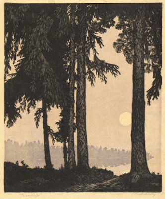
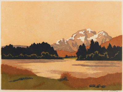
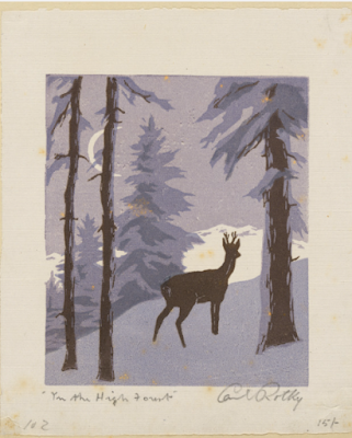
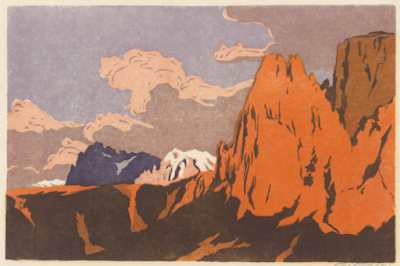
If you have always had the impression that Carl Rotky was predictable, you may have to readjust for more than one reason. He is best known for his views of the Styrian mountain countryside in southern Austria where he lived for many years, a pity because there is more to Rotky. His prints are varied and often display the same sense of style as many of his Austrian contemporaries but for some reason his best and most interesting prints still do not come up all that often online and it is not easy to see why.


Rotky's father was an official in the Austro-Hungarian government and disapproved of his son's ambition to become an artist and like so many young men and women of his background, Carl acceded to his father's wish and went to train in medicine in Graz and then at the Charles University in Prague where he graduated in 1914 and soon found himself working as a military surgeon on the eastern front. Despite coming out of the service with a reputation as a good doctor, he returned to his old ambition and took lessons is art in Graz and then Munich. Finally in 1928 he returned to the Kogelberg where his family had lived during the summer months.


So far so good. Or at least that was the case until one day I decided to take one of the two linocuts I own out of their frame. The two prints had come from the collection of someone called Mrs Hockey in Richmond, Surrey, but had not been bought by myself. I was disconcerted to find Rotky had printed the Styrian landscape on heavy card and it looked better in the frame than it did out of it. The mountain landscape was a much better print and I had never intended to remove it from Mrs Hockey's gilded frame but it was obvious that too had been printed on card.


It is not hard to find work printed on paper by Rotky. In fact Bonham's in London mention that one print they were selling was on paper. One one other the paper has cockled and the National Gallery of Australia have a collection of eighty printed on paper though even here it is not easy to tell whether those prints are laid on the back card. I have never come across this before and wonder why an artist like Rotky ever adopted the method because it does not make for a happy outcome. It also will leave anyone wondering how many are on paper and how many are on card. I have not looked at any other museum collections but as prices continue to rise into four figures in Austria and Germany I assume collectors there are content. It is different here in Britain where we have limited access. His work appears in exhibitions advertised by British dealers and like my own were still available in the 1980s and I have been asked to identify his work by dealers in the US.


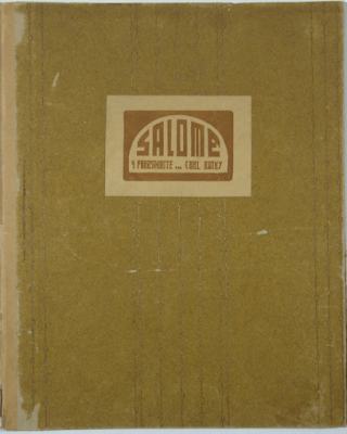
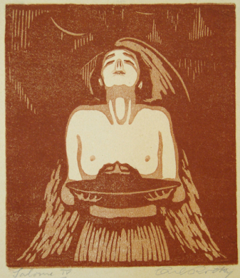
So it is hard to understand why an artist who was selling his work abroad was using a rather crude method. It may be that he only used card for a time but would help to explain the bold simplicity of the images he is famous for. Printing with any degree of subtly on the heavy card would be a challenge. It would also deter an artist from employing detail. There is also the issue of whether or not he was using both wood or lino. It has always been accepted his made use of lino. The artist himself went as far as to describe his work on his portfolio Salome (above and below) as Farbschnitte or colour-cuts, a term I have never come across until now.


Judge for yourself. Here is Rotky's Hiawatha version of the wanton princess carrying the head of John the Baptist on a dish. As an image it is not unusual in itself for the period but would we have expected it from Rotky? It remains at an extreme but shows that Rotky knew all about contemporary styles. I have already written about the history of linocut in Austria but it makes you wonder what medium Rotky was using and why he chose to describe the work as a colour-cut. There was nothing unusal about lino in Austria after all. Norbertine Bresslern Roth was making a career out of it in nearby Graz.


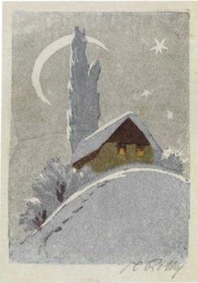
All this only means there is more to come, including an image of my own mountain scene. He made at least one bookplate for Leo Adler and some of the work above and below does not look like full scale prints. All the same it is intriguing to see Rotky working in this attractive way. There is certainly a lot more available online than there was ten years ago in terms of both images and biography but you will probably guess where this is all heading. Rotky more than anyone needs a proper catalogue and there may well be one in German though somehow I think this is unlikely. 


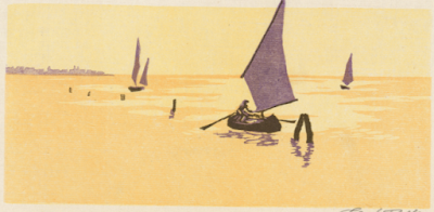
Rotky visited Italy, France and elsewhere but I have found few images that obviously record his travels. The one above of the lagoon at Venice is identifiable only because the topo he depicts was only used in the shallow waters. Otherwise the location would be impossible to guess. Then compare the approach taken by Ethel Kirkpatrick. When she made a colour woodcut showing the lagoon with a topo and wooden mooring posts, you will find an artist sympathetic to her subject but able to employ considerable powers of suggestion. I am not saying you get literal depiction with Rotky but true to Austrian aesthetics of the period, colour and design comes first. Try and imagine a British contemporary of Rotky's printing on heavy card. It isn't possible. Behind Kirkpatrick there is Hiroshige and an understanding of the way images work. (See The boats of Venice )


You only have to look at the British artists who were exhibiting in Vienna at the beginning of the C20th to understand how little interest the Austrians had in the British idea of an original print. Neither William Nicholson nor Frank Brangwyn printed their own work. Even worse, Nicolson engraved on box the way a newspaper illustrator would but made his prints appear to be woodcuts. This was the artifice the Austrians admired and which formed the basis of so much modern design.


Wednesday, 13 September 2023

The week on ebay plus arts & crafts in California


I have to lead with the S.G. Boxsius woodcut Winter because it is so unusual to have a print begin with a low starting bid. This is in overall good condition apart from some foxing in the margin and into the image. Any white flecks you can see are intentional, there was never a pencil signature on any of this series and the hand-made japan he used here makes the print something special. The black is printer's ink but the rest of the water-based inks shimmer. Not typical of him but all in all Boxsius at his magical best.


From Germany we have Ilsa Koch Amberg's vibrant Zinnia's. Stylish, eloquent and original, it  has a lot more impact than Walter Phillip's depiction of the same flowers (above). Popular in the 1920s an 1930s as garden plants but not seen very much today, both prints of zinnias are good examples of the way a well-chosen subject helps make a colour woodcut work. The Phillips is one of a group of British, American and Canadian colour woodcuts at the California Historical Design auction of Arts and Crafts on 16th and 17th September and the catalogue is well worth browsing through even if you don't intend to buy


Also included is Dean Babcock's nicely-handled mountain scene Tamina Peak  The faux naif touch and all-over rugged values give it away as American rather than Austrian or German. I have no doubt it will not be cheap even though it will have less actual interest as a print than the Boxsius snow scene. By comparison, I think that will be better value but as a reader suggested American prints are going to attract American buyers.


It may be the same situation for Alfred Peter's colour woodcut bookplates. They are no longer the bargains they used to be. I bought this ex libris for O Bertschi when they only cost a few pounds. They are a bit more now but remain still well worth having if you like small works to put in portfolios. This one makes great use of only three colours and his trademark sense of design.


Nearer to home is the Birmingham artist Ivy Anne Ellis. Strangely enough two people have recently mentioned either Ellis or the Birmingham group of artists she belonged to. She was the most prolific but was not always as successful as she is here in Columbines. The other woodcut currently for sale on British ebay is not as good How she ended up for sale in California is another thing.


A well-made woodcut by Wilfred Rene Wood (above) of an English town at dawn has been been languishing on British ebay for some while now. At £150 it is not all that expensive but Wood was a late-comer to the roller-coaster colour woodcut scene and does not have a fan-base (and never will). The trade never learn that a colour woodcut is not going to sell simply because it is a colour woodcut. He was fond of architectural prints which made them long like this one. Unfortunately architecture does not have the same appeal it had in the twenties and thirties. I might buy it at half the price but other than that I suspect it is dead in the water.


The same goes for John Platt's The Vltava at Prague. £950 is a lot to ask for a print that is all skill and no content. Completed in May, 1930, it came at the end of a long series of meticulous prints depicting boats and water that began with The jetty, Sennen Cove in 1921 and came to a dead-end with Mullion Cove early in 1931. As such it is only for die-hard fans, which counts most of us out. It is no more than another detailed and clever work by John Platt. Frankly, I could not care less and if I remember rightly none of us could when this print came up for auction on ebay some years ago. All we were interested in was the price it would fetch and since then we have all moved on.


As I was singing the praises of Dagmar Hooch not all that long ago I should not miss her out this jolly but stylish print of nasturtiums. The different tones she used suggest it was a decorating piece intended to match a variety of colour schemes in the manner of John Hall Thorpe. The fussy vase lets it down but I suppose you can't have everything.


This brings me to  Hans Figura's evocation of boats with coloured sails moored along the Grand Canal at Venice. What this has is intelligence and panache. No colour woodcut artist in their right mind could resist such craft and they became almost a sub-genre to themselves with the most perceptive colour woodcutters. Ethel Kirkpatrick, Carl Thiemann and Ada Collier made prints as full of admiration of the Italian scene as this one. Nowhere ever had a better waterfront than Venice and no waterfront ever had more glorious boats than these. This is the heartland of our culture, a factor never found in John Platt.


Monday, 11 September 2023

Update on SG Boxsius 'Ruins at Walberswick' at Dallas


I thought about calling this update 'Ruins at Dallas' because I am told SG Boxsius' Ruins at Walberswick sold for only $150 yesterday. The only interest came from a reader who assumed it would go higher and tells me he had not intended to bid. I say all this only because there is no certainty about the way a print of even this standard will go and it is always worth watching a lot as my reader did. I can understand why such a dark print might not have general appeal but sooner or later there will be none to buy at all. Finally, I am always pleased when readers do well and in this case the longer the reader owns 'Ruins at Dallas' the more it will prove to have been a great opportunity he did not miss.

In his own view a print by an American artist would have created more interest. As it was the Boxsius was lost amongst the furniture and jewellery.

Wednesday, 6 September 2023

Ian Cheyne's 'The breakwater' at auction in Chicago


The great city of Chicago is many things but one thing it is not; it is not the Centre for Ian Cheyne Studies. A reader in Scotland told me on Monday about the current sale of Ian Cheyne's colour woodcut The breakwater in the city. Unfortunately, Hindman Auctions have chosen to use a handwritten description on the back of the picture that says the work is a colour linocut called 'The Great Wave'. Why it is hard to say. It is easy enough to discover the facts about Cheyne's print. Both the British Museum (above) and the Zimmerli Art Museum at Rutgers (below) have correct description of Cheyne's print although the approach taken by the two institutions is different. The British Museum provide details of the inscriptions and of the work's provenance as well as giving the correct date for the first time it was exhibited. All we get from the Zimmerli is the title and a useful photograph of the complete proof. The British Museum's print was bought from them by the Contemporary Art Society in 1941 but we are given no clues about the Cheyne print at Rutgers which lacks the artist's signature as you can probably make out.


It may go without saying you will not find a signature on the Chicago proof either. It hails from the estate of the distinguished American photographer and philanthropist Lucia Woods Lindley and against all the conventions of framing an original print, 'The Great Wave' is mounted to the edge of the image, leaving everyone to conclude Cheyne never signed it. I am not suggesting there is anything wrong with the print. All I know is in the early 1980s, Alan Guest tracked down Cheyne's widow, Jessie Garrow, by the straightforward expedient of going through the Glasgow telephone directory. One result of his diligence was the London dealer Robin Garton visiting Garrow and buying a number of proofs. The artist died in 1983 and in the spring of 1986 twelve Cheyne prints went up for sale at the Alpine Gallery in Mayfair with seven bearing a violet studio stamp.  All the others were signed - and I am not suggesting they necessarily came from the studio. My own proof of Summer picnic came from Manou Sharma Levy on Portobello Road.


The curious thing is The breakwater was not one of them, leading me to wonder where these two unsigned proofs came from (and I admit I cannot be certain the Chicago print isn't signed). The only place Cheyne prints normally come up for sale now is in Scotland. Even by the standard of his contemporaries, Cheyne's editions were small and of the edition of only 20 for The breakwater, all were sold. Cheyne kept meticulous records of all the sales he made from 1925 onwards, though even here there are discrepancies because I have recently discovered there are at least two other colour woodcuts that do not appear on the definitive list. You may also ask yourself where I came upon one of the actual blocks for the print (above). I always believed all the surviving blocks were still in Glasgow but I was wrong. The four blocks made for what I want to call A bigger splash are all at Rutgers University.

I have to leave you to draw your own conclusions because I am not finished with Chicago. To give an idea of what was happening, I am going to quote from my own book. 'In December, 1929, Glen Cluanie (1929) and The fisherman's church (1929) were selected for the Art Institute of Chicago's Third International Exhibition of Lithography and Wood Engraving and yet again Cheyne's talent proved irresistible. Glen Cluanie was awarded the Brewster Prize as a meritorious print, with Cheyne selling eight proofs as the exhibition toured the U.S. As with Read at Los Angeles, originality had won out and it was soon apparent that the lowered blocks and graduated areas of colour first used in Summer picnic were to be the most original features of an unsurpassed series of Highland prints.'


The proof illustrated here is the Art Institute's own. As it is marked '6 proofs available for sale price $10' and the Institute's is 12/20, it appears Cheyne had already sold a further two at Chicago. This suggests Alans Guest's version (which appears in an unpublished essay about Cheyne) was misleading. It all goes to show once more that what we need is a full and proper catalogue of Cheyne's prints. Unlike Seaby, this is not a daunting task. The notebooks should still be in Scotland and there are new prints by Cheyne appearing online, including the etching owned by a fortunate reader, that present a different picture from the one in Cheyne's own well-kept accounts. 


The accounts are all very well but the fact is it is Ian Cheyne we know too little about not collectors, not least the ones in the United States, who were after all the people helping to support Cheyne. Following his success there, Cheyne and Garrow were able to marry and spent their honeymoon travelling in France and Spain. On their return to Glasgow, Cheyne then made Mediterranean bar, the best and most audacious art deco print ever made in Britain and one that has found a good home in a city famed for its art deco seafront. No, this time I mean Miami.

The post also includes Jessie Garrow's The wave and Eric Slater's Rough seas. Lots for the timed auction at Hindman end on 11th September, 2023.