Sunday, 7 August 2011

James Woodford


Still in the Blackheath area, we now come to James Woodford (1893 - 1976). Not someone who was known for his prints, the first two images you see here are the actual boxwood blocks he made, both of them well in line with the kind of wood-engravings the sculptor and printmaker Eric Gill was producing in the 1920s. I don't whether there were editions or even whether he sold any but he must have made proofs. But this post isn't so much about his printmaking as the play-off between the different media he used - drawing, engraving, modelling and relief sculpture.


Like me, he was brought up in Nottingham, the son of a lace designer. After studies at the local school of art, interrupted by war-time service, he went on to the RCA in London (where he might have got to know Charles Paine). 1922 saw him with a three-year scholarship to study sculpture at the British School in Rome. You can see him below two years later in this wonderful study by Robert Austin - Woodfood posed for the figure on the right - where the large crucifix brings in the requisite Catholic note. (Eric Gill, whose work he must have known, was a convert).
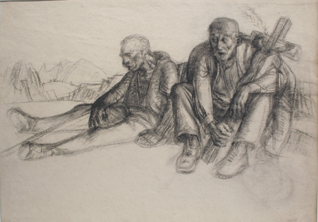


It's certainly interesting to note the unnerving mix of religion and eroticism for which poor Gill has become so notorious. Obviously it's quite hard to judge their effectiveness as prints when all we see is the block. The real print you see below, I think is ungainly. The interests of the sculptor in form and carving are uppermost. What matters, though, is the effort he put into producing work that would be flat.


You only have to compare Austin's subtle draughtsmanship with Woodford's stark, anatomical description of this cow, to see just how different their priorties were. Even so, I think it was his approach to modelling and structure that had an impact on his colleagues. Because by about 1930 Woodford was at Blackheath school of art, alongside Charles Paine and John Platt. (All three men were certainly there some time between 1932 and 1935).


This bronze relief for a series at Norwich City Hall especially reminds me of the woodcut of a bull that Platt produced in March, 1932. The position of the animal is almost exactly the same. I have no way of knowing exactly what interaction existed between staff and students at the school. Norwich City Hall was opened in 1938 but Woodford must have been working on his panels well before  that. All I want to suggest is the way these artists and teachers were open to new ways of doing things. Both Platt and Paine changed their style in the 1930s. I don't think this is just something you dream up on your own or on a whim. You only need to scroll back to Paine's Welwyn squirrel to see the way he analyses structure in a new and envigorating way. Woodford's bull may well be a compliment to his friend, John Platt. Platt mentions both men as friends in his Authors' Note to Colour Woodcuts of 1937. We are not talking about up-and-coming artists here; these were all succesful men. It was in 1937 that Woodford was elected associate of the Royal Academy. You can see him seated third from the left with the-great-and-the-not-so-good of the selection committee. Woodford, Platt and Paine may not have been modernists but all of them, to their credit, were affected by the modern spirit - and made it new. [I must add here that I am grateful to Liss Fine Art for all the images here apart from the RA photo, the Austin, which is Abbot & Holder's, and the bronze relief.]


Saturday, 6 August 2011

Charles Paine: Edinburgh connections


The British designer Charles Paine (1895 - 1967) is my lead-in to the next post on the work of staff and students at Blackheath art school in the 1930s. Alot like F Gregory Brown, Paine began work as the arts and crafts movement was coming to an end. Apprenticed as a stained glass designer in his home town of Salford, Lancashire, he went on to train in Manchester, followed by the RCA in London. As studies were interrupted by service in the armed forces, he didn't finally graduate untill 1919. I wonder if he was astute enough by then to recognise the opportunities that work in Edinburgh was to offer him. I suspect that he was.


Edinburgh College of Art  already had two of the best British printmakers at work. Not only was its director Frank Morley Fletcher but Mabel Royds also returned to work there about the same time Paine took up his post in the department of applied arts. This field of work was dear to Morley Fletcher's heart and it was not long before he appointed yet another important printmaker to be Charles Paine's immediate boss. This was John Platt. Paine could not have known just how useful this was all to prove. He left Edinburgh fairly soon afterwards (I'm not sure exactly when) to work in stained glass for the Glasgow firm of Guthrie and Wells. But Edinburgh hadn't left him. As early as 1921, he received his first breakthrough commission to design posters for London Underground.


It's impossible to say whether it was Platt who put him onto Frank Pick at the Underground. Platt was noted for his genorosity towards people and my hunch is that it was Platt who made the introduction. As it happens, 1922 also saw Platt designing his one-and-only poster for the Tube -  his chamaeleon design, too clever and too complicated. Unlike Platt and Gregory Brown, Paine wasn't a painter and was rarely tempted into picture-making when he designed. Paine's training in stained glass led him to concentrate on strong colours and simplified images. In his most effective work, he did exactly that.


But he also made a move that we would now take for granted in advertising but which must have been alot less obvious at the time.  Instead of relating his imagery to the subject in a literal way, he often chose an image for what it suggested. What have fish in a river to do with Uxbridge? Very little other than suggest the countryside that lies just beyond the end of the line. Even bolder was his poster for the 1921 boat race - nothing more than a stylised wake and the ripples left by the oars. He understands that he only has to attract attention, that he doesn't have to represent anything to get a message across.


And looking at this end-paper above and his advertising for Sundour fabrics, no one could accuse Paine and sticking to a formula. One of the remarkable things about him is his ability to match his manner to the job. Whether this meant falling back on historical pastiche or picking up the latest design trend, didn't matter. (Nor do I want to suggest he was only involved in graphics from the twenties onwards but I've been unable to turn up a single textile or stained glass design by him).


I don't know when Paine made his move to California, but in 1924 Morley Fletcher was appointed first director of the new Santa Barbara School of Arts. I am pretty sure it must have been his old boss at Edinburgh who motivated him but I don't know whether his job as head of applied arts at the Community Arts School was under Morley Fletcher's supervision. But he didn't stay, anyway. It's clear that artists like Fletcher recognised his ability but it strikes me that teaching wasn't something he felt committed to - unlike Fletcher and Platt.


But one thing that does remain constant during the period was his use of animal imagery, specially where no animals are really called for. Their appeal to children is strong, their appeal to adults through children even stronger. Around 1930 he was living in Welwyn Garden City, a new garden suburb in rural Hertfordshire, where he was commissioned by the development company to design posters for use on London underground. The choice of the four seasons as their subject emphasised its all-year-round appeal. Not that Paine went for the obvious option. No charming houses and lovely countryside for him. Instead he produced four remarkably modern animal images: a lamb and snowdrops for spring (which frankly was pushing it) insects round what looks like a daffodill for summer, hares in the snow and a chaffinch for winter, and this tremendous red squirrel for the autumn. Yes, they are standard ideas but the execution implies an educated audience. The appeal is both muted, up-to-date and subtle. (Unfortunately, some misguided individual at Welwyn Hatfield borough council has chosen to bung SAMPLE across the other three images - the only ones available to a world-wide audience. I only hope the culprit reads this.) And what else was Paine doing while designing posters for the Welwyn estate? Well, he was back to teaching, this time at Blackheath school of art in London. And who was he working for now? It was John Platt, of course.

Thursday, 4 August 2011

Tales from ebay: Leslie Moffat Ward


Readers will know I don't generally hand out tips on ebay items up for sale and this post is no exception. But it is a cautionary tale of just how badly things can go wrong if you don't pay almost constant attention to our favourite website. There is no point being occasional about ebay; you must be unremitting. And this is why. The colour print you see above is by the British artist Leslie Moffat Ward (1888 - 1978). Perhaps not exciting but an artist I've liked for a long time without ever finding anything decent by him ie one of his better landscape etchings from the 1920s. This rare woodcut is from the same period, I would say, and looks very much like a steal from SG Boxsius' Autumn. Some few weeks back it came up on ebay with the far-fetched starting price of £90. Having failed to sell, it came back a week or two later, now starting at a more reasonable £75. Even so, no one was biting. So, finally the vendor put it in at £50. And what happened? Two charlies slogged it out, bid after bid, and took the price to £156! I mean I like Ward but I don't want to make a fool of myself. You couldn't make it up.

Sunday, 31 July 2011

Ethel Kirkpatrick Society: Colour woodcut tour of Cornwall


Here's a nice irony. Even the colour woodcutters went down to the west of Cornwall and made prints even though the idea behind the colonies of artists at Newlyn and St Ives was to work outdoors in front of the subject. What had attracted artists was the opportunity to paint marine landscape, not something taught in the academic schools. Unfortunately, the artists didn't prove as tough as the  fisherman they liked to paint and it wasn't untill the completion of the railway line between London Paddington and Penzance in 1859 that they were able to undertake the remarkable journey between Exeter and Cornwall. In the 1880s that they began to up easels in Pont Aven and Concarneau in Brittainy and move to West Penwith where they found wonderful light, cheap lodgings and incomprehensible subjects.


Above HM Brock's woodcut-looking poster for 'The Pirates of Penzance'  (first performed in New York in 1879), there is a real woodcut by the British artist Sidney Lee (1866 - 1949). I will say now that I have bought prints by Lee in the past and the only work by him that I would now buy are his few-and-far-between colour woodcuts. This one must be earlyish so far as printmakers go in Cornwall and, even better, is one I'd never come across before. It may not be the first wave; it's nice but is it plein air? I don't believe Lee was a painter ( I don't think he could draw very well) and I have no idea how he went about making The bay, St Ives. It may have been something he worked up in the studio some time after a trip to Cornwall. But he was there and obviously made visual notes in front of the subject.
                                                                       

Much the same could be said for Cornwall coast by Elizabeth Colwell (1881 - 1954). The main thing here is that Colwell was from the US so this isn't just some parochial British thing we're dealing with. Although British artists had drifted from Brittainy to Cornwall, they had continued to exhibit in the Paris salons, gaining an international reputation for a remote Cornish port. There is also more of an attempt in Colwell to capture some effect of the light though frankly not that much. It's also more Japanese and nuanced than anything the hapless Lee could manage. It took an artist who we know had worked in France to actually put together the idiom of colour woodcut and the ethos of plein air and make a success of it. This artist was the redoubtable Ethel Kirkpatrick (1870 - 1941).


Now, readers will know that I have banged on about Kirkpatrick more than once before and I will tell them frankly that I have by no means finished with her. But with Summer we have a new and scintillating woodcut. And one that shows exactly what kind of artist I think she was. I cannot say hand on heart that this is a Cornish view but I believe these are Cornish luggers. This isn't a mere decorative work. Just like her view of Mousehole (see The definitive Ethel Kirkpatrick, December 2010) this is a descriptive work capturing the intense and shadowless light of summer as if she were actually there making the woodcut in front of the subject. This would depend on two things: good sketches and a good memory.


Less of a success but no less interesting is this woodcut of the jetty at Lamorna Cove. Lamorna is some miles west of Mousehole (and was a well-known hang-out of the painter Samuel Lamorna Birch). Now this we can date to 1916 because it was the print Frank Morley Fletcher (1866 - 1950) used as an exemplar in the first edition of Woodblock Printing. A contemporary of Lee and Kirkpatrick, we know Fletcher took the lead in his interpretation of Japanese woodblock and that both the other two artists must have followed his example - Lee, as I've said, occasionally, Kirkpatrick with a passion. But it's the Cornish connection that is so striking and unexpected. I don't think he ever did any other work down there and so far as I know there is no documentation of an FMF trip to Cornwall. By 1916 he was working in Edinburgh, a very long was from Lamorna in those days. But I assume this small print does reflect his own brush with plein air.


We are always on firmer ground with the artists of the 1920s and John Platt is no exception. By 1921, when he made The jetty, Sennen Cove, he was head of applied art at Edinburgh College of Art while Morley Fletcher was principal. I think this firms up the Cornish connection and, as it happens, Sennen is another few miles along the coast from Lamorna. He also produced 'The Irish Lady', Land's End (below) in 1922 and Mullion Cove on the Lizard peninsula. He also made a print Brixham Town, in Devon as it happens but it looks more like St Tropez, and was still painting in Cornwall during the second war though plein air was definitely out the window by then. Platt moved from job to job as principal of colleges of art, often part time so he could print and paint. Meticulous and with great craftsmanship, I think I'd still rather have something a bit smudged.


With this 1927 linocut Mousehole in Cornwall by Ernest Watson (1889 - 1964) we are quite some way from the Colwell approach and utterly remote from Kirkpatrick. Like Colwell, he was an American but came to Cornwall in the 1920s when the impetus had gone out landscape painting. Lee and Kirkpatrick had also moved on from Cornwall and began to make visits to the artists colony at Walberswick in Suffolk (alot handier for London) and where Lee also made one of his rare colour woodcuts. The dullness of Watson's surface only goes to show how the earliest printmakers working in Cornwall really were using their imaginations and expressing something of what they saw. (And if anyone is at all skeptical about the Kirkpatrick/Cornwall connection, please compare the luggers in Ronald Lampitt's 1936 poster for the Great Western and in Platt's view of Sennen Cove with the fishing boats in Summer!)


Thursday, 28 July 2011

Winifred McKenzie


The facts are many, the print works available are few is how I'd describe the present situation for the Scots artist and teacher Winifred McKenzie (1905 - 2001). She spent her early childhood in Bombay where her father was in business. George McKenzie had once trained with Charles Rennie Mackintosh, no less, and in 1913 returned his family home to Scotland where his two daughters attended Prior's Field School. In 1923 McKenzie moved on to the Glasgow School of Art to study painting and drawing. And it was here that she first came across the printmaking MacNabs.


Like McKenzie, Chica MacNab's family had spent time in the far east and she now set about introducing her to the woodcut. The extent of her success can be judged by the colour prints here, more modern in feel than the work of Ian Cheyne who had also studied at Glasgow and was over ten years her senior. She applies an easy faux-cubism (at least to our eyes) and certainly has a more abstract feel than Cheyne but comparisons are unavoidable partly because the standard he set for younger Scottish printmakers were high ones. As you also can tell from the two Scottish subjects The old bridge, Dalmally and Haslithal, McKenzie rose to the challenge. She was awarded her diploma and teacher's cetificate in 1927. The challenges were then compounded by Chica's brother, Iain.


A former student at Glasgow himself, Iain MacNab (1890 - 1967) had opened the Grosvenor School of Modern Art in Pimlico, London, in 1925. The teachers included the linocut luminaries Sybil Andrews, Claude Flight (who left in 1930) and Cyril Power but McKenzie, I think fatefully, turned to Macnab and his class in wood-engraving. That was 1932. And while The law mill, St Andrews is fine work, frankly, it could be almost anyone. Well, perhaps, not anyone, but someone good from the 1920s. But she made this print in 1949. The family, certainly including her mother and younger sister, Alison, had decamped to London in 1930. It may have been the difficulties of war or the London blitz or the availability of work that drove them back to Scotland. Both sisters had exhibited in London but between 1940 and 1945 Winifred taught wood engraving to allied servicemen at St Andrew's, University (the course was especially popular with the Polish students) and then in 1944 set up the wood-engraving class at Dundee College of Art. She retired from there in 1958 but was still painting (as she had said she always would) untill she died.  Incredibly, that was only ten years ago. How long it will take for her stylish, sumptuous colour prints to get the recognition they deserve is anyone's guess. Paintings by her there are many, colour woodcuts there are few.


Sunday, 24 July 2011

Phillip Needell: northern patrol, Japanese manner


Phillip Needell (1886 - 1974) has the distinction of being a Londoner who avoided the subject of London. (I've only seen one painting of some barges on the Thames). His great love was rural France and the small, old towns he found there. They wouldn't have had much in common with the mixed neighbourhoods of Islington in north London where he grew up. An interest in art was already there but his father found him work in a bank. Undeterred, Needell attended classes at the Polytechnic School of Art in Regent St. This was probably the only formal training he had. Nor was it a school of fine art. The main course was vocational and students received bursaries to attend.


Even so, he was accomplished enough by the time he joined the Royal Navy Reserve in 1916 to have produced a poster for a fund-raising concert organised by the London, Country & Westminster Bank. It's a bold-looking affair in gouache, similar to the early work for the Underground by F Gregory Brown. Here was a young man who was aware of contemporary styles. He may not have been very interested in London as a subject but he clearly gained from growing up there. The two years he then spent at sea with the Northern Patrol on the Atlantic approaches to the North Sea were also to have their effect. The sea is important in a number of his colour woodcuts (though not on an Ethel Kirkpatrick scale) and his letters home to his wife Anne show him sensitive to light and atmosphere.


If that isn't Anne Needell at work on her embroidery, the woman in this small illustration (it's the best I could manage) is certainly her; if the woman embroidering is Mrs Needell, then it adds irony to the subject because the needle and thread poised above the artist's signature involve a pun on her married name. My first reactions to Needell's work are sometimes adverse. I find them a bit outlandish and Embroidering from 1923 was no exception. But it has grown on me, as they say, and I like both the personal touch of the needle and the bird that appears to come to life. And again, here is an artist aware of the fashions of the time. The vogue for chintzy C17th style fabrics had its roots in the manor house revival of pre-war days and was the house-style of the Collard pottery in Devon during the twenties. I think it also incorporates a subtle compliment to his wife.


How he came to start making colour woodcuts isn't known yet but he was clearly aware of printmakers like Hiroshige and Hokusai when he began because he used the same pinkish-brown that is almost commonplace in their work. He doesn't use it in a non-realistic fashion as Hokusai would in his pink Mt Fuji, for example (we have to wait for his first attempt at Corfe Castle to get ink-blue woodland) but his manner is as Japanese as any other artist making colour woodcuts in the twenties and I have him down as a follower of Frank Morley Fletcher. But I would say his other great love was the work of the French printmaker Henri Riviere (1864 - 1951). The first print I know of with a French subject is Le pont d'Avignon from 1925.


This print is from the same year as Corfe (as far as I can make out) but there is already a change in his approach. Gone are the fussy textile patternings of the English 1920s and in comes a new sense of structure, perspective and detailing, which is so much a part of Riviere's charm. He isn't as good or as chic as the Frenchman but then he isn't too much like him either. Nor would he have been the first Londoner to have gone over to France for inspiration but from the mid-twenties onwards he kept on going back. Untill 1964, in fact.


The following year he came up with his most well-known print, Northern Patrol. It is based, almost word for word, on one of his paintings and although the painting gives a greater idea of the sea's loneliness and power, the print on this occasion is the better work, I think. I like the reflections on the deck but when I first saw this woodcut many years ago, I was taken aback - firstly by the image itself and secondly by the price. (I was in the Japanese gallery on Kensington Church St, having spent a fruitless morning at the Portobello Road). I do think it is overworked and that it comes across less well when you see it. But this is equally true of Le pont d'Avignon, which I also failed to buy at some point. But then my life is littered with regrets.


There are more paintings and drawings of France (watercolour, oil, gouache - he tried them all) than anything else. I've included his lovely Vue du chateau, which finds him in full Riviere mode. So much so it reads like a woodcut and it strikes me that the madder pink and blue-green trees might date the picture to the mid 1920s. One very striking fact is that he went on making colour woodcuts untill the late 1940s, after even Ian Cheyne and John Platt had given up. So you have to assume that he did enjoy making them. Nor did his style remain constant. There are further changes and it's these shifts that make him less of an amateur than people sometimes think he is. There is a consistent tone throughout all his work but he learned to limit his palette to achieve the subtle and delicate effects that are so often remarked upon.


But this represents his mature style. In the doldrums (of the becalmed sailing ship) dates from 1928 and all the rest of his woodcuts from then on are more subdued and subtle. In the doldrums is the most impressionist print of his I've come across but View of Kynance Cove looks straight out from the beach at the breaking surf. The incoming waves are the subject and, basically, I think he's a painter first and his prints are often the tonal works of a painter, not always 100% successful but always of interest. In fact, his best paintings are surprisingly good without ever quite being modern.


Vue du chateau isn't typical but it is nice meeting of Japanese patterning with French delicacy of manner. There's an odd occurence in the left foreground again and I'm not exactly sure what's going off but I suspect you will all be used to this by now. (I need to credit Bellagraphica in Cornwall for Corfe and William P Carl Fine Prints for In the doldrums and Le pont d'Avignon. So far as I know, all the prints are still for sale).

Thursday, 21 July 2011

The summer outing to Sussex


Even though Arthur Rigden Read had a house in Winchelsea for many years, he never made a woodcut showing the county that became his home. But plenty of other printmakers couldn't resist the glories of Sussex, amongst them Diana Gardner, Sue Scullard, Sylvan Boxsius, Phillip Needell, Eric Ravilious, Edward Bawden, Helen Lock, Kenneth Broad, Michael Renton. From mysterious dewponds to dubious Brighton, Sussex has it all. But I have to begin with a surprising colour woodcut I've unearthed by Eric Slater (1896 - ?). I say surprising because he comes across to me like a hack watercolourist alot of the time but the one above looks pretty good. If you know the Seaford and Cuckmere Haven area where he lived and worked, his prints do have an undeniable charm though why he fetches the prices he seems to, is beyond me. This one has no title that I can read but I assume it's our county because Sussex is his subject.


It was the unlikely object of German bombers as shown in this stylish wood engraving of 1940 by Diana Gardner (1913 - 1997). It shows the village of Rodmell where she lived with her father. (It was also the home of Virginia and Leonard Woolf). The stark lighting, the dramatic pose of the figure, the overscale planes all recall the work of Eric Ravilious, himself Sussex bred if not born.


This early morning view of Rye by Phillip Needell (1886 - 1974) is altogether a much more delicate affair. Probably on a visit because he recorded places as far apart as the northern Atlantic and the bridge at Avignon. Not always to my taste, I still regret not buying Needell when I could (and must also acknowledge Clive at Art and the Aesthete where I pinched this from). I get the feeling that small towns like Rye and Winchelsea, Lewis and Arundel, were full of people who read books and bought pictures and this may help explain why so many artists moved that way.


Michael Renton (1934 - 2001) made more than one letter-heading for a bookshop at Rye. He is more modern than the printmakers seen so far but illustrates the way that printmaking and literacy still go hand in hand in Sussex.


Like Michael Renton, Sylvan Boxsius (1878 - 1941) was a Londoner. Unlike Renton, he spent most of his working life in London but must have visited Sussex more than once to compose his two small colour woodcuts of Winchelsea and his lovely woodcut Houghton Bridge, Sussex. Readers may remember this print from my Boxsius post and I will not have to explain that I include it here out of sheer love of his work. He had such a good sense of scale and form, he could leave alot out and achieve a childlike simplicity without ever becoming self-conscious.


With Hastings by Sue Scullard (b 1958) we move into the uneasy territory of the professional printmaker. She has done everything from editions lsuch as this to cookery book illustrations and I suspect you would search Scullard's prints in vain for a defect like Hall Thorpe's misregistered ladybird or Sylvan Boxsius' printing crease. Work like hers depends upon a perfect surface and she achieves a delicate tone and nice range of greys. But for all the clever shifts in perspective on the boat and huts, with the gulls a touch overscale, I miss the unselfconscious quirkiness of the pre-war artists. But then Scullard was trained by Yvonne Skargon (b 1931) who is no slouch herself and who in turn was trained by Blair Hughes Stanton and John O'Connor. Long gone are the days when you learned from Frank Morley Fletcher who had taught himself.

                                                                                      
 Eric Ravilious (1903 - 1942) is too well- known to need any commentary from me. His chic lithograph Newhaven Harbour of 1937 belongs to the lithographs for schools series. (I remember this coming up at auction in the early 1980s and it not even selling the first time. I think we were too intent on colour woodcuts even then!) The wood-engraving below has the rigmarole of imagery that people of his generation became fluent with. It includes the chalk figure known as the Long Man of Wilmington and one of those dew ponds. I'm not sure what the flying bull is doing there and hardly feel it matters. But Ravilious was a native and not only knew Sussex but loved it, too, as anyone can tell from his exceptional paintings.


Kenneth Broad (1889 - 1959) was another Londoner who lived in both Surrey and, I think, Sussex for a while. This is a new photograph of A Sussex Farm and does the print far more justice than the one I included on my Broad post some while back. Not much of a draughtsman or watercolour painter, he used the Japanese manner to achieve a fine luminosity in his colour woodcuts. Normally producing rather heavily constructed prints, here he abandons that approach for expressive brushwork. He offers all we need to know with the long morning shadows, the dark leaves of midsummer and the washing that tells which was the breeze blows. For all his apparent concentration on the farm buildings, this is his least architectural and most emotive woodcut.


Nor could I resist re-posting Helen Lock's masterly image of a Keeshond. She made quite a few of these and was a friend and archivist to a lady breeder in Sussex and conclude that she has put the dog firmly onto downland turf with the Sussex countryside well behind.


And last but far from least, a panoramic capriccio called Brighton Pier by Edward Bawden (1903 - 1989). A contemporary of Eric Ravilious and fellow student studying under Paul Nash at the RCA, his work looks forward to the range of professional printmaking that did become the norm in Britain after the war. He manages here to balance his affections for the landscape and its oddities with a strong sense of design (and wonderful use of black and white). It has become so commonplace a style, we forget that someone had to invent it. Others that followed never seemed to quite get it right.


And, of course, it was necessary to include a railway poster - this time by Alan Durman (1905 - 1963). I don't have a date for this but it must have been designed after nationalisation in 1947. (It's for British Railways). Durman has it all, folksy in the foreground, south coast elegance beyond, an appeal to children, the peach and lemon of Italy - just in case we were thinking about abroad - and could that be the deco version of the modern world? Fine all the year round.