Showing posts with label Read Arthur Rigden. Show all posts

Sunday, 27 August 2023

Classic British colour woodcuts for sale at Banbury


It is not often we are presented with a good choice of colour woodcuts in a single sale but the forthcoming auction at Banbury has an old collection of prints put together with care and good judgement. All seven come in their period frames and some have well-known dealers from the 1920s like Redfern, Bromhead and Abbey Galleries on the back.  I say this partly because the labels suggest the prints were bought framed but mainly because I prefer the way prints were placed in good-sized mounts at that time. Apart from the Arthur Rigden Read, the frames themselves are not up to much (and one has bowed outwards).


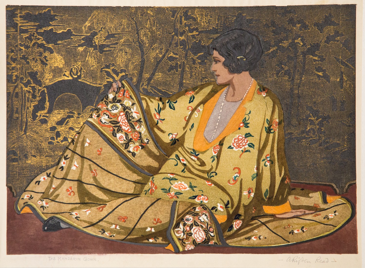
Heading the post is Rigden Read's bravura early masterpiece from 1923. Here is one of the most irresistible of all British colour prints with Kathleen Rigden Read in a sumptuous golden shawl worn over a plain linen shift, presumably of her own making. Read has dated the proof 1924 but that was the year it was pulled. It first appeared the year before. It has a large area of unprinted paper and this may have led to many proofs being discoloured. The one you see at the top is not the one in the sale. You can see that above. So far as I can see this one is in good condition and has been housed in a sympathetic frame.

The downside to many prints by Read is firstly they are small and secondly he often used drab colours in order to team up with the vegetable dyes his wife was using for her fabrics. The Venetian shawl was made before they held joint exhibitions and stands out, even though it is remains quite small. My mother had my own proof on loan for many years and everyone who came into the room for the first time commented on it. Read was a showman and that characteristic is to the fore here. This is not to say that Allen Seaby's owl does not have the necessary sense of drama but his theatricality was different. Read was just as observant as Seaby the naturalist. What Seaby has on offer in this print is poetry. Half-owl, half-ghost, what you have here is Seaby's presiding spirit, the constant search for what is always absent. 


The auctioneers give the title as 'The owl'. This must be wrong. To begin with, Seaby was a dedicated ornithologist and would have said it was a barn owl. Secondly, he made two similar but different prints of barn owls. One was more the work of the naturalist, the other more expressive. Regretfully, these are two of the only prints of Seaby's I have no record for. His output of about 100 colour woodcuts is too large to catalogue easily and the only records I have are the exhibition dates for the Graver Printers.


In 1910, Seaby exhibited fourteen colour woodcuts alone at the Graver Printers. This was the society's first exhibition and Seaby already had many prints in hand, including one entitled Lapwings. As with his barn owl, Seaby had two tries at the same subject and also made a print of young birds, which the National Gallery of Scotland call 'Lapwings' too. With no proper catalogue being available, the confusion is understandable. Seaby rarely put titles on a print. What you can see bottom left is the edition number. My guess is the one you see here is the first one and the better known one with the birds facing the opposite direction is Lapwings prepared for the Graver Printers exhibition of 1910.


For all the effort Walter Phillips put into making colour woodcuts, I remain unenthusiastic. Even so, his strong links with north America make him sought after over there and I have no doubt Norman Bay no 2 will be pricey. Phillips liked to present himself as a backwoodsman who taught himself how to the make colour woodcut by dint of his own ingenuity and hard work. This is tosh but Phillips was an able journalist with a regular column who could present himself as he wished. He was as earnest as Seaby (who was also a friend) but lacked Seaby's broader interests and his sense of humour. His prices are commensurably high without being an out-and-out joke. 


John Hall Thorpe on the other hand has had his day, partly because people are better informed about colour woodcut than they were ten years ago and partly because the fashion for art deco has died the death. All this will should make Cowslips and Forget-me-nots affordable and, I will admit, I was tempted recently by Marigolds mainly because it was still housed in its original frame. It is a glorious decorative print and was the first colour woodcut I owned but I decided against. If I found these two in a junk shop for £1.50 (as I did Marigolds) I would buy them. But that will not bring the 1970s with all its fads and bargains back. They are gone for good. And so is John Hall Thorpe.


While Seaby's Lapwings was hanging on the wall at the Goupil Gallery on Regent St., a twenty-two year old called Yoshijiro Urushibara was giving demonstrations of colour woodblock printing beyond even Seaby's capability in Shepherd's Bush. Only eighteen years later he became one of only four colour woodcut artists to ever have a solo exhibition of prints in London. (It says a good deal about what we have here that the other three were Hall Thorpe, Phillips and Seaby). Grasshoppers was among the exhibits at the Abbey Gallery in 1928 and provides firm evidence of the breadth of his work by the age of forty. One of the most thoroughly Japanese of all his many woodcuts, the series of images and his prominent signature are played off one against the other in a virtuoso display of nuance. Nowhere in the annals of British art has the relationship between image and calligraphy been so well made (unless we take his Crayfish into account as well). But where the detachment of Crayfish  is unnerving and creepy, Grasshoppers introduced collectors to the muted colours of the 1930s a good two years before the decade began. And if that doesn't sell it to you, nothing will.

The sale will be held at Holloways Auctioneers, Banbury, on 2nd September, 2023. There should be a follow-up post regarding prices once the sale is over.


Thursday, 2 February 2023

Arthur Rigden Read's 'The mandarin gown' at Bentley's


Perhaps things are looking up for colour woodcut, because I now hear that Arthur Rigden Read's show-stopper The mandarin gown (1927) is up for sale this coming Saturday (4th February) at Bentley's in Kent. It is in a job lot, but the Read should be the item of interest so far as I can see and, as with the Kirkpatricks, the estimate is on the low side. It depicts Kathleen Rigden Read wearing a glamourous Chinese gown with a decorative Chinese screen behind her. I will admit, I was rather appalled when I first saw this print. The combination of ruthless overkill and Read's willingness to represent his wife in yet another flattering gown was too much even for one such as myself inured to the runaway theatricality of British colour woodcut. But it has grown on me over time and, let's face it, the execution of such a complicated print is admirable. I mean, who else could have pulled it off? It would be a mistake to come to Read looking for the sensitivity of a Giles or Seaby. What you should expect from him at his best is showmanship and wit.


 It is also important to tell you this: Read made two versions of The mandarin gown. The one at Bentley's is the less expensive one, in a lower key and with a black and white background. The full throttle version (above) is simply the most unusual colour woodcut made by any British or American artist that I can think of in the twenties. That does not mean it is the best, but it does mean it overtops everyone else and that in a field where restraint was hardly a byword. Sad to say, Bentley's do not have the golden version, so you must content yourself with something less outrageous, but worth having all the same.

Sunday, 20 June 2021

Arthur Rigden Read's 'Valencia'


As there is a copy of this print for sale which people may have seen, I wanted to explain exactly what it is. The print suggests like nothing else he made how much broader Read's approach to making colour woodcuts than any of his contemporaries. I remember seeing it first many years ago in a shop in Camden Passage in Islington and being bewildered. I certainly didn't buy it because I had a very limited idea at the time what a British colour woodcut was partly because I had seen so few of them and partly because I had only even seen Read's Venetian shawl and which I owned by then. But this print was different and I now know why. 

So far as I am aware, Read never had any formal training apart from the instruction he received at the School of Photo-Engraving and Lithography at Bolt Court just off Fleet Street in London. The locality says everything. Most of the boys intended to enter the London print-trade and while he lived in London Read worked as a writer and publisher's illustrator. Beyond that Bolt Court (as it was always called) had a considerable effect on Read's attitude to making prints and, as I said, it is nowhere more evident than in Valencia.

Amongst other things, the boys at Bolt Court were trained in reproductive techniques. The idea was to reproduce the feel of the original work and Read was proficient enough as water-colourist by then for other boys to use his watercolours as a basis for their own lithographic reproductions. Once Read began making colour woodcuts about 1920, he not only gave his attention in particular to pattern and texture, he went out of his way to depict effects like the sheen of silk or the dirt on a chimney sweep's face. It was this approach that helped make him so original. Unfortunately, when he came to to make Valencia in 1933, the way the blocks were printed off defeated him.


Read took the idea for Valencia from Edouard Manet's Lola de Valence. Manet had painted this in 1862 while Lola was performing in Paris as a member of a troupe  of dancers.  It may be a coincidence but Lola de Valence went into the collection of the Louvre in 1912 at the time that Read was training at Bolt Court. He probably also saw it at the Louvre, where it stayed until it was moved to the Jeu de Paume in 1947. Admittedly, it is only the title that makes it plain that Read decided on Manet as his victim this time round though the flowered skirt and the edging of Lola's own shawl obviously provided Read with his main leads. But you have to start somewhere and Read may or may not have known that Manet adapted the pose from Francisco Goya's full length portrait of the Duchess of Alba. Read decided against against that appraoch and instead we have a portrait that emphasises the shawl covered with camellias. Alphonse Legros used to tell his students at the Slade that if they were going to rob anyone, they should rob the rich and not the poor. Artists certainly do not get any richer than Manet. Nothing if not ambitious, Read's image itself falls flat mainly because it was printed on the press at the art printer Bemrose in Derby (this is why none of the images are signed in pencil). Read's flair for texture, which relieved the flat designs he often made, was impossible to reproduce and no amount of busy detail could save the image from looking unappealing. Basically, it is the face that let's it down because the fringes and the flowers are all well executed. And having said this much, I  must add that once I got a second opportunity to buy it at a reasonable price, I did so. But you would need to be a serious collector of Read (or writing a book about colour woodcut) to lay out even fairly serious money ie £250, on Valencia. 

Saturday, 13 February 2021

Some classic British colour woodcuts on ebay


At last something has turned up on British ebay that I am sure is the kind of thing collectors will be looking for. I mean one of the two images Allen Seaby made of magpies in the classic bird print years roughly between 1903 and 1910 when he turned out masterpieces like Heron, Bittern and Ptarmigan. This is not up to that standard (but then few British colour woodcuts are) and does not have the same impact as his other magpie print. The paper is wrinkled at the edge which probably means it isn't laid down - one of my bug bears.

The print was probably made in the first five years of his career as a colour woodcut artist and (but not necessarily printed then) and before he had the additional responsibility of the post of professor at Reading and before he embarked on his book Birds of the sea and air. I never thought Seaby regained the freshness, creativity and distinction of this period. The blacks are superb, especially in Heron, and the keyblock never dominates.

By comparison with Arthur Rigden Read's Night wind, which maintained current prices for that artist and sold for £1,1170 only last night, this is by far the better print. Seaby had the advantage of studying woodblock with Frank Morley Fletcher while Read could only work from his book Woodblock printing and although Seaby suffered from Fletcher's rigorous teaching in the early stages and struggled with the Japanese method, by the time he made this print he had adapted what he had learned from Fletcher and developed his distinctive manner.


Another little masterpiece but of  different kind coming up is John Hall Thorpe's Forget-me-nots from 1922. For all the easy appeal of Hall Thorpe's prints, his economy of means in this particular one is startling. Hall Thorpe was quite clear that these prints were intended for home decoration and he was careful to introduce a variety of colours and give buyers the chance to adapt the prints to their colour schemes and although he said they were suitable for both a London flat or a country cottage, it seems plain he was providing pictures for people who had both.

Whether we should consider them as works of art is another thing. Hall Thorpe took a pragmatic approach to making prints - not surprising if you consider he had no success until he began exhibiting prints in 1919 at the age of forty. He had originally worked as an engraver on Sydney newspapers where all the images were printed at the press and he always had his colour woodcuts printed at a commercial press. No one has ever said where (and he certainly didn't) but I have a good idea, I think. Printing by hand would have meant two things: the prints would not have looked so polished and it would have entailed a lot of work because large numbers of prints were made.


Also up for sale is The Chinese vase (which I think goes tomorrow) and The caravan. Personally, I don't think either have the appeal of the classic series of flower prints. The Chinese vase has an oriental-looking key-block. What is striking about Forget-me-nots is the way he pulled it off without using a key-block and instead arranged contrasting shapes and colours to define the flowers. The black backgrounds were also an important part of the effect, another reason why I don't think The Chinese vase comes off as well.


                                                                                                   Annex Galleries


Finally, there is Rigden Read's Strangers at the gate, back on after failing to sell with a starting bid of £300. I can't say I am surprised. If you are going to give a woodcut like this the remorseless hard sell, you have to know what you are doing. It is one of the many prints Read produced using a limited palette, an approach that went against the basic tenets of the colour print movement. The founding fathers all put colour first so how did Read come up with dowdy prints like Strangers at the gate? The answer is he read about C16th chiaroscuro woodcuts in the introduction to Woodblock printing and took it from there. The sweep, which was the first one in 1924, was the best, but after that almost all of them were less accomplished, mainly because the thinking behind them was conventional.

I need to add that none of the images you see here are the ones currently for sale on ebay.

Saturday, 7 November 2020

Portrait of Miss Jessie Garrow


I cannot be sure that the colour woodcut above is a self-portrait by the Glasgow artist, Jessie Garrow, but I tend to think that it is. Even if it is not, colour woodcut portraiture of this distinction was very unusual in 1920s Britain. A number of people including Arthur Rigden Read, Urushibara, Frank Morley Fletcher and Phillip Needell tried and only Urushibara and Read were in any way satisfactory - and, in Read's case, not always. Garrow's portrait pulls it off, mainly because she was a figurative artist and knew what she was doing.


But I think there might have been another reason for her success and it is Ito Shinsui's masterly colour woodcut 'Portrait of Miss Elizabeth Keith'. Again, I have no idea whether Garrow knew Ito's portrait or not, but you only need to compare the two to come to same conclusion that I did. Ito had been working with the publisher Shozaburo Wantanabe since 1916 and in 1922 he asked Keith (who was another of his artists) to sit for Ito. The result was the witty, sensitive and knowing portrait of the thirty-four year old Keith, delectable with her befeathered hat, silken gown and large pink cushion. I also tend to think that Garrow was not alone when she identified the wry splendour of Ito's portrait. Below, I have added Read's portrait of his wife, Kathleen Rigden Read. It had not occurred to me until I began to write that Read might have used the Ito as a source, but as it was made one year afterwards in 1923 and because Read used other people's portraits as a model (notably Edouard Manet's 'Lola de Valence'),, my guess is that he did. Again you decide but this is what blogs are for.


Going back to Garrow's portrait, there are two or three things that stand out. One is the mouth in the pale face, which is so similar to Keith; there is also the hat. To me, this looks like the same  academic cap won by John Swinnerton Phillimore in the portrait painted by Maurice Greiffenhagen in 1924. Greiffenhagen taught at Glasgow School of Art all the time that Garrow was a student there. His work covered a broad range of portraiture, style and other figurative work and the stylised figures and use of white with blue in his painting 'The message' (1923) are pretty close to Garrow's use of them in her colour woodcut 'The wave' which appeared in The Studio one year later. I am not suggesting that Garrow was unoriginal but only like many printmakers she picked up ideas from various sources. Garrow had been making woodcuts by 1919, although they may not have been in colour. Generally I think she and her husband, Ian Cheyne, didn't begin making colour woodcuts until about 1923 or so. He sold his first colour woodcut in 1925. Cheyne was another student of Greiffenhagen, but as a landscape artist, Cheyne had little in common with him. His wife's bold stylisation and wit were more sympathetic to Greiffenhagen than they were to her husband's work, even his celebrated colour woodcuts.


.


Friday, 21 July 2017

A Sussex wave from Japan, the colour woodcuts of Eric Slater & Arthur Rigden Read: Hastings Museum and Art Gallery


In 1934 a friend of Arthur Rigden Read gave fifteen of his colour woodcuts to Hastings Art Gallery and I assume the fifteen colour woodcuts form the basis for the current exhibition at Hastings, but which also includes work by Urushibara, John Platt,  Eric Slater and Frank Morley Fletcher, an interesting mix of colour woodcut artists who all  made use of the Japanese method, hence the title of the exhibition.


Eric Slater was nowhere near as good a printmaker as Read, but he will help to bring in the crowds. It would be fair to say they formed a local school of sorts in the late twenties and thirties, but the Reads lived in Sussex for twenty years only and many of his subjects were French or Londoners or people like the Romanies who came from nowhere, so it's a shame curators try to give a minor artist this duff local slant. Read may be minor but he deserves better. As does his wife, who appears in a number of his woodcuts.
                                                                              

The show runs from 27th May to 3rd September and will appeal to the summer crowds as well as local cognoscenti. It will be worth going simply because I know that the bequest includes a number of prints that are rare enough to be unavailable anywhere online. Certainly I have never seen  some of them, but they have not been included in the booklet that has been published to coincide with the exhibition. But the less said about that little effort the better.

Thursday, 13 August 2015

Arthur Rigden Read: an education in himself


It was 1923 and Arthur Rigden Read was on a roll. He had only begun making colour woodcuts the year previously at the age of forty-four but already had already followed up John Platt's re-launch of British colour print with some distinctive and original portraits of his own. The sweep may well be an acquired taste today and admittedly it took me some time to come round to it but once you have the key, it has all sorts of interesting aspects.


For instance, you only have to take a look at one of Utagawa Kunisada's portraits of the kabuki actor, Ichikawa Danjuro  to see what I mean. Not only had Read appropriated the mop of hair (and wag that he was translated it into a brush) both the dark colours and exaggerated expression have some of their source in the work of the masterly Kunisada. This is all a roundabout way of giving an example of what I meant when I mentioned Read's interest in 'shape' in one of the comment boxes. Not that shape was all there was to it; throughout his work, Read had a surprising gift for expressing texture.

                                                                        
The lady in black has it all: rough old coat, silky feather, weather-beaten face. No-one except Allen Seaby had ever made such an effort with description. Nor had anyone moved obviously beyond the usual Japanese models of Hiroshige and Hokusai. Read had no real training as an artist. He was a mediocre water-colourist at best with all the amateur's talent for pernickety detail but no one took the dictum that colour woodcut provided excellent training for the student more to heart than Read and no one benefitted more from it. It made him selective and showed him how to emphasise the telling detail. He learned how to liven up a silhouette against unprinted paper from Kunisada but his application was both unique and entertaining. Imagine the reaction of his contemporaries at the Society of Graver-Printers in Colour and the curators at the British Museum seeing the outlandishness of Kunisada transformed without the least hint of looking Japanese. This was where his originality lay - he didn't show off his knowledge or misapply Japanese aesthetics. No, at forty-four he was wise enough to absorb their lessons as William Nicholson (below) had done before him.
                                                                                 

OK, Nicolson's Die Alte Frau (1897) has dramatic genius and the kind of detachment that all good art has. Read was much less sure and when it came to a serious attempt to come out on top, it all could go disastrously wrong. Trying to use Leonardo's The last supper as a model for a French country market scene he called Market in Languedoc was, as ideas go, pretty inappropriate. The mismatch is just too great and add to that awfulness of genre and - well, I will say no more but only show the wonderful details at the feet of tradesmen and their customers. Fascinated by both basketry and poultry, I have no doubt the birds for sale in France would have been quite irresistible to Read. Imagine him sketching the turkeys, guinea fowl, pigeons and ducks and the array of baskets. It's a little encyclopedia of wickerwork and yet not naïve.


There was a lyrical talent at work in Read, a talent no more obvious than in his blithe May morning (1924). The bird-cage almost certainly made by the Romany people he so much admired suggests how essentially modest Read was, able to include not only his own fixations but the work of others, including the embroidery basket of his wife, Kathleen. In the end, I am not writing here about a set of influences, its a list of compliments that Read was paying. It was said at the time that his success was almost inspite of himself, malgre lui in fact the phrase was. He has the elegance and objectivity of the French temperament and French art. Ingres he may not be but very likeable and independent-minded he is.
 

Thursday, 3 March 2011

The itinerants of Arthur Rigden Read

No one seems to know very much about the British printmaker and watercolour painter Arthur Rigden Read (1879 - 1955). He was born in Bermondsey and presumably grew up there. It's a working class area on the south bank of the Thames in London but unlike his fellow Londoners, SG Boxsius and Kenneth Broad, there are no signs of prints of anywhere in the city and at some point he moved to the small old town of Winchelsea very near the Sussex coast. It was an area that was popular with artists. Eric Slater worked along the coast towards Beachy Head and Cuckmere Haven, Read's friend, the etcher Bertram Buchanan, lived not far away at Iden and Sylvan Boxsius produced two linocuts of the Winchelsea area. I assume Read and Boxsius also were friends. There are very few people at all in the work of Boxsius, Broad was especially fond of crowd scenes but along with Mabel Royds, Read was about the only other British colour woodcutter to concentrate on figure subjects. Basically, he used the Vienna Secession manner, close-up and with minimal background. The only landscape I know by him is short on detail but the countryside is implicit in all these images. Not only are they figure subjects, they show us a very specific type of person. Here are men and women who made a livelihood by travelling through the sort of country Oliver Rackham memorably described as social countryside. Woods, heaths, commons and beaches are all implied in these images, all connected up by an intricate network of lanes and footpaths. It may seem a far cry from Bermondsey but I would suggest the London riverside predisposed Rigden Read to recognise and adopt the itinerants of Sussex. The list of them is surprisingly long: chimney sweeps, donkey men, poachers, tinkers, labourers, bodgers or chair makers, Romanies. People like this woman selling pegs, and who is possibly an Irish tinker, were commonplace in the mid 1920s when Read produced many of his woodcuts. He was fairly prolific because the prints weren't complex. It is far more the person that interests him here rather than the use of colour or the subtleties of printing. In some ways he is like Eric Hesketh Hubbard. Hubbard was also a Londoner who moved to the same type of ancient countryside (in his case the purlieus of the New Forest in Hampshire). But Read shows greater understanding of the lives of his subjects (though I have to admit that I now regret not bidding for Hubbard's image of travelling cider-makers).
The travelling life of the countryside wasn't unique as a theme to Rigden Read. The poet Edward Thomas in particular also recognised a very special sort of person who moved from one remote farmstead or hamlet to another across that same network of lanes and paths but Read was almost documentary in the way he picked out individual types. With their brown faces and their scarves and hats, they are people who are out in all weathers. The sacks they have thrown over their shoulders are their means to earning a living. They are picturesque to some extent but also prosaic, specially if compared to his finer work. If readers have any other examples showing these resilient and resourceful people who were obviously the object of admiration for Read, please send them in. And the rest of us can admire them, too.